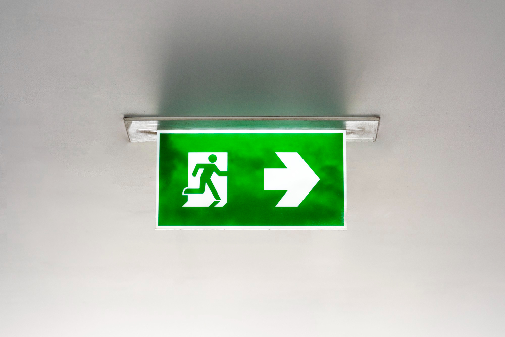
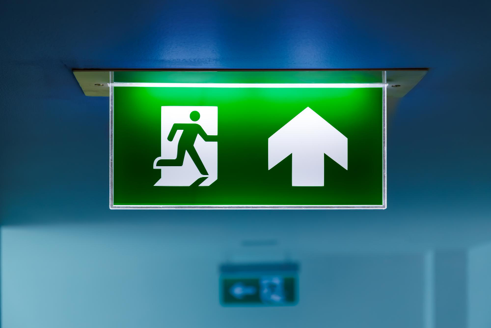
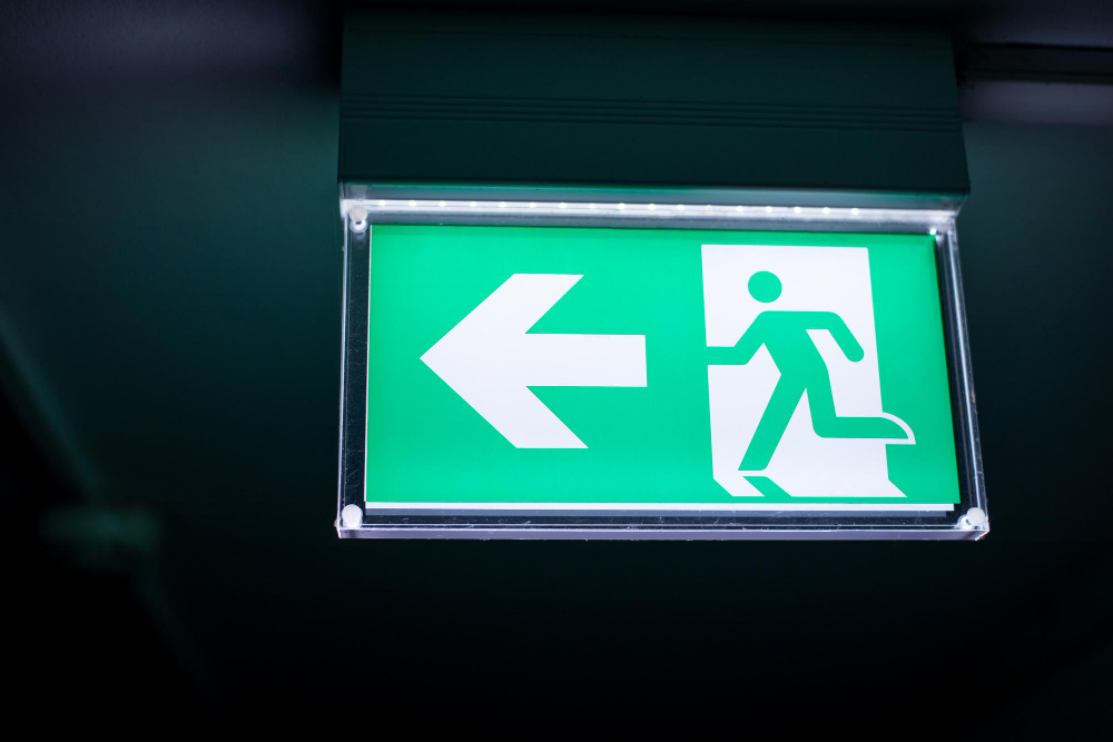
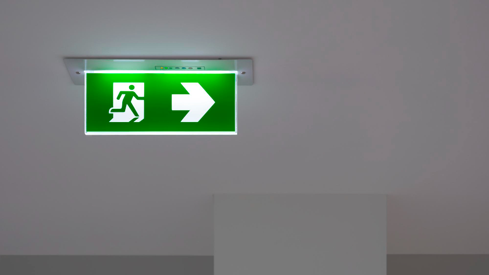
Walk through an airport, a cinema or a hotel almost anywhere in the world and the exit is marked by a green panel showing a running figure heading through a door.
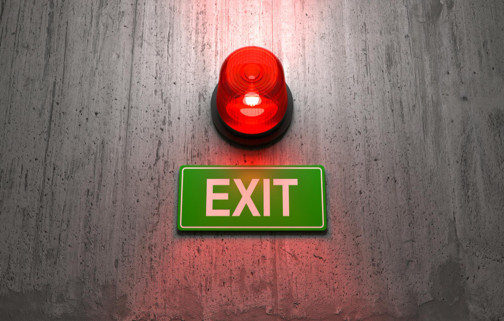
Walk through the same building in the United States and it will say EXIT, in red capitals.
Two systems, both standardised, both defended with evidence, and the split is one of the clearest examples anywhere of a safety decision being made twice and coming out differently.
The Argument for the Running Man
The case against a word is straightforward. A word only works if you can read it, which means it only works in one language, for literate adults, who are close enough to resolve the letters.
A pictogram has none of those constraints. It works for a child, for somebody who does not speak the local language, for somebody who has lost their glasses, and – the decisive argument – it works at a distance and in smoke, because a shape is recognisable when letters have degraded into a blur.
Smoke is the condition that matters, and it does two things. It reduces contrast, so fine detail disappears before gross shape does. And it fills a room from the ceiling downward, so the sign is seen through the worst of it.
The green is deliberate too. International convention assigns green to safety and safe conditions, and red to prohibition and fire equipment. On that logic a red exit sign is saying the wrong thing twice over: red means stop, and red is the colour the fire extinguisher is.
Like our content? Follow us for more.
Where the Figure Came From
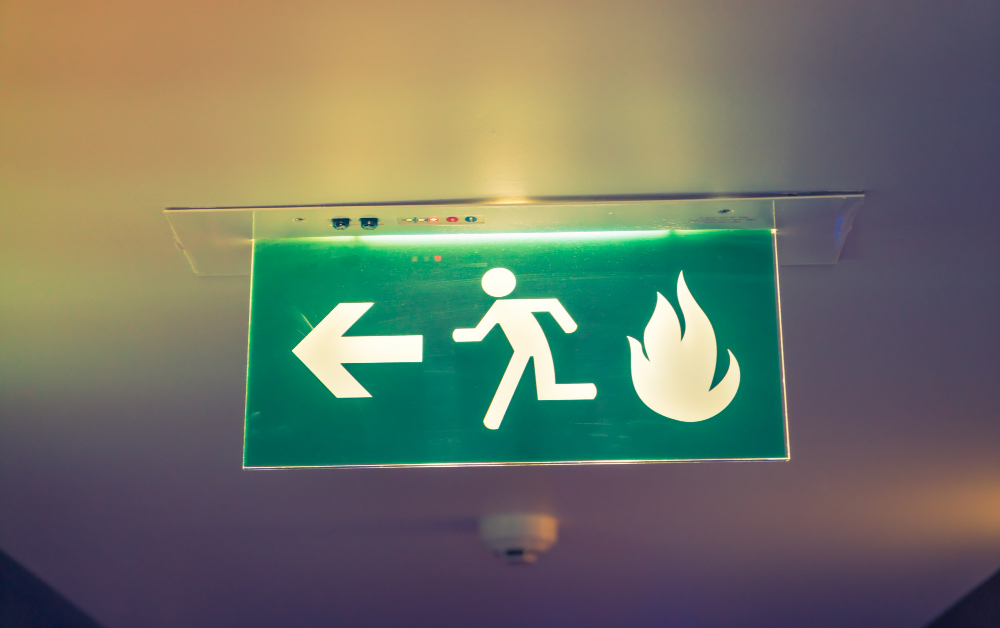
The running man was designed in Japan, in a competition run in the late 1970s to produce a pictogram that could be understood without any text. The winning design is credited to Yukio Ota, and it was adopted as a Japanese standard and then taken up internationally.
The figure was refined over subsequent revisions – the stride, the arm position, the relationship to the door frame and the directional arrow – and it became an international standard in the 1980s. It is now one of the most widely reproduced pieces of graphic design in existence, and almost nobody knows who drew it.
The design decisions in it are worth noticing. The figure is running rather than walking, so the sign communicates urgency as well as direction. The door is shown as a frame with the figure passing through it, which distinguishes the sign from a generic pedestrian symbol. And the whole thing is built from solid blocks of a single colour with no interior detail, so it survives degradation – which is the entire point.
Why One Country Kept the Word
The illuminated exit sign is an older idea than the pictogram, and it was developed where the fire codes came first. By the time an international symbol existed, that country already had millions of installed signs, a building code written around them, a manufacturing industry supplying them, and a population that had been reading the word its whole life.
Changing it would have meant replacing every sign in every building, rewriting the codes, and – the argument that carried most weight – introducing a transition period during which some buildings said one thing and some said another, which is worse than either system on its own.
There is also a genuine technical argument that gets made and is not nothing. A word is unambiguous about what the sign means. A running figure has, on occasion, been read as an instruction about an emergency route rather than as the exit itself, and the arrow conventions attached to it have to be learned.
The compromise in practice has been to allow pictograms alongside the word, and newer installations in that market frequently show both.
Red Versus Green Is Not Settled Either
Even within the word-based system the colour has been argued over for decades.
Red is the traditional choice and has the weight of familiarity. Green is specified in some jurisdictions within the same country, on the reasoning that green stands out against the red glow of a fire and against emergency lighting, and that it does not compete with fire equipment signage.
The evidence is genuinely mixed. Red has slightly better recognition in clear air for people who have been trained on it. Green is more visible through smoke and at low light levels, and performs better for people with some forms of colour vision deficiency.
What tends to settle these arguments in practice is not which performs marginally better but which is consistent, because the worst outcome is a building where the exits are marked in two different ways and the occupants have to work out which is which.
The Sign Has to Work When Everything Else Fails
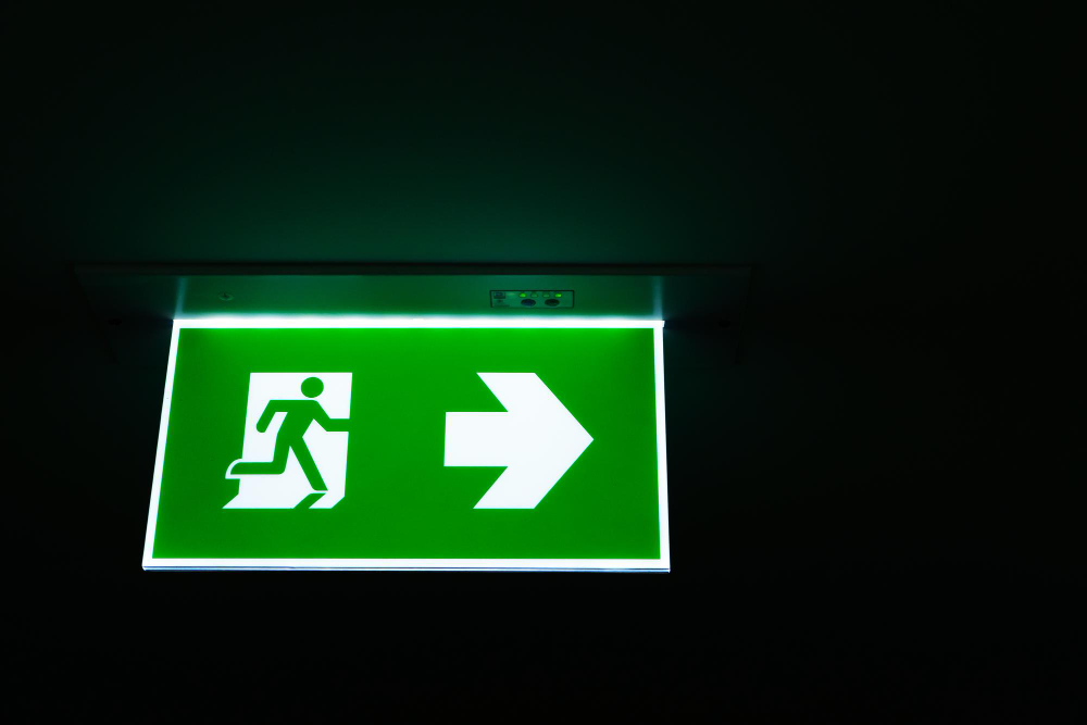
An exit sign is one of a very small number of objects in a building required to function when the power has gone, the air is full of smoke, and the people looking at it are panicking.
That produces requirements that have nothing to do with graphics. The sign must be internally illuminated or externally lit, it must have its own battery or a connection to an emergency supply, it must stay lit for a specified duration after the mains fails, it must be visible from a specified distance, and in many codes it must be tested on a schedule with the test recorded.
Photoluminescent signs, which absorb light during normal conditions and glow afterwards, are used in some applications and are attractive because they need no power at all – but they need to have been charged by ambient light, which is a real limitation in a space that has been dark.
The low-level marking that runs along the floor of some buildings, and along aircraft aisles, exists for the same reason the floor lighting in an aircraft does: smoke fills from the top, and the last clear air is at ankle height.
The Sign Is Only the Last Few Feet of the System
A sign is useless if it is the first thing somebody is relying on, and the codes behind it are built on that understanding.
Egress design works backwards from a maximum travel distance – how far anybody in a building can be from an exit – which varies by the use of the building and whether it has sprinklers. That distance determines how many exits there are and where they go, before anybody chooses a sign.
Exits also have to be remote from one another, so that a single fire cannot block both. Two doors side by side at the end of a corridor are one exit for code purposes, however many doors there are, because the thing being counted is independent escape routes rather than openings.
The route has to be continuous and protected: a stair enclosed in fire-rated construction, doors that self-close, a path that does not pass through a space that could be the thing on fire, and a discharge to the open air rather than into another part of the building.
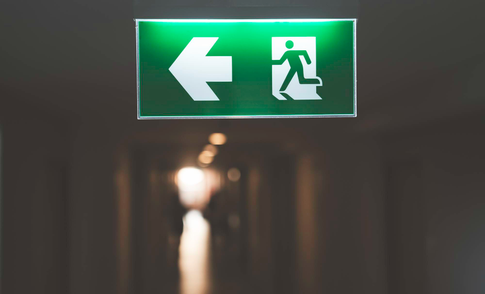
And the whole route has to work without anybody making a decision. A person evacuating does not evaluate options – they move in the direction they are pointed, and if two signs disagree they stop, which is the single most dangerous thing anybody can do in a corridor with people behind them.
Seen that way the sign is the cheapest component of a very expensive system, and its only job is to tell somebody which way they were already supposed to be going.
Pictograms Spread Far Beyond the Exit
The exit sign is the most consequential member of a family of symbols that was built deliberately over the second half of the twentieth century.
The lineage runs through the symbol systems developed for international transport, then through the pictogram sets produced for airports and the Olympic Games, and into the standardised safety symbols now used worldwide – the wheelchair, the telephone, the baggage, the no-smoking, the biohazard, the fragile glass, the umbrella meaning keep dry.
Each one was designed to be understood without language, tested on people who had never seen it, and refined until recognition was high across cultures. That testing is the part people underestimate: a symbol that seems obvious to its designer frequently is not, and the discarded candidates in those programmes are full of images that failed for reasons nobody anticipated.
The running man is the most successful of all of them, because it is in more buildings than any other symbol and because almost everybody can describe it from memory.
What to Actually Do With This
Two practical things come out of it, and both are worth the four seconds they cost.
In an unfamiliar building, notice which system is in use before you need it, because in a hotel in one country you are looking for a green figure and in another you are looking for a red word. People who travel frequently do this without thinking and everybody else does not do it at all.
And in a hotel room specifically, look at the plan on the back of the door and count the doors between your room and the stairs in each direction. That is the same advice as counting rows on an aircraft, for the same reason: in smoke you will be moving along a corridor by feel, at a crouch, and the only thing that will be reliable is a number you memorised while the lights were on.
The sign at the end of that corridor has been designed, tested and standardised by a lot of people over fifty years so that it will still be telling you something useful when almost nothing else is. The least anybody can do is look at it once on the way in.
Like our content? Follow us for more.