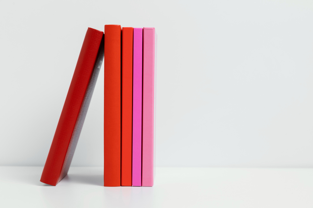
Stand in front of a bookshelf in an English-speaking country and tilt your head to the right to read the spines. The titles run downward, from the top of the spine to the bottom.
Do the same in France, Germany, Italy or Spain and you will be tilting your head the other way. The titles run upward.
Both conventions are standardised, both have been in place for about a century, and a shelf containing books from both traditions is genuinely annoying to scan – which is the only practical consequence either side has ever produced.
What Each System Optimises For

The argument has two sides and they are about two different moments.
The downward convention optimises for the book lying flat. Put a book face up on a table with the front cover towards you, and a spine printed top to bottom reads correctly – the title runs left to right across the spine exactly as it does on the cover. Pick the book up and nothing has to be rotated in your head.
The upward convention optimises for the book on the shelf. A title printed bottom to top is read by tilting the head to the left, which some argue is the more natural direction, and it means the title begins at the bottom of the spine where the eye arrives when scanning along a shelf at waist height.
Neither argument is decisive, which is precisely why two answers survived. If one had been clearly better the other would have died.
Like our content? Follow us for more.
Nobody Decided This, Exactly

There was no moment at which anybody chose. What happened is the usual thing: a convention formed in a trade, hardened as printing industrialised, and then got written into national standards after the fact.
Before machine binding, spine titles were frequently printed horizontally across the spine in stacked lines, or on a separate label glued on, or not printed at all – a reader identified a book by its binding, its position, or by pulling it out. Spines were narrow, gold tooling was done by hand, and running a long title vertically was a solution to a space problem rather than a design choice.
As book production industrialised and publishers’ output grew, shelves got fuller and the spine became the only face of the book anybody saw. At that point the direction mattered, and different national printing trades had already settled into different habits.
Standards bodies in several countries later codified what their trade was already doing, which is how both conventions became official without either ever being argued out.
The Mixed Shelf Problem Is Real for Some People

For most readers this is a curiosity. For a few categories of people it is a daily irritation.
Librarians and booksellers scanning a shelf with imported stock move their heads twice, and in a research library holding material in many languages the shelf is a continuous alternation. Anybody cataloguing has to handle both.
It also affects design work. A publisher producing a book for simultaneous release in several markets has to decide whether to print different spines, which costs money, or to pick one and accept that it will look wrong somewhere.
And it produces a specific small failure in photographs. A stock image of a bookshelf shot in one country and used in another looks subtly off to people from the second country without their being able to say why, which is the sort of thing art directors notice and nobody else does.
Some Traditions Avoid the Question Entirely

The vertical-title problem only exists for scripts written horizontally in a narrow space.
Books in languages written vertically, or that can be set vertically, handle the spine differently and frequently more elegantly, because a vertical script running down a spine is simply the script in its normal orientation rather than a rotated version of a horizontal one.
Books that open from what an English reader would call the back – which follows from writing right to left – also shelve the other way round, so a shelf of them has the spines facing the same direction but the volumes ordered in reverse.
And a great many books sidestep it: very thick books print the title horizontally across the spine in stacked lines, which is readable from any angle, and very thin ones have no room for anything at all and rely on the cover.
The Convention Is Weaker Than It Looks

Described as two national systems it sounds tidy. In practice both are leakier than either trade admits.
English-language publishers have printed upward spines, usually by accident when a cover was adapted from a continental edition, and occasionally on purpose on art books and photography titles where the designer preferred it. Nobody complains loudly enough to change it.
Continental publishers producing for export frequently print downward, because a book intended for the English-language market with an upward spine looks foreign on the shelf before anybody opens it – which is either a disadvantage or the entire point, depending on the book.
Academic and scientific publishing, which is overwhelmingly in English and distributed everywhere, has largely standardised downward regardless of where the publisher sits, simply because a research library is mostly English-language material and a consistent shelf is worth more than a national habit.
And self-published and print-on-demand books, which are now a very large share of titles produced, follow whatever the template in the software does – which means the convention is increasingly being set by the default setting in a handful of pieces of publishing software rather than by any tradition at all.
That last one is how a great many conventions are quietly ending: not argued out, not legislated, just replaced by whatever a dialogue box does when nobody changes it.
What Else Is Hiding on a Spine

Once you are looking at spines rather than through them, they carry a surprising amount.
The publisher’s imprint sits at the foot of the spine, which is why a shelf of one publisher’s output looks like a set even when the designs differ – the eye is reading a repeated mark at a repeated height.
Series design is done almost entirely on the spine, because that is the only part visible once the book is shelved, and the long-running imprint liveries are among the most durable pieces of graphic design anywhere.
The spine is also where the designer has least room and most constraint. The width is determined by the page count and the bulk of the paper, which is not finalised until late, so spine typography is frequently the last thing designed and the first thing compromised. A title that will not fit gets abbreviated, and an author’s name gets dropped.
And the top and bottom of the spine carry the headband – a small strip of coloured thread, originally structural and now almost entirely decorative, which is one of the few surviving visible traces of how books used to be made.
The Shelf Is Doing Something Else Too
The reason any of this matters is that a bookshelf is a browsing interface, and it is a good one.
A shelf of several hundred spines presents the entire collection simultaneously, at a glance, sorted by whatever logic the owner chose, with no interaction required. Size, colour, wear and position all carry information. A reader can find a book they cannot name by remembering it was green and near the window, and that works.
No digital library has reproduced it. A list of titles is not the same thing, because it removes size, colour and position – the three channels a physical shelf uses that have nothing to do with text. Attempts to simulate a shelf on screen have mostly been abandoned as skeuomorphic clutter, which is fair, and the thing they were imitating still works better for finding a book you half remember.
So the direction argument is a dispute about the legibility of the one surface that carries almost the whole burden of being findable. Neither side is wrong, both have about a century of practice behind them, and the only people genuinely inconvenienced are the ones whose shelves contain both – which, increasingly, is anybody who buys books in more than one language.
If you want to settle it in your own house, there is a solution nobody likes: shelve the two traditions separately. Most people prefer the head-tilting.
There is one last thing worth knowing, because it is the detail that makes people go and look at their own shelves.
Check the spines of your oldest hardbacks against your newest paperbacks. On a good many older English-language books, particularly before the middle of the twentieth century, the title is set horizontally in stacked lines rather than running vertically at all – because the books were thicker, the print runs were smaller, and the binder had room.
The vertical spine title is largely a consequence of books getting thinner and shelves getting fuller. It is not an ancient tradition being defended on either side of the argument. It is a space-saving measure that became a convention, then became a national convention, and is now being quietly re-decided by software defaults.
Which is roughly the life cycle of every design rule that anybody has ever argued about: invented to solve a shortage, hardened into a custom, defended as a principle, and eventually overwritten by whatever is easiest.
Like our content? Follow us for more.