

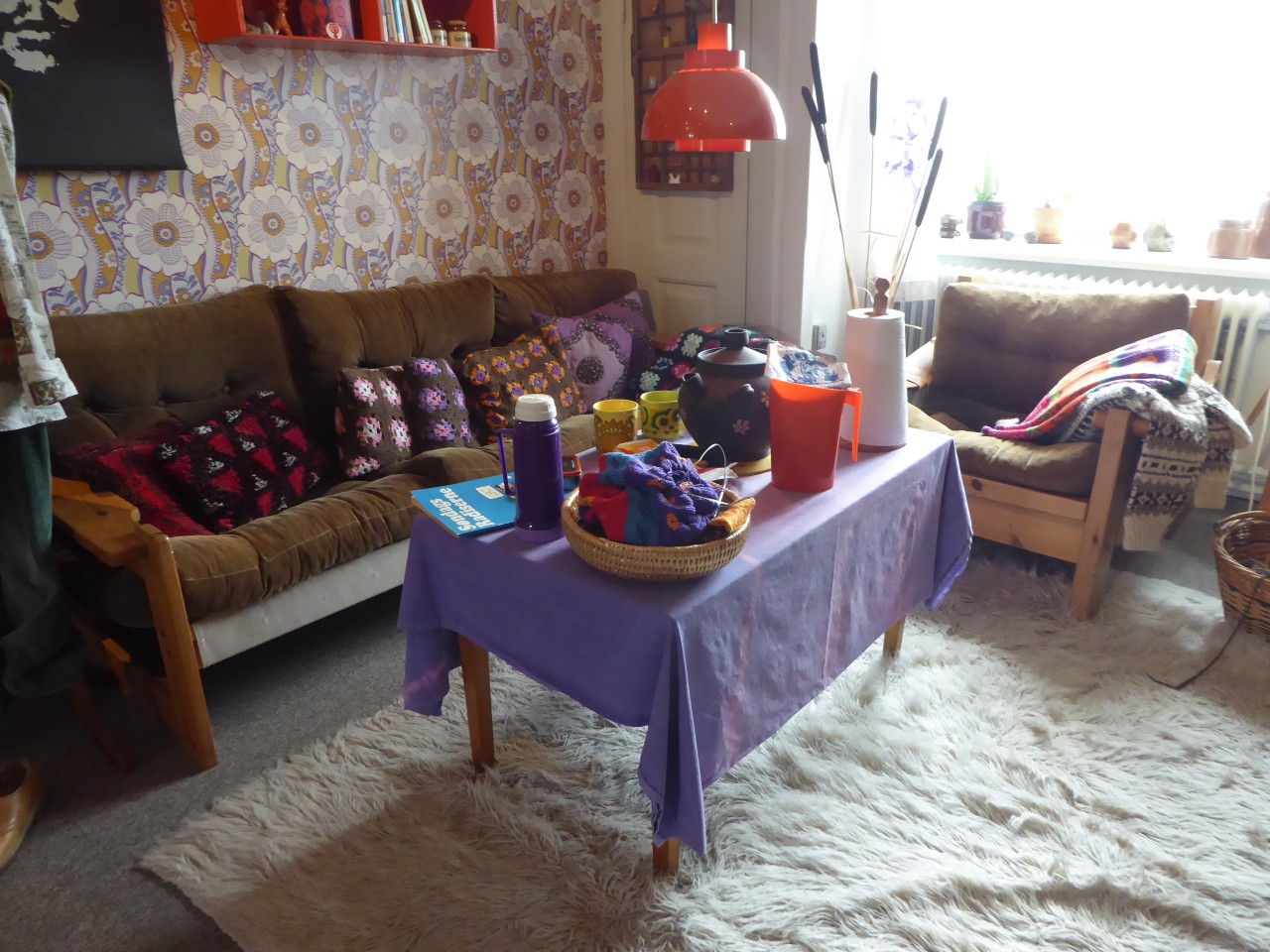
In 1974 an American living room had a carpet you raked, walls made of printed plywood, a ceiling sprayed to look like cottage cheese, and a step down in the middle of the floor.
The appliances were mustard yellow. The bathtub was pink and weighed three hundred pounds. There was a second living room nobody was allowed to sit in, with vinyl covers on the furniture. And every surface in the room was patterned, on purpose, because a plain one looked unfinished.
Here are sixteen things inside every American home in 1974, and what replaced each of them.
1. Shag Carpet Deep Enough to Need Its Own Rake
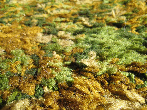
Long-pile carpet with strands an inch or more tall, in orange, gold, avocado or brown, laid wall to wall in living rooms, bedrooms, hallways and occasionally up the stairs and onto a step.
Short dense low-pile carpet, engineered wood and luxury vinyl plank. Shag came with a plastic rake, sold alongside it, because a vacuum could not lift the pile back up and flattened it instead.
The rake is the detail that tells you what the material actually was. You raked the carpet after vacuuming, the way you would rake a lawn, to stand the fibres up again – and a well-kept living room in 1974 had rake lines in it, which a family could see and a visitor was meant to notice.
Like our content? Follow us for more.
2. Wood Panelling on Every Wall of Every Room
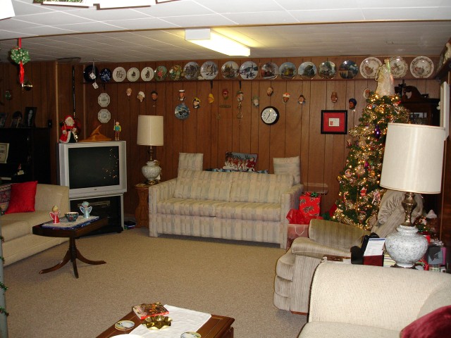
Thin plywood sheets printed with a wood grain, grooved to look like planks, nailed over the existing walls in dens, family rooms, hallways and sometimes bedrooms and kitchens.
Painted drywall, with real wood used sparingly as an accent. The panelling was not timber – it was a photographic print of timber on a quarter-inch sheet, and it was cheap, fast and forgiving.
Which is exactly why it spread. It covered cracked plaster, bad patching and uneven walls without any skill, it came in four-by-eight sheets that two people could carry, and it needed no painting, no finishing and no drying time – so a room could be transformed in a weekend by somebody with a hammer.
3. Ceilings Sprayed With a Texture Like Cottage Cheese
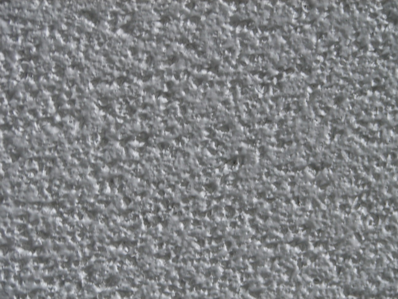
Ceilings were sprayed with a thick aggregate coating that dried into a bumpy popcorn surface, standard in new construction and widely applied in remodelling.
Smooth finished ceilings, which require a flat, well-taped surface and a skilled hand. The texture existed to hide imperfect drywall work and to absorb sound in rooms with hard floors.
There is one genuinely important thing to say about it. Some sprayed ceiling textures applied before around 1980 contained asbestos, which is why removing one is not a job to attack with a scraper. Anybody dealing with a ceiling of that age should have it assessed and handled by somebody qualified, and that is the whole of the advice offered here.
4. Appliances in Harvest Gold and Avocado Green

Refrigerators, ranges, dishwashers, washing machines and wall ovens were sold in a coordinated palette – a mustard yellow and a muted green, plus a coppery brown – and a kitchen was fitted in one of them throughout.
Stainless steel and white, with black as the main alternative. The coloured palette was pushed hard by manufacturers and was adopted almost universally in new and remodelled kitchens.
The commitment involved is the part that is hard to convey now. Choosing the colour meant choosing it for every major appliance, for fifteen years, because they did not fail at the same time and a replacement had to match – so a household was still buying avocado in 1981 to go with a kitchen fitted in 1973.
5. Bathroom Fixtures in Permanent Colour
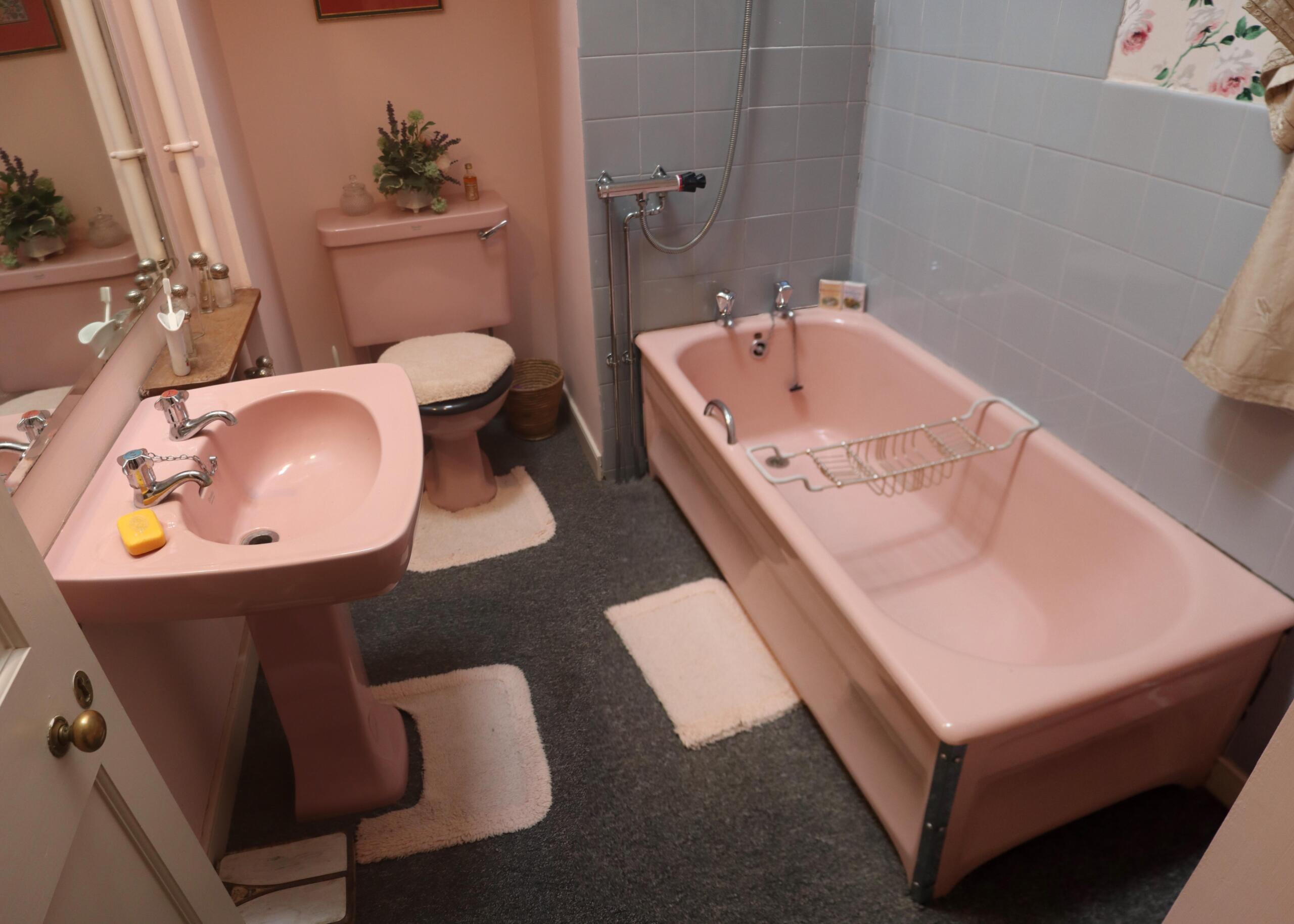
Toilets, basins and bathtubs came in pink, mint, avocado, gold, blue and black, and the colour was fired into the porcelain of a cast iron tub that weighed several hundred pounds.
White, almost exclusively, with colour confined to paint, tile and accessories that can be changed. The coloured suite was a permanent decision made on a passing fashion.
And it is why so many of these survive. A coloured appliance can be replaced when taste moves; a cast iron tub set into a tiled wall cannot be, not without demolishing the room – so households kept the pink bathroom for forty years, not out of affection but because removing it was a construction project.
6. Carpet on the Bathroom Floor
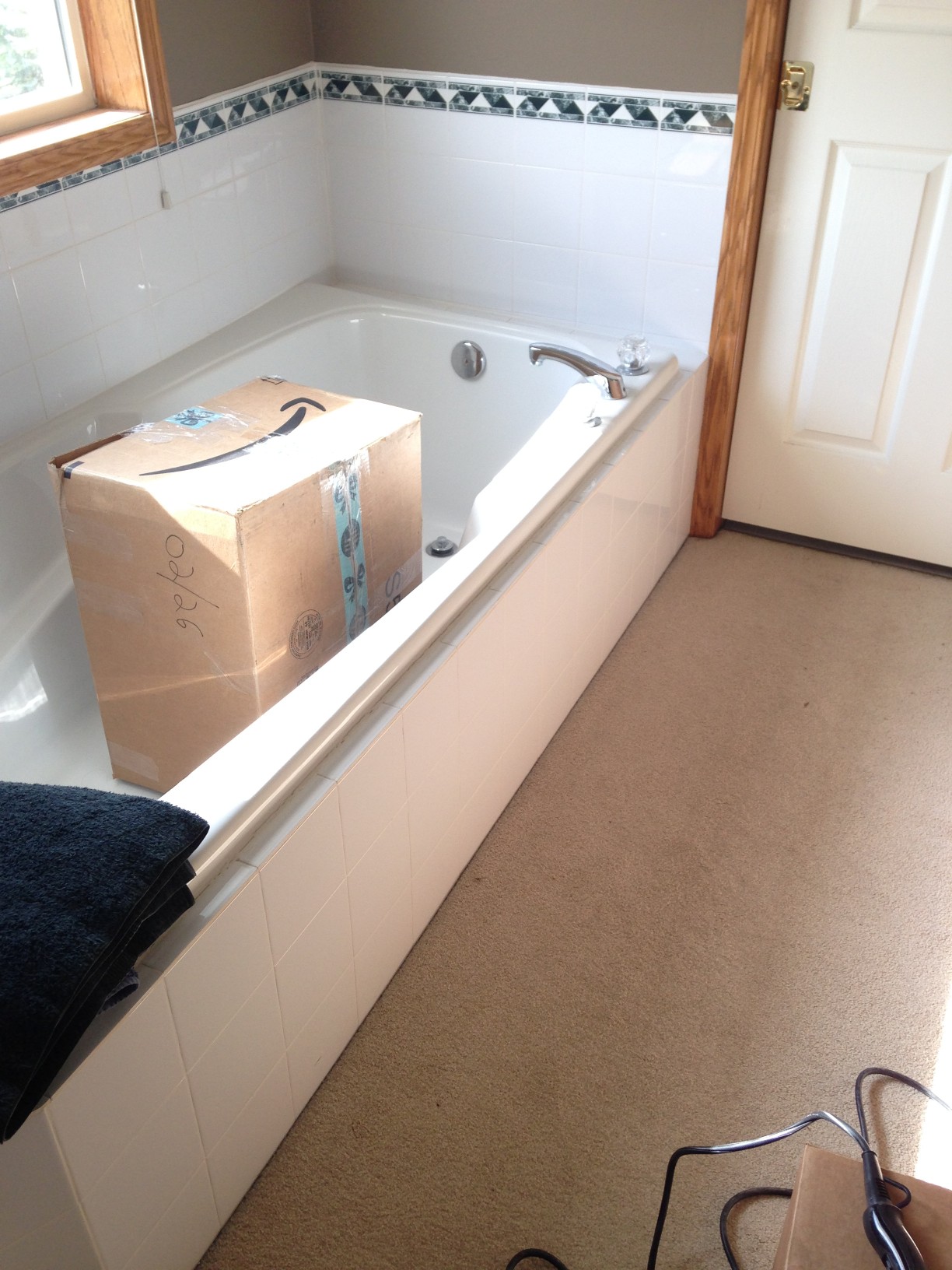
Wall-to-wall carpet was laid in bathrooms, cut around the toilet base, and sold on warmth underfoot and on continuity with the carpet in the hall.
Tile, vinyl and sealed stone, with at most a washable mat. Bathroom carpet was a mainstream choice offered by builders and chosen by homeowners, not an eccentricity.
The problem with it was understood almost immediately and ignored for a decade. Carpet in a room that is repeatedly wetted holds moisture against the subfloor, cannot be properly dried, and the fitted cut around a toilet is precisely the part that cannot be lifted and cleaned – and most of it was gone by the end of the 1980s.
7. A Living Room Nobody Was Allowed to Sit In
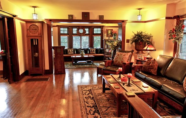
The house had two sitting rooms: a family room where everybody actually was, and a formal living room at the front with the better furniture, kept clean and unused except for visitors.
Open-plan living in which the good room and the used room are the same room. The formal living room was a substantial fraction of the house’s floor area held in reserve.
Children remember this more clearly than adults do, because it was enforced. The room had a carpet with no footprints in it, furniture at precise angles, and an atmosphere of being out of bounds – and a house where a quarter of the ground floor was off limits made sense only in a world where visitors were expected to be impressed.
8. Plastic Covers Over the Good Furniture
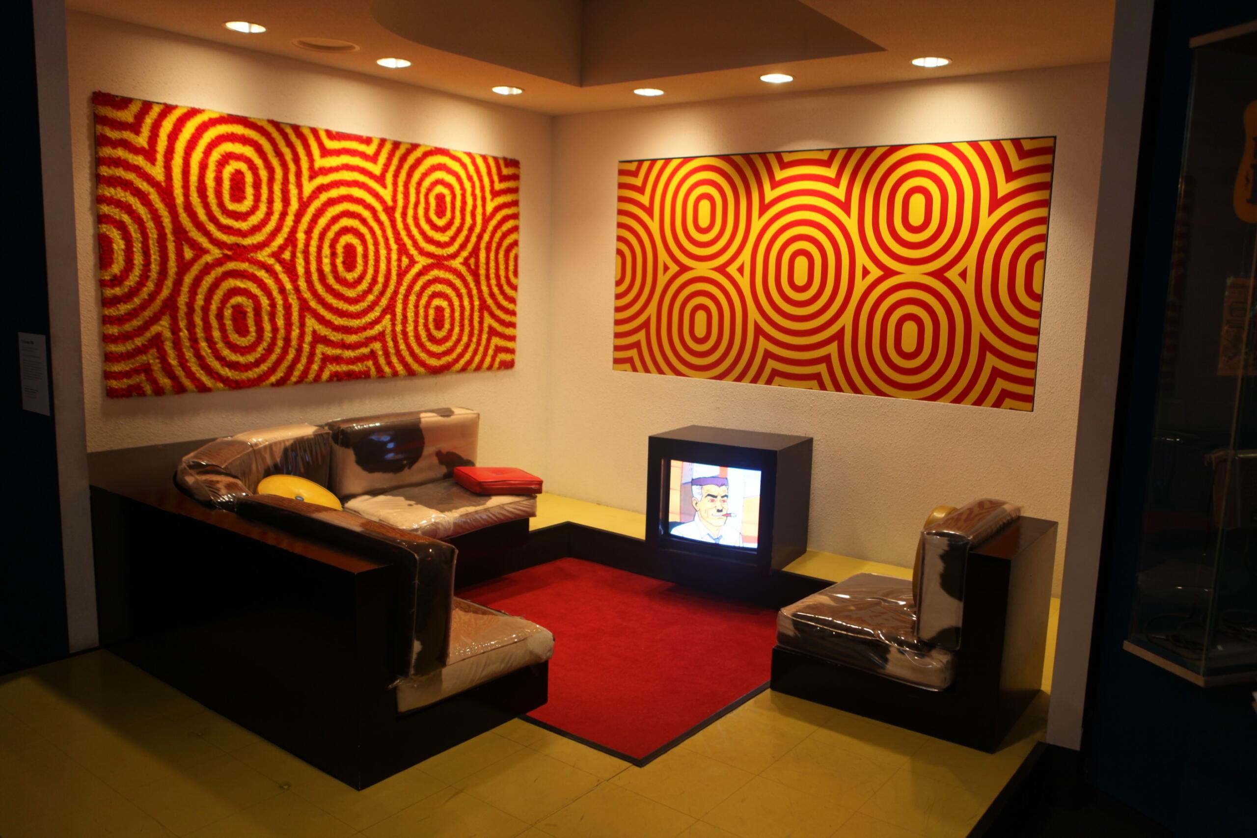
Sofas and armchairs in the formal room were fitted with clear vinyl slipcovers, either loose or custom-made, left on permanently to protect the upholstery underneath.
Washable covers, stain-resistant fabric and the general acceptance that furniture will wear out. The vinyl cover was a rational response to furniture being a major purchase.
It is easy to mock and the logic was sound. A three-piece suite was a significant expense expected to last twenty years, upholstery could not be cleaned at home, and children and pets were the enemy. The vinyl worked – the fabric beneath it is frequently still immaculate – at the cost of making the furniture unpleasant to sit on, which nobody did anyway.
9. A Living Room With the Floor Missing
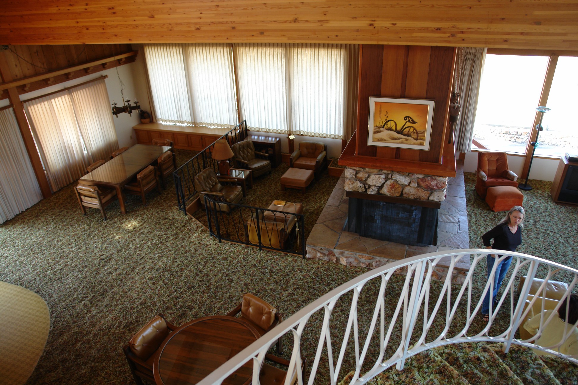
The conversation pit – a seating area set a step or two below the surrounding floor, often with built-in upholstered benches running round the perimeter – was a sought-after architectural feature.
Level floors throughout, which is now a requirement in much new construction and an expectation in the rest. The pit was a genuine design idea with a serious practical flaw.
Its flaw was that it was a step in the middle of a room, in the dark, at a party. They are hazardous to anybody unsteady, impossible for anybody using a wheelchair or a walker, a problem for small children, and a liability that modern design and accessibility standards simply rule out – which is why the surviving ones are mostly filled in.
10. A Wall of Mirror Tiles Held On With Adhesive Squares
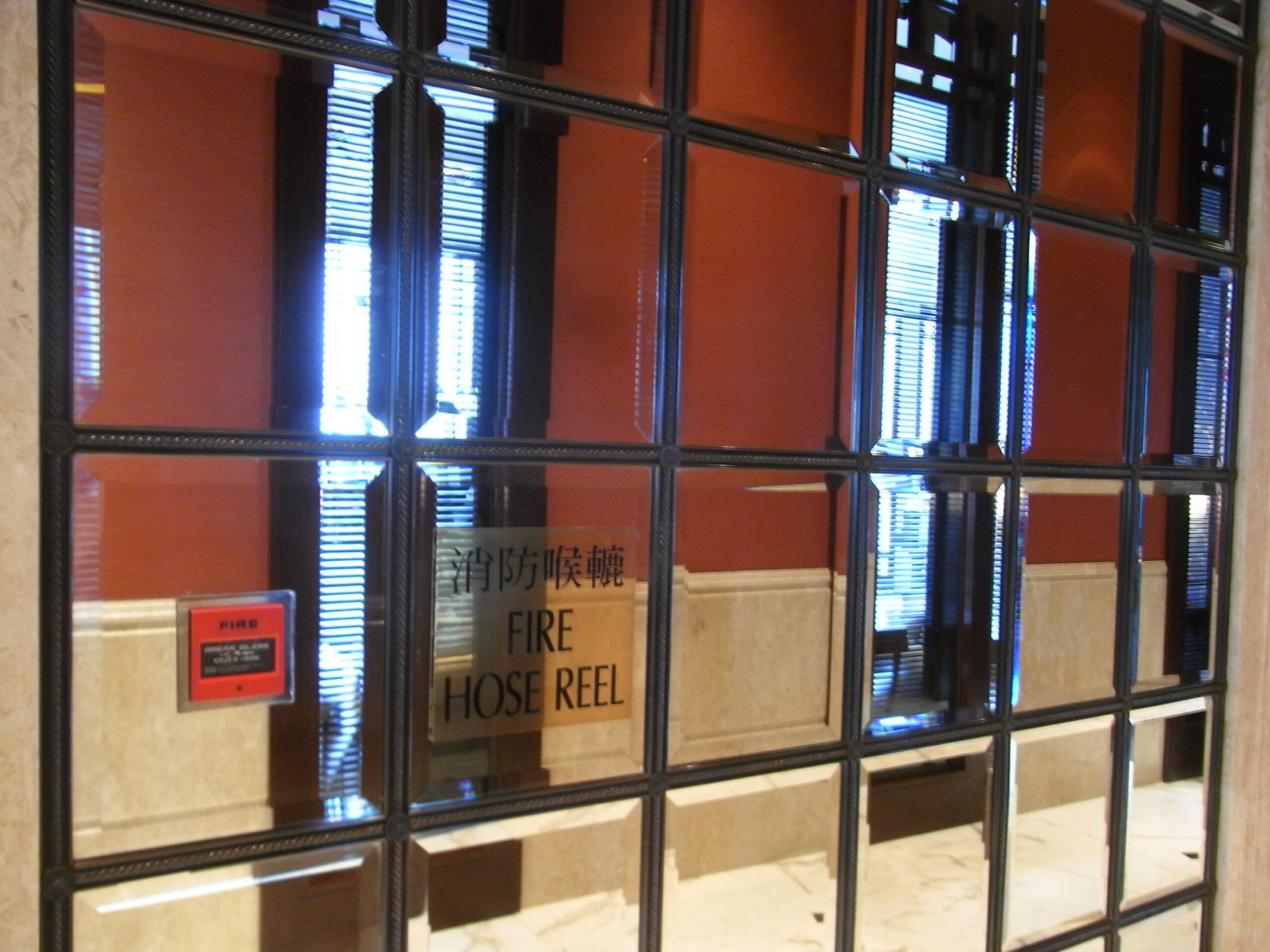
Twelve-inch mirror tiles, sometimes smoked, bevelled or veined with gold, were stuck to a feature wall with adhesive pads to make the room feel larger.
Single large mirrors used sparingly, properly mounted. The tiles were sold as a self-fit product and the grid of seams between them was accepted as part of the look.
They almost never sat flat, which is the part people forget. Walls are not true, the pads were thicker in some places than others, and the result was a wall of slightly misaligned mirrors each reflecting at a marginally different angle – so the enlarged room it produced was subtly, permanently broken up.
11. Wallpaper With a Raised Velvet Pattern You Could Feel
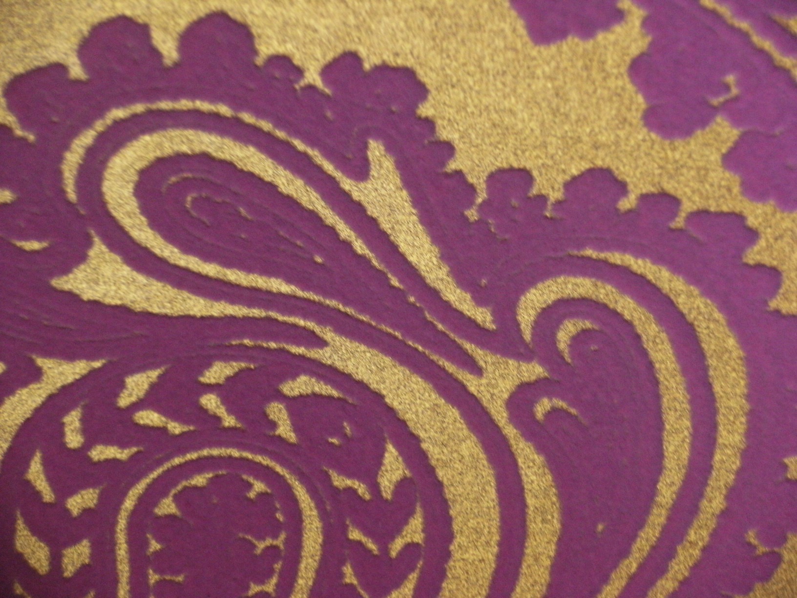
Flocked wallpaper carried a pattern in short fibres applied to the surface, giving a raised velvet texture, usually in a large damask or floral print in strong colours.
Paint, with wallpaper used in single rooms and mostly in flat prints. Flock was expensive, it was meant to look expensive, and it went into dining rooms, halls and the formal living room.
Its defining property was that it collected everything. The raised fibres trapped dust, cooking grease and smoke, could not be wiped because wiping crushed the pile, and darkened unevenly over a decade – so by 1980 a great deal of it looked considerably worse than the plain paper it had been chosen over.
12. A Bar Built Into the Family Room
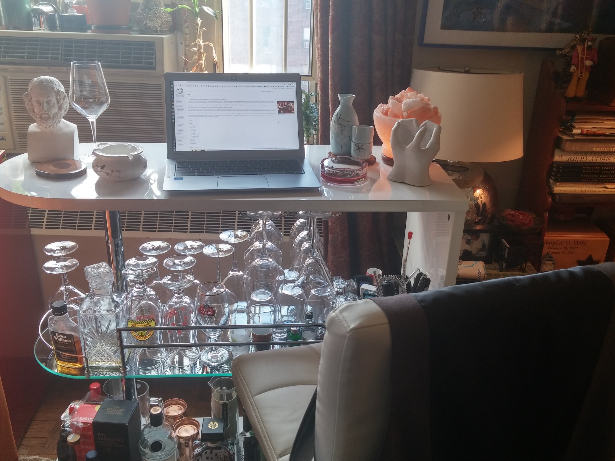
Houses were built and remodelled with a permanent bar – a counter with a padded leather-look front, stools, a sink in the better versions, glass shelving and a mirror behind.
Kitchen islands with seating, and entertaining that happens in the kitchen. The home bar was a dedicated room feature for a specific kind of adult socialising.
It tells you something true about how these houses were meant to work. Guests were received in rooms built for receiving them, away from the kitchen and away from the children, and the bar was the centre of that arrangement – which is precisely the division of the house that open-plan design was invented to destroy.
13. An Intercom Panel in the Hallway Wall
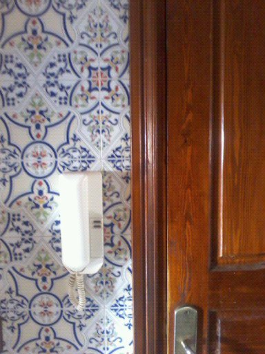
Houses were wired with a room-to-room intercom: a master panel with a radio built in, and speaker stations in bedrooms, the kitchen and by the front door, so you could talk between floors or pipe music through the house.
Mobile phones, smart speakers and simply shouting. The wired intercom was marketed as a sign of a modern house and was installed in a great many of them.
What it was actually used for was narrower than the brochure suggested. It called children for dinner, it answered the front door, and it played the radio in the kitchen – and the bedroom stations were mostly used by children to listen to whatever the master panel was picking up downstairs, which parents worked out eventually.
14. A Breakfast Nook With Benches You Could Not Get Out Of
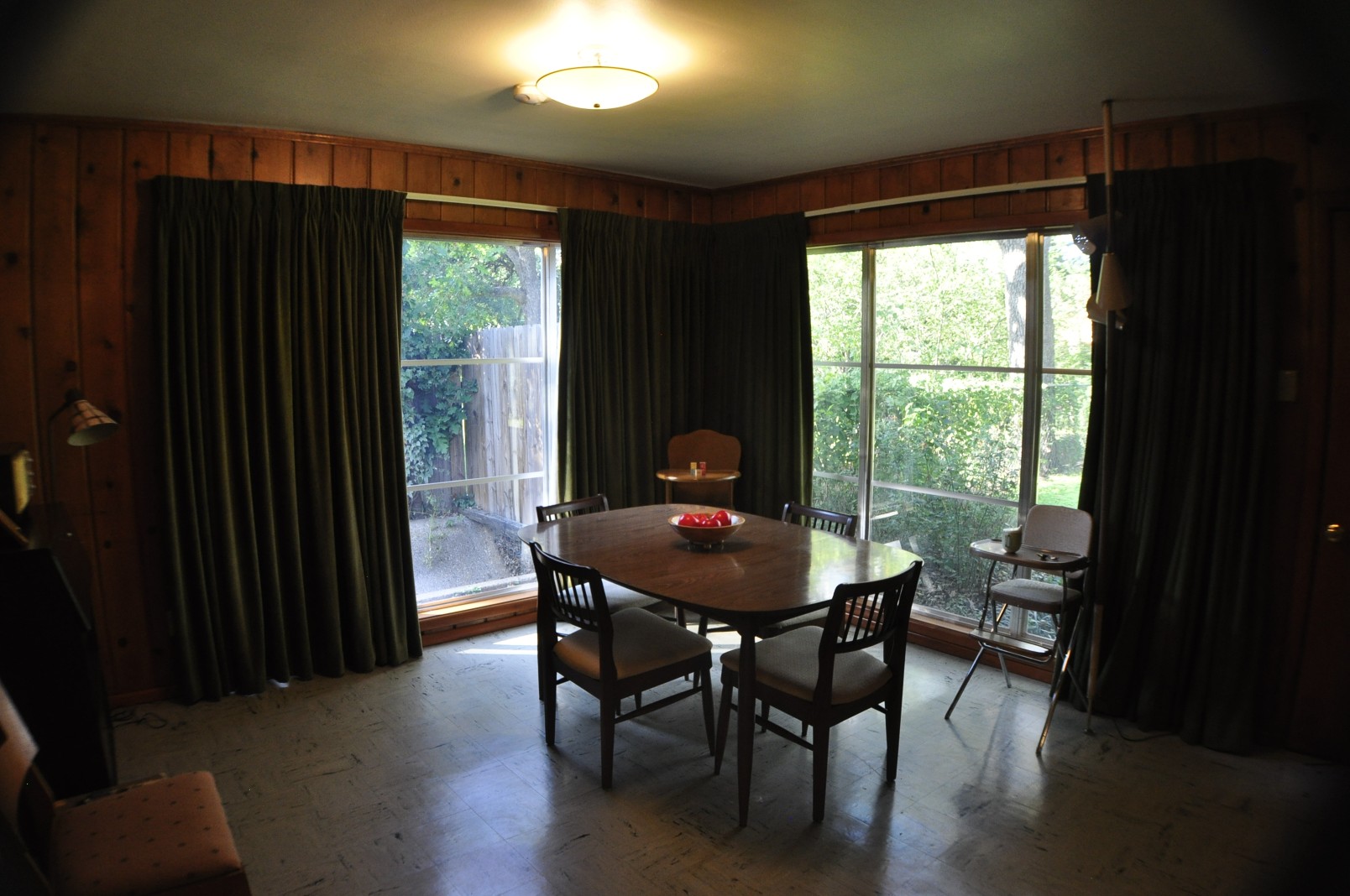
Kitchens were built with a built-in corner booth – fixed upholstered benches on two sides of a table, like a diner – as a space-saving alternative to chairs.
Loose chairs and an island with stools. The booth saved floor space and was cheaper than buying a dinette set, which is why builders liked it.
Everybody who grew up with one remembers the same problem. Whoever sat innermost was trapped until everybody on that side got out, the benches could not be moved to clean behind them, and the upholstery was fixed in place and could not be replaced – so the nook aged with the kitchen whether anybody wanted it to or not.
15. Everything in the Room Matched, Including the Things That Should Not
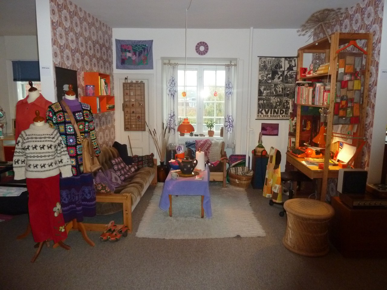
Coordination was the governing principle: the wallpaper, the curtains, the bedspread, the lampshades, the upholstery and sometimes the towels and the telephone were bought in one scheme.
Deliberate mixing, with pattern used as an accent against neutral ground. The matched scheme was sold as a package by retailers and was what a finished room was supposed to look like.
Which is the actual reason these interiors read as overwhelming now rather than merely dated. It is not that the colours were strong; it is that there was no plain surface anywhere for the eye to rest on – the walls, the floor, the windows and the furniture were all doing something at once, on purpose, because restraint read as unfinished.
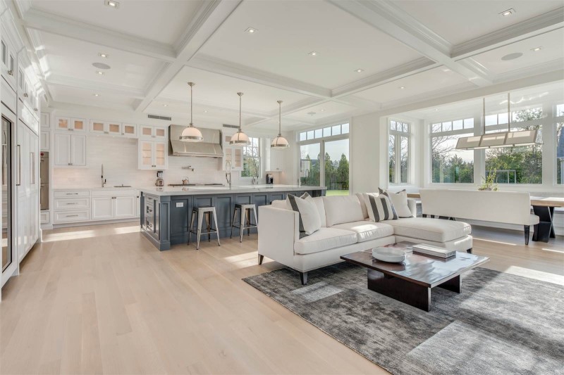
16. Then Open Plan Arrived and Everything Had to Be Beige
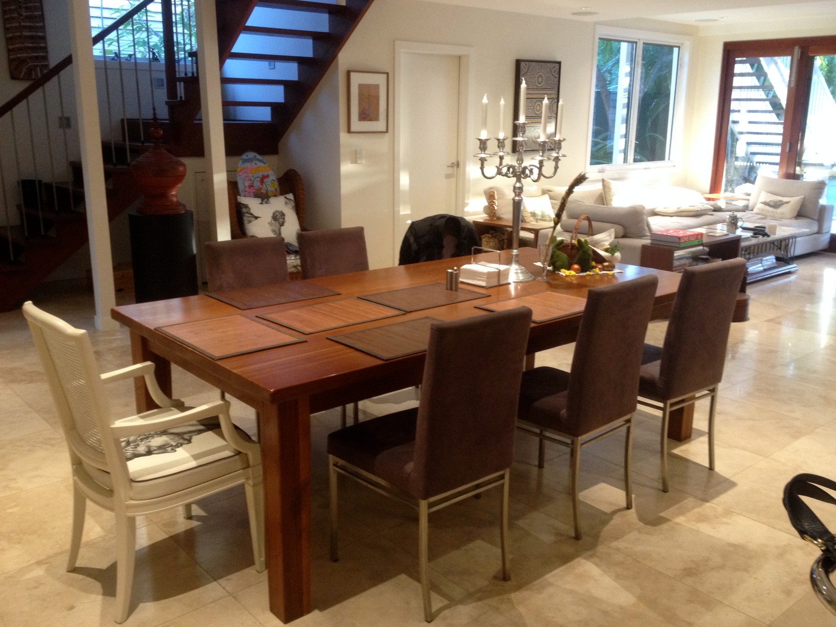
All of it rested on rooms with separate jobs, surfaces that hid poor workmanship, materials that were cheap and fast, and an assumption that a house was decorated to be seen by visitors.
Open-plan layouts that removed the walls these finishes were applied to, smooth painted surfaces that require good workmanship and show it, and a property market in which houses are styled for resale rather than for the people living in them.
The resale point is the one that actually did it, and it is worth separating from taste. Once a house was understood primarily as an asset to be sold, every strong decision became a liability, because a buyer has to be able to imagine themselves in it. Panelling, coloured fixtures, flock, mirror tiles and a pit in the floor are all decisions somebody else made, visibly, and all of them cost money to undo. So the finishes converged on neutral – not because anybody preferred beige, but because beige is what you choose when the room is not really for you.
Beige Is Not a Taste. It Is a Resale Strategy
The standard explanation for all of this is that taste improved, and that explanation is almost entirely wrong.
Taste did change, obviously. But taste changes constantly and in both directions, and it does not explain why interiors moved, over about twenty years, from maximum decision-making to minimum decision-making and then stayed there for the next thirty.
Three things actually did it, and only one of them is about looks.
The first is construction. These finishes existed largely to hide work. Panelling covered cracked plaster. Sprayed texture covered imperfect drywall taping. Pattern covered everything. When drywall finishing improved and became standard, a smooth painted wall became achievable – and a smooth painted wall is both cheaper and a demonstration that the work underneath is good. The finishes that hid bad workmanship became a signal of it.
The second is the removal of the walls. Panelling, flock, mirror tiles and coordinated schemes are treatments for a room with four sides and a door. Open-plan layouts took out the walls those treatments were applied to, and a continuous surface running from a kitchen through a dining area into a living space cannot carry a different scheme in each part. One finish has to work everywhere, which means it has to be quiet.
The third is the one that settled it. A house stopped being understood as somewhere you live and became an asset you will sell.
Once that is the frame, every strong decision is a cost. A buyer walking through a house has to be able to picture themselves in it, and they cannot do that in somebody else’s conversation pit, somebody else’s pink bathroom, somebody else’s velvet wallpaper. Each of those is a visible decision made by a stranger, and each carries an estimate of what it would take to undo.
So the finishes converged on neutral. Not because anybody prefers greige walls and grey plank flooring, but because neutral is what you choose when the room is not really for you – when it has to be acceptable to an unknown person at an unknown future date.
Which is the honest difference between 1974 and now, and it does not flatter the present.
Those houses were decorated by the people living in them, for themselves, with conviction, in colours they picked on purpose. The results were frequently terrible. They were also, unmistakably, somebody’s. Nobody rakes a carpet into lines for a buyer.
If you grew up in this, there was a room in your house you were not allowed to sit in.
And you can still name the colour of the bathtub.
Like our content? Follow us for more.
