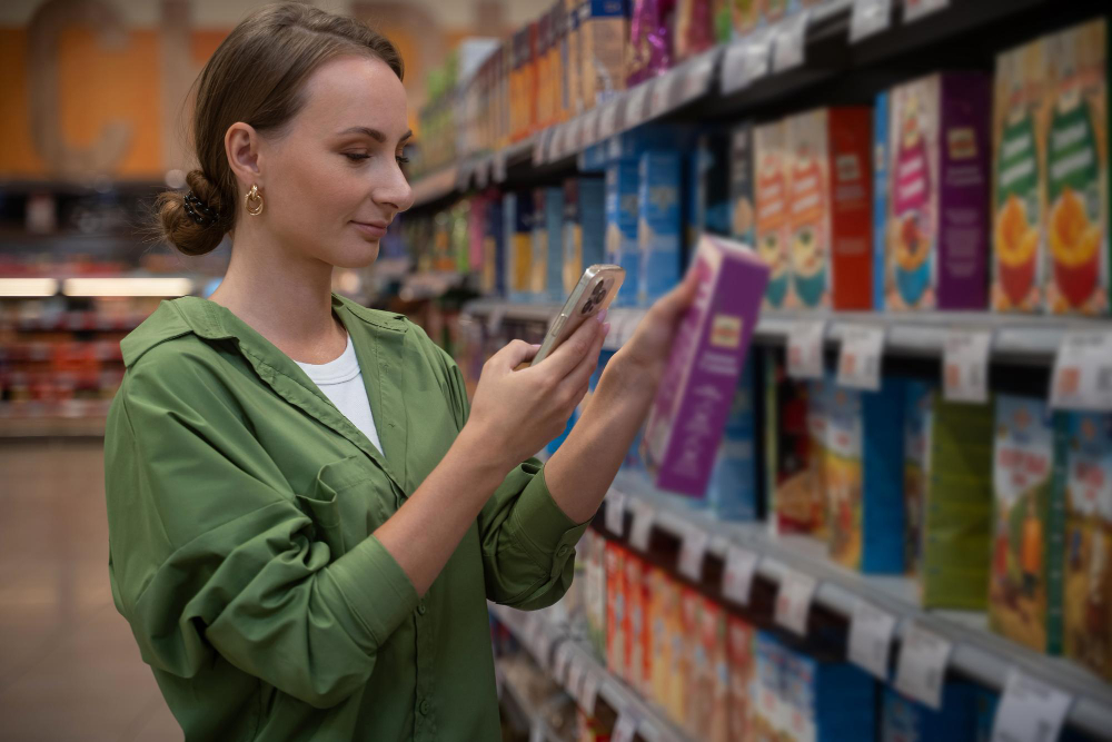
The cereal aisle is the most carefully arranged few metres in a supermarket, and the arrangement is not about you.
Children’s cereals sit low, roughly at the eye level of a child standing beside a trolley or sitting in the seat of one. The adult brands – the bran, the oats, the ones with a picture of a field on them – sit higher, at the eye level of the person holding the purse. This is not an accident of packaging size, and the people who design it do not pretend otherwise.
Shelf Height Is Sold, Not Chosen

The first thing to understand is that the position of a product on a shelf is a commercial transaction rather than a shopkeeper’s judgement.
In most large grocery chains, the arrangement of a category is governed by a planogram – a diagram specifying exactly which product occupies which position, how many facings it gets, and at what height. Those positions are negotiated. Manufacturers pay for them, directly through slotting and placement fees or indirectly through promotional allowances and volume agreements, and the best positions cost the most.
The best position, by a wide margin, is eye level. The trade phrase for it is old and blunt: eye level is buy level. Products placed at adult eye level consistently outsell the same products placed at the bottom shelf, and the difference is large enough that the entire negotiation exists because of it.
Which raises an obvious question. If eye level is the premium position, why are children’s cereals – some of the most heavily marketed products in the shop – down near the floor?
Like our content? Follow us for more.
Because There Are Two Eye Levels
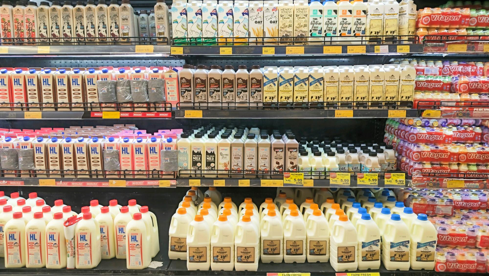
The answer is that the aisle has two customers, and only one of them is paying.
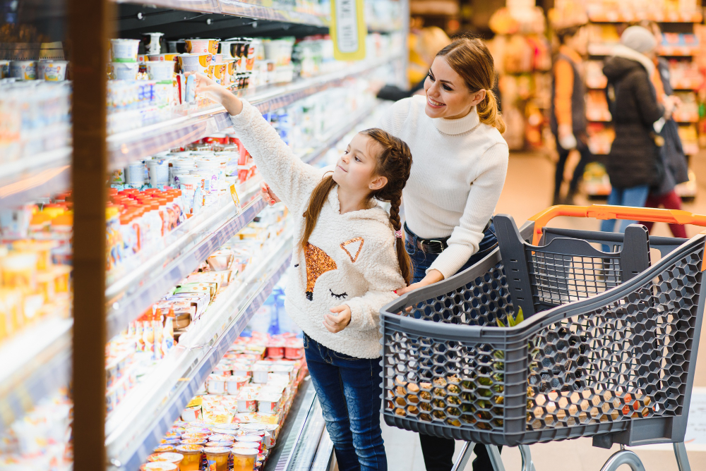
A child of four or five standing in the cereal aisle has an eye level somewhere around three feet, and a child in the seat of a trolley is at a similar height. Research examining supermarket shelves has repeatedly found that cereals marketed to children sit substantially lower than those marketed to adults, in the band where a child looking straight ahead meets the box directly.
The purchase decision in that aisle frequently does not belong to the adult. It belongs to the child, exercised through persistence, and the industry has a term for that too – the nag factor, or pester power, depending on which side of the Atlantic the research was written on. A product that is chosen by a child and paid for by an adult does not need to be at the adult’s eye level. It needs to be where the child will see it, recognise the character, and ask.
So the premium position for those brands is not the premium position for everything else, and the shelf is arranged around that split. The cereals aimed at adults are above, where an adult scanning the aisle meets them.
The Detail About the Eyes
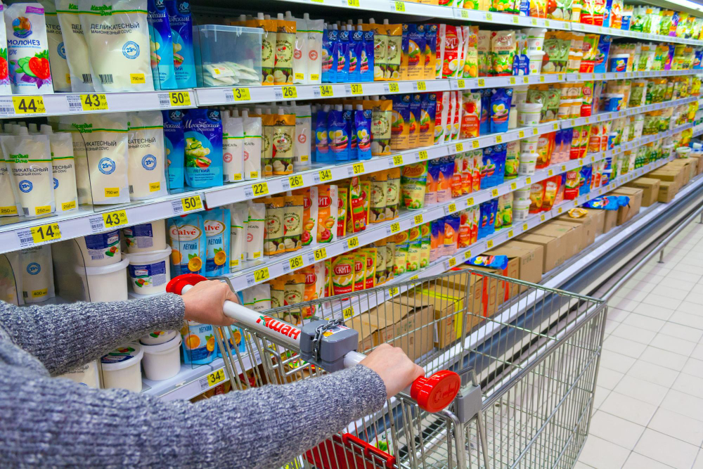
The finding that made this subject travel beyond trade journals concerns where the characters are looking.
Researchers analysing cereal packaging found that the cartoon characters on boxes aimed at children are typically drawn with their gaze directed slightly downward, while characters or figures on adult cereals look straight ahead or up. Combined with the shelf heights – children’s boxes low, adult boxes high – the effect is that in both cases the figure on the box is looking into the face of its intended customer.
The same work found that shoppers reported greater trust in a brand and a greater likelihood of buying when the character on the box appeared to make eye contact with them. Eye contact is one of the most reliable triggers in human social processing, which is presumably why it has been engineered into breakfast.
Two cautions are worth attaching. This comes from a small number of studies rather than a large literature, and the effect sizes in that kind of research are usually modest. And it does not require anybody to have sat in a meeting and specified a downward gaze angle – designers draw a character looking at the viewer, and if the viewer is a child standing below the box, the gaze goes down. The outcome is real whether or not the intent was explicit.
Everything Else in the Box Is Aimed Downward Too
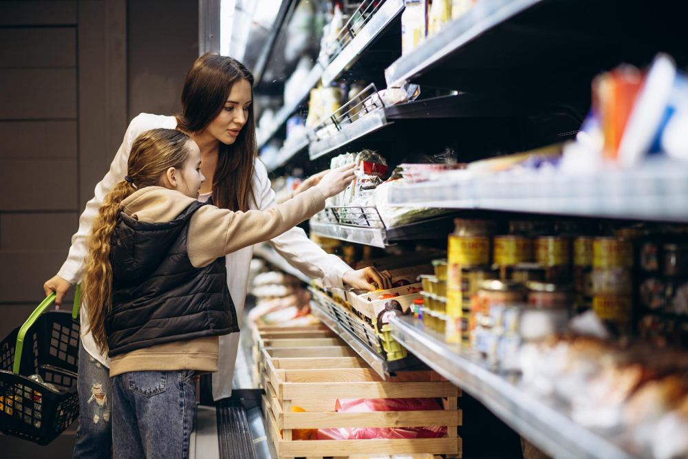
Once you notice the height, the rest of the design logic becomes legible.
The colours on children’s cereals are more saturated and higher in contrast than almost anything else in the shop, because that is what reads at a distance to an undeveloped visual system and what stands out against the beige of the adult boxes above.
The character is the primary element and the product name is secondary, because a pre-literate child recognises a face long before they can read a brand. This is why the characters are decades old and barely change – the recognition is the asset, and a redesign resets it.
The front of the box is a game, a puzzle, a maze or a cut-out, placed where a child can read it while sitting at a breakfast table with nothing else to look at. The back is more of the same. The box is designed to be read at breakfast, every morning, for the life of the box.
And the free item inside – historically a toy, now more often a code for something online – exists to convert a one-off purchase into a request for the same brand next week.
The Box Was a Marketing Object Before It Was a Container
Cereal packaging has been doing this longer than almost any other category, and the techniques were worked out early.
Breakfast cereal was a nineteenth-century health product that became, within a few decades, a children’s confection sold on personality. The box-top premium – cut out the coupon, post it with a coin, receive a ring or a badge or a decoder – was running on a national scale by the 1930s, and it accomplished two things at once. It converted a purchase into a transaction with the brand directly, and it required the child to finish the box and ask for another.
The in-pack toy followed, removing the postal delay. The character followed that, giving the brand a face a child could recognise before they could read. The cartoon tie-in followed that, so the face on the box was also the face on the television on a Saturday morning.
Each step shortened the distance between the advertisement and the shelf. By the time self-service supermarkets replaced counter service – the change that put the customer physically in front of the stock for the first time – the industry had several decades of practice at talking directly to children, and it simply continued doing it at a new height.
The Rest of the Shop Is Arranged the Same Way
Once the principle is clear, the layout of the whole building reads differently.
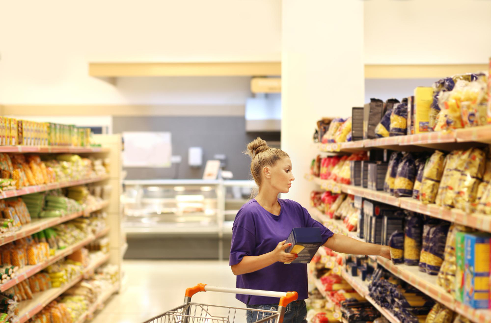
Milk, eggs and bread are usually as far from the entrance as the building allows, because they are what most people came for and the walk to reach them passes everything else. The route is not an accident of refrigeration plumbing, whatever shops sometimes say – the plumbing follows the layout decision.
Fresh produce and flowers are at the entrance because they look and smell like abundance and set the tone for everything that follows, and because a trolley that starts with vegetables in it is understood by the person pushing it as a virtuous trolley.
The end of an aisle is the most valuable display space in the shop after eye level, and those positions are bought.
The confectionery at the till is the same mechanism as the cereal aisle, aimed at the same customer, at the same height, at the moment when the adult is occupied with payment and least able to say no. Several retailers have voluntarily cleared those displays, and in some places it is required for certain products – which is a straightforward admission of what the position was doing.
What Has Actually Changed
This has been the subject of sustained public argument for decades, and the results are genuinely mixed.
Advertising directed at children has been restricted in various jurisdictions, with rules on what may be advertised during children’s programming, and the industry has operated self-regulatory pledges on the nutritional profile of products it markets to children. Several countries have gone considerably further: some have restricted the use of cartoon characters on packaging for products exceeding thresholds for sugar, salt or fat, and some require front-of-pack warning labels.
Where those rules apply, the effect on the aisle is visible – characters disappear from certain boxes, and the boxes themselves get plainer.
Where they do not, the economics are unchanged. Sugar content in children’s cereals has fallen somewhat under pressure, and the placement logic has not moved at all, because placement itself is essentially unregulated. A supermarket is free to put whatever it likes at whatever height it likes.
So the most effective intervention remains an unglamorous one, and anybody who has shopped with a small child already knows it: the trolley does not have to go down that aisle. The arrangement only works on a child who is in front of it.
Like our content? Follow us for more.