

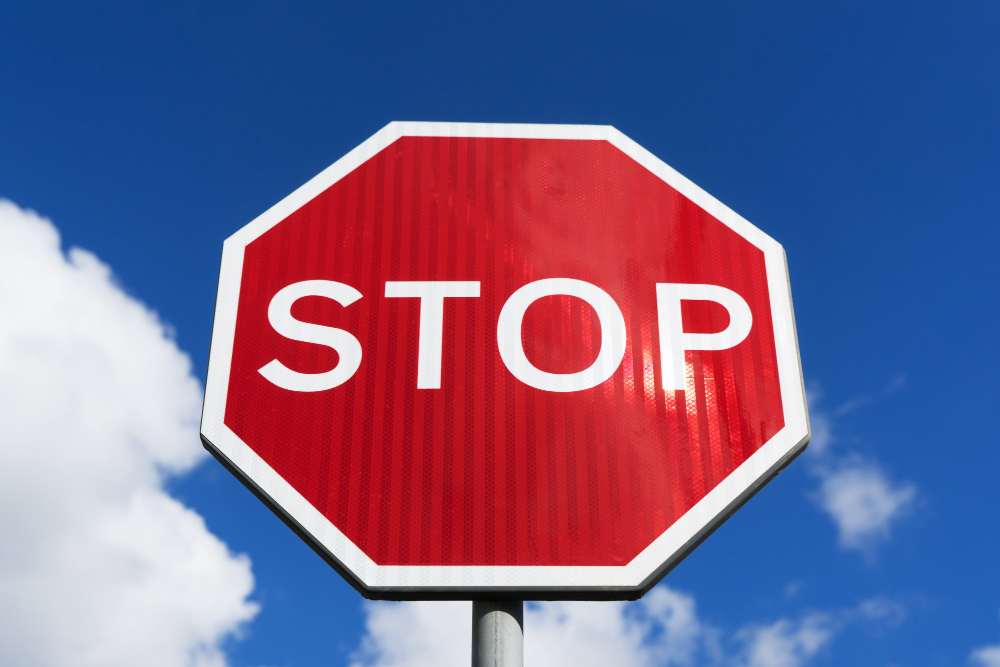
The stop sign is the only octagonal object most people encounter in a normal day. It is a strange shape to manufacture, it wastes material compared to a square, and it is harder to cut, stack and ship.
It is that shape because in 1923 a committee of state highway engineers sat down to solve a problem that had nothing to do with aesthetics, and arrived at an answer that is still working a century later in almost every country on earth.
The Problem Was That Signs Did Not Agree With Each Other
By the early 1920s the number of motor vehicles had grown faster than anybody’s ability to regulate them, and road signs were being put up by whoever felt like putting one up. Counties made their own. Local motoring clubs made their own. Individual landowners made their own. A sign meaning stop in one state might be a square of white board with black lettering, and fifty miles away it might be a yellow diamond.
A driver crossing a state line entered a different visual language. There was no shared vocabulary, no shared colour code, and no way at all to know what a sign meant if you could not read the words on it – at night, in rain, in fog, or at a speed that gave you less than a second to look.
In 1923 the Mississippi Valley Association of State Highway Departments took this on. The group covered a cluster of midwestern states and had no authority to compel anybody, but it had the engineers who actually installed signs, and its recommendations were adopted rapidly and then nationally.
Like our content? Follow us for more.
The Idea Was to Make the Shape Carry the Meaning

The committee’s insight was that a driver who cannot read a sign should still be able to tell how worried to be. So they built a hierarchy out of geometry, with one rule: the more sides a shape has, the more dangerous the situation it marks.
At the bottom sat the rectangle and the square, which carried information – route numbers, distances, place names. Nothing to react to.
Above that came the diamond, a square rotated through forty-five degrees, for warnings. Something ahead requires attention but not necessarily a stop.
Above that came the octagon, for stop. Eight sides, the second-highest count in the system, for the one instruction a driver must obey absolutely.
And at the top, the circle – which the committee treated as having infinite sides – was reserved for the single most dangerous thing on the road network: the railroad crossing. A collision between a car and a train is not a survivable accident, and the circle marked it.
The logic is elegant and it is almost entirely forgotten. Most drivers have never been told that the round railroad crossing sign outranks the stop sign, and that the ranking is by sides.
The Stop Sign Was Yellow for Thirty Years
Here is the part that reliably surprises people. The stop sign was not red. It was yellow with black lettering, and it stayed that way from the mid-1920s until 1954.
The reason was pigment. Red was always the obvious colour for stop – it had been the colour of danger in railway signalling since the nineteenth century, and the association was already fixed in the public mind. But there was no red paint or enamel available in the 1920s that would survive outdoor exposure without fading. A red sign went pink within a couple of seasons and then went pale, which is worse than useless, because a faded sign still looks like a sign and no longer reads as urgent.
Yellow pigments held their colour. So the engineers used the colour that worked rather than the colour that meant the right thing, and accepted the compromise for three decades.
What changed was materials science. Fade-resistant enamels improved through the 1940s, and reflective sheeting – a surface covered in microscopic glass beads that returns headlight light straight back towards its source – became commercially practical in the same period. In 1954 the national manual governing traffic control devices specified the red octagon with white lettering, and the yellow signs came down over the following years as they wore out.
Why the Shape Still Earns Its Keep

A shape-coded sign does three things that a word-coded sign cannot.
It can be read from behind. A driver approaching a junction can see the back of the sign facing the cross traffic and know, without reading anything, that the other road has to stop and they do not. In some jurisdictions the backs are even painted to make this easier. No amount of lettering achieves that.
It survives partial obstruction. Snow sticking to the face, a branch across half of it, mud thrown up from the road, graffiti – the outline is still an octagon, and the outline is the message.
And it works on people who cannot read the word. Children, drivers who do not speak the local language, and anybody whose eyesight is doing badly in low light all get the instruction from the silhouette. This is precisely what the 1923 committee was designing for, and it is the reason that when the shape was put to the test internationally it won.
How the Octagon Went Worldwide, and Who Said No
The 1968 Vienna Convention on Road Signs and Signals is the agreement that harmonised road signage across much of the world, and it adopted the octagon for stop. Delegates could have chosen anything. They chose the shape that had already been in service for forty-five years and had demonstrated that it was legible under the worst conditions anybody could arrange.
The result is that the octagonal stop sign is now one of a very small number of designed objects that mean the same thing almost everywhere. The word on it changes – stop, arret, alto, halt – and in a number of countries the English word is used regardless of the local language, precisely because the shape has made it universal.
Japan is the well-known exception. Japanese stop signs are inverted triangles, red with white lettering, and the country has retained the shape through successive revisions. A few other jurisdictions have local variants. But the octagon’s coverage is close to total, which is a remarkable outcome for a committee recommendation with no legal force issued by a regional highway association in the American Midwest.
The Sign Itself Is Specified Down to the Inch
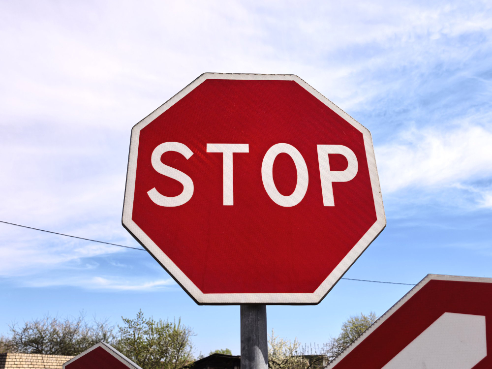
Nothing about a stop sign is left to the person installing it. The standard face is thirty inches across the flats, rising to thirty-six inches on multi-lane and higher-speed roads, with larger sizes specified for expressway use. The white border is a defined width. The letters are a defined height in a defined typeface, originally a condensed sans serif developed specifically for highway legibility.
The mounting height is specified from the bottom of the sign to the road edge, and the lateral offset from the kerb is specified too, because a sign set too far back is read late and a sign set too close is struck by mirrors and wing panels. The face is angled very slightly away from perpendicular to stop it mirroring headlights straight back into the driver’s eyes as a white sheet.
All of that exists because the sign has one job and gets well under a second to do it. The engineers who wrote those numbers were working from measured reaction times, stopping distances and the limits of human night vision, and the octagon is the only part of the specification that a member of the public could describe from memory.
It Is Now the Only Shape That Means Stop Without Words
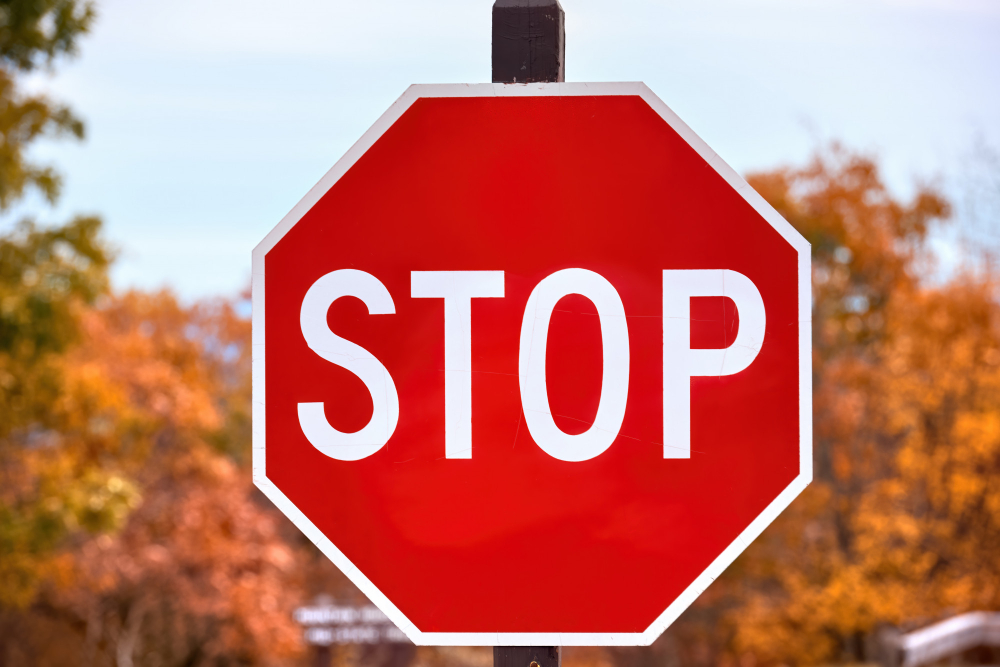
The shape has outgrown the road. An octagon with nothing written on it is understood, more or less globally, as an instruction to halt, and it is used that way in places that have nothing to do with driving – on factory floors, on machinery guards, in software warning dialogues, on construction hoardings, in children’s books, as an emoji.
That is an unusual achievement for a piece of industrial design. There are very few shapes that carry a verb. A triangle means caution only in context; a circle means almost anything depending on what is inside it. The octagon means stop on its own, and it means it to people who have never driven.
The road sign earned that by being the same shape in the same colour at the same junction, hundreds of times a week, for the whole of everybody’s life. Which was the plan, more or less, except that the 1923 committee was only trying to get the states to agree with each other.
The Rest of the Hierarchy Quietly Collapsed
The stop sign kept its shape. The system it belonged to mostly did not.
The circle survived for railroad crossings but is now frequently accompanied by, or replaced with, the crossbuck and active signals, and in much of the world the circle means a regulatory instruction rather than a mortal hazard – speed limits, prohibitions, mandatory directions. The infinite-sided top of the ranking became, internationally, the ordinary round sign you see twenty times a day.
The diamond held on for warnings in North America. Most of the rest of the world warns with a triangle, which under the 1923 logic would rank below a square, and which therefore inverts the original hierarchy entirely.
The pentagon was assigned to school zones and is still used, though hardly anybody could tell you it is a pentagon or what the five sides are meant to signify.
So the one piece of the scheme that everybody still obeys daily is also the only piece most people have no idea was ever part of a scheme. The next time you stop at one, the eight sides are telling you something the engineers who specified them assumed you would never need to be told: this is serious, and it is one rank below a train.
Like our content? Follow us for more.
