The useful habit is to read a map as an argument rather than as a photograph. Somebody decided all of this, and knowing what they decided tells you what the map is for. Here are sixteen.
1. Something Has to Be Wrong

A curved surface cannot be flattened without distortion, so every flat map misrepresents shape, area, distance or direction – and the only question is which.
There is no undistorted option. Unavoidable distortion is the constraint every other decision follows from.
Like our content? Follow us for more.
2. Which Property Was Protected

A projection preserving angles cannot preserve area, and one preserving area cannot preserve shape, so the maker chose which property mattered for the purpose.
Navigation and comparison want different things. The preserved property is the decision that determines what the map is good for.
3. And Which Was Sacrificed
Whatever was not protected is wrong, sometimes dramatically, and the errors are largest furthest from wherever the projection was optimised.
The distortion is systematic rather than random. The sacrificed property is the information the map is actively misrepresenting.
4. Where the Middle Is

Every world map has a centre, no centre is geometrically privileged, and the choice determines what is at the edge and what gets split in half.
Different traditions centre differently and always have. The chosen centre is the decision that looks like nature and is not.
5. What Was Too Small to Include

Scale forces omission, so a mapmaker decides what disappears – which settlements, which roads, which streams – and those decisions are systematic rather than casual.
A map showing everything at true scale would be the size of the thing. Generalisation is the necessary editing that determines what exists on the map.
6. Which Things Were Made Bigger

Roads on a road map are drawn many times wider than true scale, because a road at true width would be invisible, so the feature people most want is deliberately exaggerated.
The same applies to rivers, tracks and boundaries. Deliberate exaggeration is the distortion introduced to make the map usable.
7. What the Symbols Mean

Everything represented by a symbol is a convention agreed by the maker, which is why a map needs a key and why symbols differ between countries and eras.
Nothing about a symbol is self-evident. The symbol set is the vocabulary you have to be taught.
8. How the Ground Shape Was Encoded
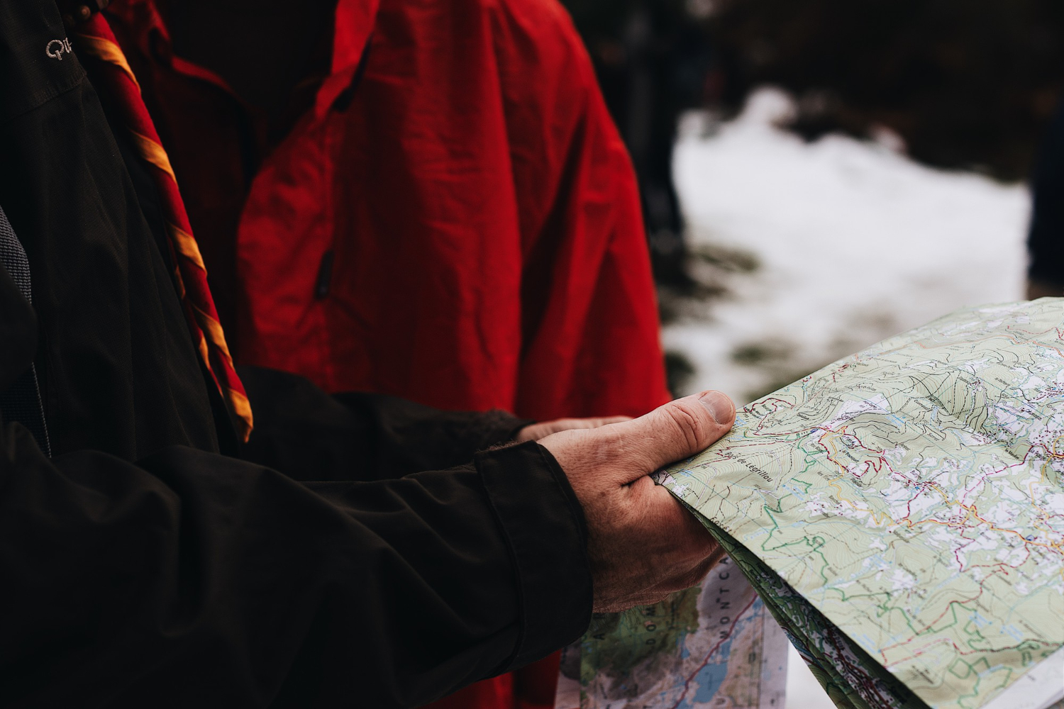
Contour lines connect points of equal elevation, so their spacing represents steepness, and reading terrain from them is a skill rather than an observation.
Close together means steep and far apart means gentle. Contour spacing is the code that puts a third dimension on a flat sheet.
9. Which Name Was Used

Places frequently have more than one name, and printing one is a decision about which and whose – a choice made by the mapmaker on grounds that are not cartographic.
Different maps of the same ground disagree. Name selection is the decision that carries the most weight outside geography.
10. When It Was True

A map records a survey at a moment, and begins going out of date immediately as roads change, buildings appear and coastlines move.
The date matters as much as the coverage. The survey date is the information most users never check.
11. What the Blank Areas Meant
Unmapped regions on historic maps indicated absence of surveyed information rather than absence of anything, and the land concerned was generally well known to the people living there.
Blank meant unrecorded by that mapmaker. Empty space is the convention most commonly misread.
12. Whether Geography Was Abandoned Entirely

Transit diagrams deliberately discard true distance, direction and position, preserving only connection order – because a passenger needs to know sequence rather than geometry.
They are not bad maps; they are diagrams of a different thing. Topological representation is the decision to keep the useful property and delete the rest.
13. What Data Was Laid Over It
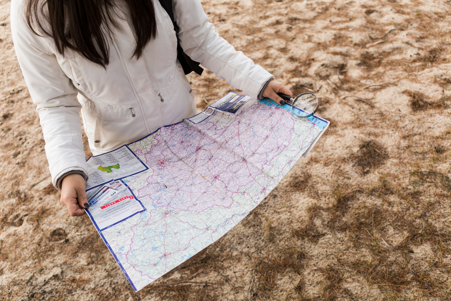
Thematic maps use geography as a container for information about something else, and the choices of category, colour and interval determine what pattern appears.
The same data displayed differently can suggest opposite conclusions. Data presentation is the decision that happens after the geography is finished.
14. Which Way Up
North at the top is a convention rather than a requirement, and maps have been drawn with other orientations in many traditions and periods.
Nothing about the ground specifies an upward direction. Orientation is the choice so consistent that it stops looking like one.
15. How the Ground Was Measured

Before aerial and satellite survey, position was established by triangulation from measured baselines, which is why accurate maps required an enormous prior investment in surveying.
The map is the last stage of a long process. Underlying survey is the work that a finished map completely conceals.
16. What the Map Is For

Every decision above follows from purpose – navigation, administration, taxation, planning, travel or display – and a map made for one purpose is frequently poor for another.
There is no general-purpose map. Intended use is the decision that explains all the others.
An Argument Rather Than a Picture

Distortion, centring, omission, exaggeration, symbols, names, orientation and data – sixteen decisions, all made before you looked, and all of them determined by what the map was made to do.
The last item is the one to carry. Asking what a map was made for answers nearly every question about why it looks the way it does – and a map that seems to be getting something wrong is usually a map made for a purpose other than the one you are using it for.
Like our content? Follow us for more.