

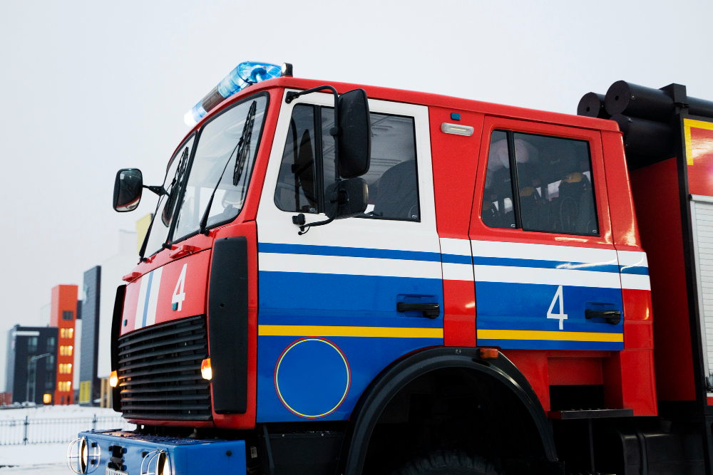
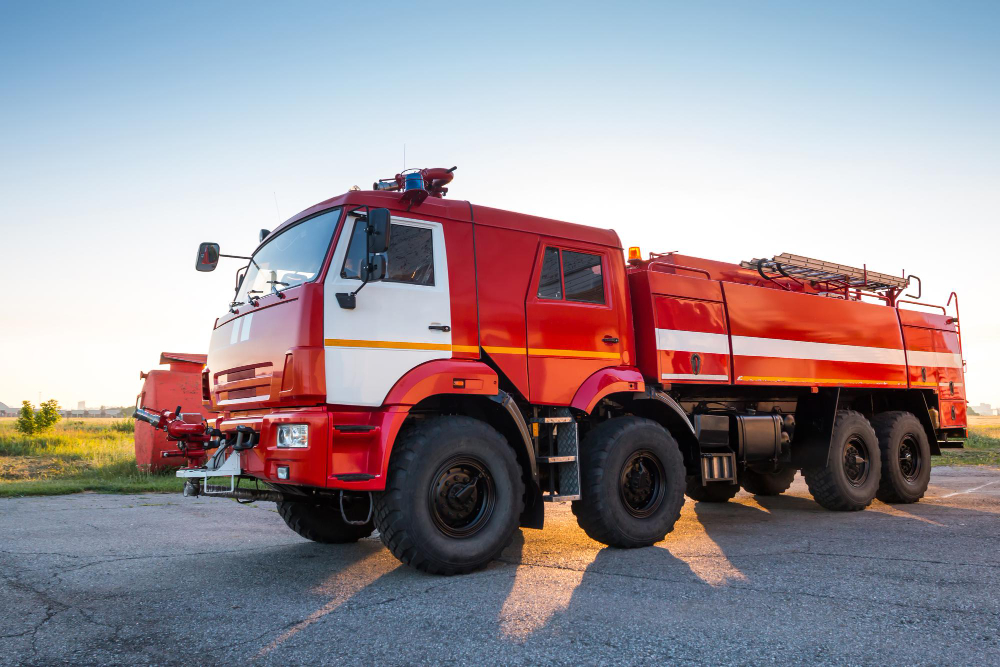
Fire engines are red almost everywhere, it is one of the most universally recognised conventions in use, and there is a substantial body of research indicating that red is close to the worst available choice.
The reason is not aesthetic preference or contrarianism. It is a specific property of human vision that only becomes relevant in exactly the conditions where a vehicle most needs to be seen.
The Eye Changes Which Colours It Favours as Light Falls
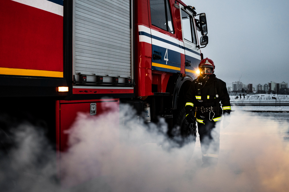
Human vision uses two kinds of receptor. Cones handle colour and detail and need reasonable light. Rods handle low light, are far more sensitive, and do not distinguish colour at all.
In bright conditions the cones dominate, and sensitivity peaks in the yellow-green part of the spectrum. As light falls, the rods take over, and the peak sensitivity of the whole visual system shifts further toward green and away from the red end.
The practical consequence is that as it gets darker, reds get darker faster than greens do. A red object and a green object that appear equally bright in daylight will not appear equally bright at dusk – the green will stand out and the red will sink toward black.
This shift has a name and has been understood for a very long time. It is the reason a red flower and green leaves that look balanced at midday look utterly different at twilight, with the flower turning almost black while the foliage still reads clearly.
And dusk, dawn and poor weather are when a very large share of road collisions occur.
Like our content? Follow us for more.
So What Does the Research Actually Say
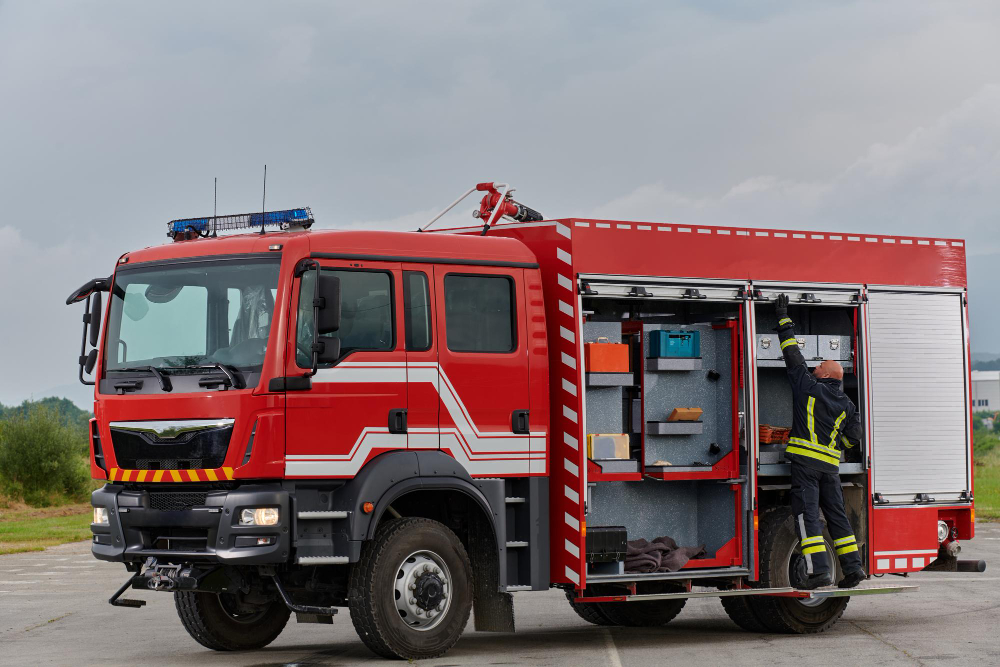
Studies comparing accident rates for emergency vehicles of different colours have generally found that lime-yellow and yellow-green vehicles are involved in fewer collisions than red ones, with the difference concentrated in low light.
The honest caveats matter here. These are observational studies rather than experiments, the fleets being compared differ in other ways, the number of relevant incidents is small enough that confidence intervals are wide, and services that chose an unconventional colour may differ in other respects such as driver training or operating procedures.
So the finding is suggestive rather than conclusive, and anybody presenting it as settled is overstating it.
What is not in dispute is the underlying visual science, which is straightforward and uncontested. Red is the least favourable colour for low-light conspicuity, and that is a fact about eyes rather than a finding about fleets. The argument is about how much that matters in practice against everything else that determines whether a driver notices an approaching appliance.
Why Red Anyway
The explanations offered for the original choice are various and mostly unverifiable.
One account is that red pigment was the cheapest available when fire services were being equipped, and the vehicles were painted with what was affordable. Another is the opposite – that red was expensive and was chosen deliberately as a display of civic pride, by services competing with each other for prestige. Both are repeated confidently and neither is well documented.
A third is simpler and probably closest: red was already the colour of danger and urgency in signalling and in flags, so it was the obvious choice for a vehicle whose whole purpose was emergency, and nobody needed a further reason.
Whatever the origin, it locked in immediately. Once the public associates a colour with a function, the colour is performing a second job – recognition – and that job is done well by red precisely because everybody already knows it.
Which sets up the real conflict. Conspicuity and recognition are different requirements. Lime-yellow is easier to see. Red is easier to identify. A vehicle that is noticed late but understood instantly and one noticed early but taking an extra half-second to interpret are not obviously ranked, and the services that have debated this have landed in different places.
Visibility and Legibility Are Not the Same Problem
There is a distinction underneath this that is worth drawing out, because it explains why the debate goes round in circles.
Being seen and being understood are separate tasks performed at different distances. At long range the question is whether a driver registers that something is there at all, which is a matter of contrast against the background and of movement. At shorter range the question is what it is, which requires shape, colour and markings to be resolved.
A colour can be excellent at one and poor at the other. Lime-yellow wins the first task. Red, because of what everybody has already learned it means, wins the second.
Worse, the background changes constantly. A red vehicle against grey road and grey sky is reasonably distinct; against autumn trees, brick buildings or a line of red tail lights it is not. Lime-yellow is uncommon in the natural and built environment, which is precisely why it works – the colour’s advantage is as much about rarity as about the eye.
That is the argument for the hybrid solution that most services arrived at without anybody designing it deliberately: use a colour nothing else is, in the places that get looked at first, and keep the conventional colour for the body. It is not elegant, and it addresses both tasks rather than optimising for either.
What Changed the Argument More Than Colour Did
The reason this debate has become less urgent is that the question was partly bypassed.
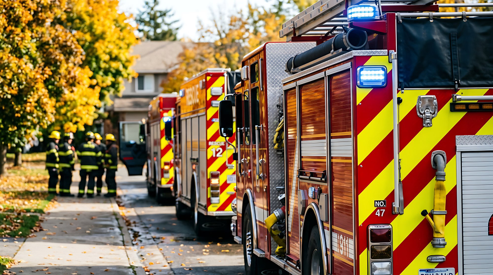
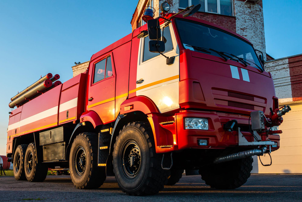
Retroreflective markings – the chevron patterns on the rear of appliances and the high-contrast banding along the sides – do something colour cannot. They return light directly to its source, so a vehicle lit by headlights appears far brighter than its surroundings regardless of the paint underneath. At night that effect dominates completely.
Lighting changed too. Modern emergency lighting is dramatically brighter, visible from further away and in more directions, and patterns are designed to attract attention rather than merely to be visible.
Between them, markings and lighting have reduced the importance of body colour substantially, which is why the colour argument has not forced a wholesale change. A red appliance with modern markings and lighting is far more conspicuous than a lime-yellow one from the period when the research was done.
That is a reasonable outcome and it is worth being precise about what it means: the colour finding was probably right, and the problem was solved by other means rather than by acting on it.
The Same Argument Runs Everywhere Else
Once you know about the low-light shift, it explains a run of other choices.
High-visibility clothing is yellow-green rather than red, and always has been, because the people specifying it were working from the visual science directly rather than from convention. Road maintenance vehicles, recovery trucks and airport equipment follow the same logic.
Older emergency lighting was frequently red and has largely moved toward blue and white in many places, with the mix varying by jurisdiction and by what each colour is permitted to signify. Blue has a practical advantage at night beyond its legal meaning, because it is uncommon in the ordinary road environment and therefore registers as unusual rather than as another tail light, and a practical disadvantage in fog and heavy rain, where shorter wavelengths scatter more.
And the general principle – that a colour chosen for meaning may be a poor colour for being seen – applies well beyond vehicles. Warning labels, signage and markings all face the same tension between the colour that carries the message and the colour that gets noticed, and the resolution is nearly always to use both: the attention-getting colour to make you look, and the conventional colour to tell you what you are looking at.
Which is exactly what a modern fire appliance does. Red body for recognition, retroreflective yellow-green chevrons for conspicuity, and lighting on top of both.
The pattern of those chevrons is specified rather than decorative, incidentally. The alternating diagonal bands on the rear of large vehicles are sized, angled and coloured to standards, because a pattern that is too fine disappears at distance and one that is too coarse fails to read as a hazard marking. Somebody measured all of that, and the result is one of the few pieces of vehicle livery anywhere that was arrived at by testing rather than by taste.
Next time you see an appliance at dusk, notice how much of what you actually see is the markings rather than the paint.
The red is for knowing what it is. The rest is for noticing it at all, and most of what you register in the dark is not paint at all.
Which is a reasonable way to think about a great many things that look like they were designed badly. The colour was chosen before the science existed, the science then said it was the wrong choice, and rather than repaint every vehicle in the country somebody solved the actual problem a different way and left the convention in place. That is frequently what happens to a wrong decision that has become load-bearing: it does not get reversed, it gets worked around, and the workaround ends up doing more than the original choice ever did.
Like our content? Follow us for more.
