

The Bars Are Not the Code
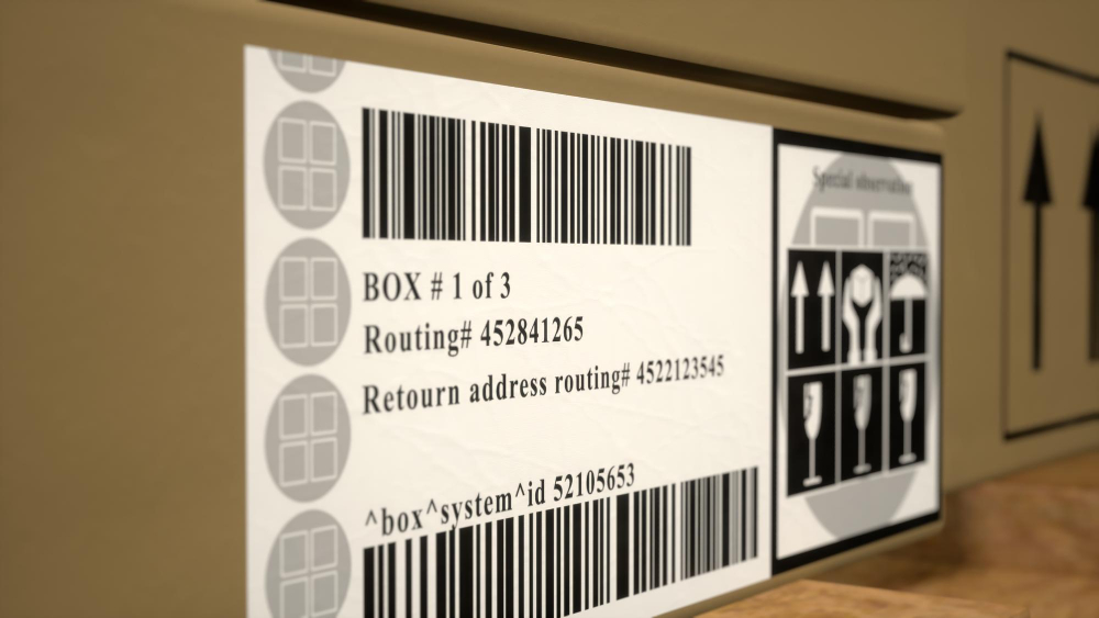
The intuitive reading of a barcode is that each bar is a symbol, like a letter, and the sequence of bars spells out the number. That is not how it works, and understanding why not explains almost everything else about the design.
What carries the information is the relative widths of the bars and the spaces between them. A digit is represented not by a bar but by a group of alternating bars and spaces whose widths, measured against each other, encode a value. The white gaps are not separators between pieces of information; they are half of the information. Painting out the white would destroy the code exactly as thoroughly as painting out the black.
This is why a barcode has no fixed size. The widths matter only in proportion to one another, so the same code can be printed the width of a thumbnail on a packet of batteries or a metre wide on a shipping crate, and both decode to the same number. Nothing in the symbol specifies an absolute dimension. The scanner works out the basic unit width from the code itself as it reads, and then measures everything against that.
It is also why a barcode wrapped round a curved tin still works. The curve compresses the bars towards the edges, but it compresses the spaces by the same proportion, so the ratios survive. A code that encoded absolute widths would fail on any curve at all.
And it is why the vertical dimension is almost entirely redundant. The bars are tall purely so that a scanner has a reasonable chance of crossing them somewhere. Every horizontal slice through the code contains the whole message, which means the height is a targeting aid rather than data. This is the reason a barcode can be scratched across the middle, or torn along the bottom, and still read perfectly.
Like our content? Follow us for more.
The Scanner Is Not Looking at It
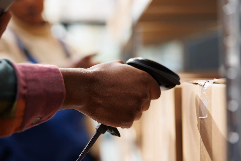
The second misconception is that a scanner photographs the code and then interprets the image. The classic laser scanner does nothing of the kind, and the difference matters.
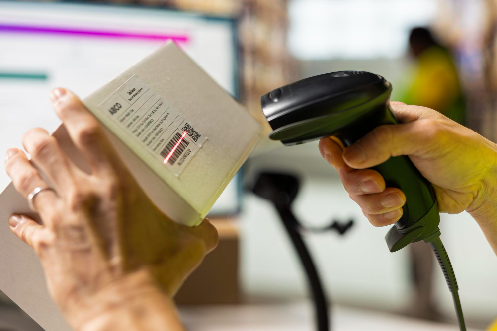
A laser scanner sweeps a single point of light rapidly across the label and measures how much light comes back, moment by moment. What it produces is not a picture but a single fluctuating signal: a trace of reflected brightness over time. Dark bars return little light and white spaces return a lot, so the signal rises and falls, and the durations of those rises and falls correspond to the widths of the spaces and bars the beam crossed.
So the device is measuring time, not space. It converts the pattern it finds in time back into a pattern of widths, and from those widths it recovers the digits. This is an extremely robust thing to do. It does not need focus in the photographic sense, it does not care about lighting conditions much, and it can be done with very simple and very fast electronics, which is precisely why the technology became ubiquitous while image-based approaches were still impractical.
It also explains the one thing that does defeat a laser scanner: anything that stops the contrast between dark and light from being clear. A shiny surface reflecting the beam straight back, a code printed in a colour the scanner’s light does not distinguish, a crumpled wrapper that scatters the beam, or a code under condensation all produce a signal with no clean transitions in it. The code may be perfectly legible to a human eye and completely unreadable to the device, because the human is reading a picture and the machine is reading a waveform.
The Empty Space Around It Is Part of the Design

Every barcode is specified with a clear margin on each side, with nothing printed in it. It looks like a layout convention and it is a functional requirement.
The scanner has no idea where the code begins. It is sweeping across a surface and receiving a continuous signal, which may include printed text, a logo, the edge of the packet and whatever else is nearby. It identifies the code by finding a particular recognisable pattern at the start, and in order to recognise that pattern it needs to have seen uninterrupted white immediately before it. Without that run of blank space, the scanner cannot tell where the first bar is, and anything printed too close becomes part of what it tries to decode.
This is one of the commonest reasons a barcode fails in practice, and it is a design failure rather than a printing failure. Somebody has placed text, a border or another graphic hard against the end of the code, and the code becomes intermittently unreadable without anybody being able to see why.
The start and end of the code carry a second deliberate feature: a fixed pattern that is always the same and does not represent any digit. Its job is to announce the presence of a code and to let the scanner calibrate. By measuring that known pattern, the device establishes what the basic unit width looks like in this particular sweep at this particular distance and angle, which is exactly the information it needs in order to interpret everything that follows in proportional terms.
How It Knows Which Way Round It Is

A code swept from right to left produces the mirror image of the same code swept from left to right. Something has to resolve that, because the two readings mean different numbers.
The solution in the familiar retail symbol is elegant. The digits in the left half of the code and the digits in the right half are encoded using different rules. In one half, every digit’s pattern begins with a space and contains an odd total of dark modules; in the other, every digit’s pattern begins with a bar and contains an even total. A digit encoded in the left-hand scheme is never identical to any digit encoded in the right-hand scheme.
This means the scanner can work out, from the characters themselves, which half it has just read and therefore which direction it was travelling. If the decoded values match the left-hand set, it read forwards; if they match the right-hand set, it read backwards and should reverse the sequence. The code carries its own orientation.
There is also a fixed pattern in the middle, separating the halves, which provides a second calibration point partway through and marks the boundary. And because the code is self-orienting, a scanner that catches only one half of the code on one sweep and the other half on the next can still assemble a complete reading, which is what allows the multi-beam scanners built into supermarket counters to read a code dragged across them at any angle.
The whole arrangement is a series of answers to the question: what if the device gets the worst possible version of this? What if it is upside down, crooked, curved, partly obscured and moving?
The Check Digit, and What It Is Actually For

The last digit of a retail barcode is not part of the product’s identity. It is calculated from all the others.
The calculation involves multiplying the digits alternately by different weights, adding the results and working out what must be added to reach the next multiple of ten. That number becomes the final digit. A scanner that reads the code performs the same calculation on the digits it read and compares the answer with the digit at the end. If they disagree, the read is discarded and the scanner simply does not beep.
This is why a scanner essentially never returns the wrong product rather than failing to return one. The arithmetic catches every single-digit misread outright, because changing any one digit changes the result. It also catches the overwhelming majority of transpositions, where two adjacent digits are read in the wrong order, because the alternating weights mean the two positions contribute differently.
The design philosophy is worth noticing, because it is the opposite of what people usually assume about automation. The system is not built to be always right. It is built so that when it is wrong, it knows, and its response to not knowing is to stay silent and wait. The familiar experience of an item needing three passes before it beeps is not the system working badly. It is the system refusing to guess, repeatedly, until it is certain.
The same logic appears in the error-correcting structure of two-dimensional codes, which go considerably further and can reconstruct missing data rather than merely detect that it is missing, which is why a square code with a logo printed over the middle of it still works.
The Number Does Not Contain the Price

One persistent assumption is that the barcode on a product encodes its price. It does not, and it never has.
What the number identifies is the product, and nothing else. The first group of digits is assigned to a numbering organisation associated with a particular country or region, the next group identifies the company that registered the item, and the remainder identifies the specific item within that company’s range. A different size, flavour or multipack of the same thing is a different number.
The price lives in the shop’s own database, keyed to that number. This is the entire reason the system was adopted with such enthusiasm, and it is a much bigger deal than faster checkouts. It means a price can be changed centrally for every branch at once, without anybody touching a single item. It means the shop knows exactly what has sold, item by item, in real time, which makes automatic reordering possible. It means stock levels and sales analysis stop being periodic manual exercises.
That is also why the barcode is best understood as an addressing scheme rather than a label. The information is not on the product. The product carries a pointer to information held elsewhere, and the whole value of the arrangement comes from the separation of the two. A code that contained the price would have locked every price to a printed packet, which is exactly the problem it was invented to remove.
And it is why the number is globally unique and why the allocation of ranges has to be administered. Two different products sharing a number would be two different things at the same address.
Why Black on White, and What Breaks It
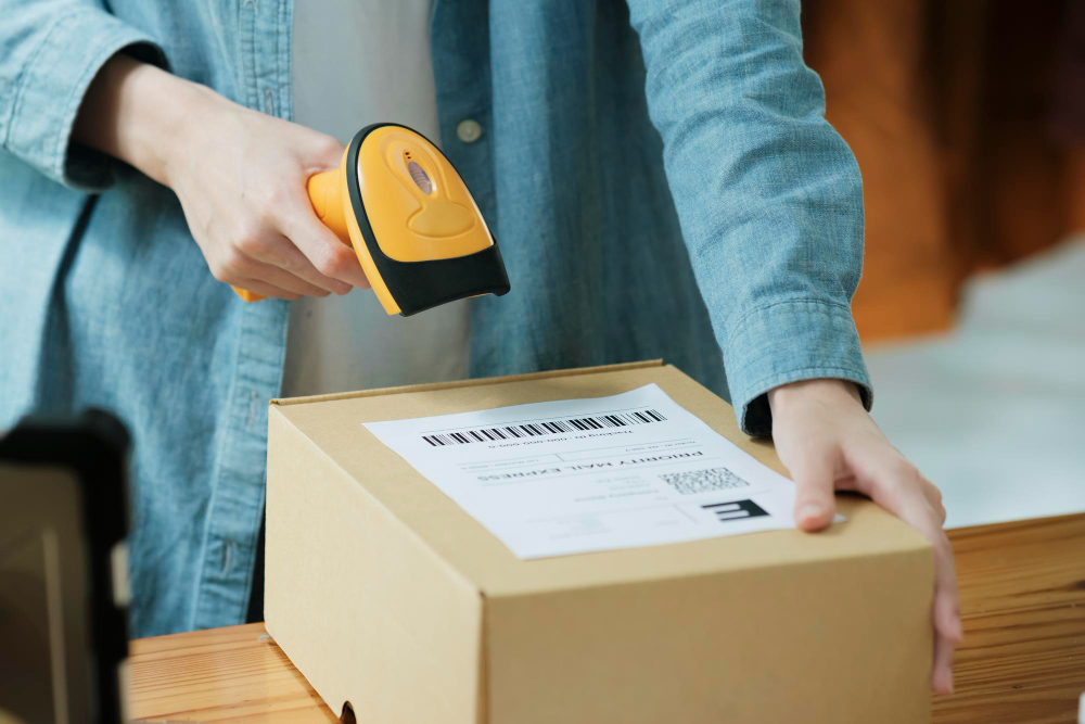
The contrast requirement comes from the reading method rather than from any convention. The scanner is measuring reflected light at a particular wavelength, and for most of the technology’s history that wavelength was in the red part of the spectrum.
This has a consequence that still catches people out. A red bar on a white background is nearly invisible to a red laser, because red ink reflects red light almost as well as white paper does. The signal has no transitions in it. Conversely, blue, green and black all absorb red light and read well. So the apparently arbitrary rule that barcodes should be dark on light, and never red on white, is a direct statement about the light source.
Similarly, a code printed on a transparent film over a dark product has no white to reflect from, and a code on highly reflective foil produces a specular glare that swamps the measurement. Both are print-design problems that look fine to a person and read as noise to a machine.
Printing resolution matters for the same reason. The code depends on width ratios, so any process that systematically thickens the bars, which most printing does to some degree, distorts those ratios. This is why printed codes are often drawn with slightly narrowed bars to compensate, and why a code reproduced by photocopying or at low resolution degrades in a way that eventually makes the ratios ambiguous.
None of these are failures of the idea. They are all consequences of the single decision to encode information in proportional widths and read it as a brightness signal, which is also the decision that made the code immune to scale, curvature, rotation and damage.
A Very Small Idea That Reorganised Retail
What the barcode actually solved was not scanning. It was the problem of getting an unambiguous identifier off a physical object and into a computer, cheaply, quickly, with no training, at a rate of thousands of times a day, using the printing and electronics available at the time.
The answer was to put the information in the ratios rather than the shapes, so that size and distance stopped mattering; to make every horizontal line through the symbol complete, so that aim stopped mattering; to encode the two halves differently, so that direction stopped mattering; to demand a margin of blank space, so that the surroundings stopped mattering; and to add a calculated final digit, so that a misread announced itself instead of passing silently into the till.
Every one of those decisions is a decision about failure. The design is not optimised to work well in good conditions. It is optimised to fail safely in bad ones, which is why a stripe of ink invented for the technology of its era still works on a crumpled packet pulled out of a freezer and dragged across a glass plate at an angle nobody intended.
Like our content? Follow us for more.
