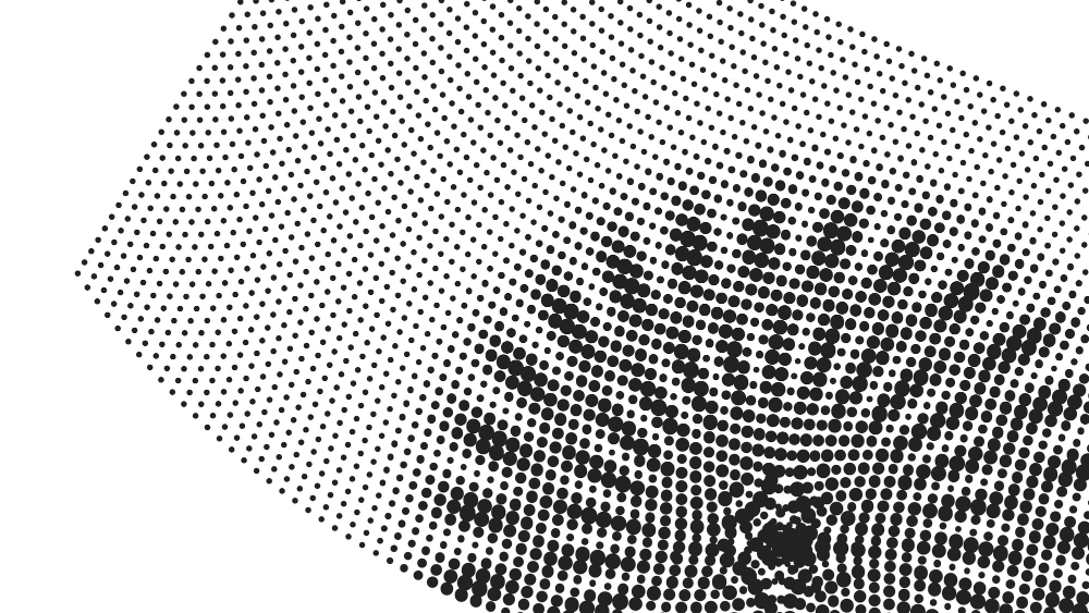
The fundamental constraint is that ink is either present or absent. Everything printers have done for a century and a half is a way of simulating tones that the process cannot actually produce. Here are fifteen.
1. There Is No Such Thing as Grey Ink
A press applies one density of ink or none, so a photograph containing a thousand shades has to be produced from a single solid black and the white of the paper.
That is the problem the whole technique solves. Binary ink is the constraint everything else works around.
Like our content? Follow us for more.
2. Tone Is Simulated by Coverage
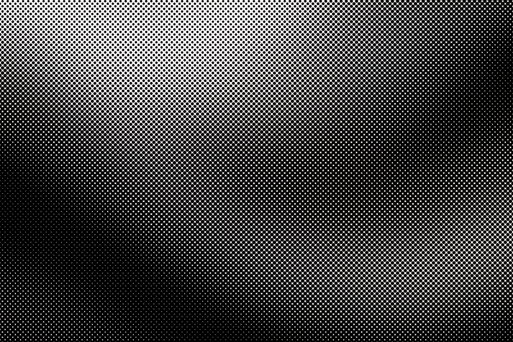
The solution is to vary how much of each small area is covered – more ink for darker regions, less for lighter – so that the average reflectance approximates the intended tone.
Nothing is being diluted. Proportional coverage is how a solid ink produces a range.
3. The Dots Vary in Size, Not Darkness
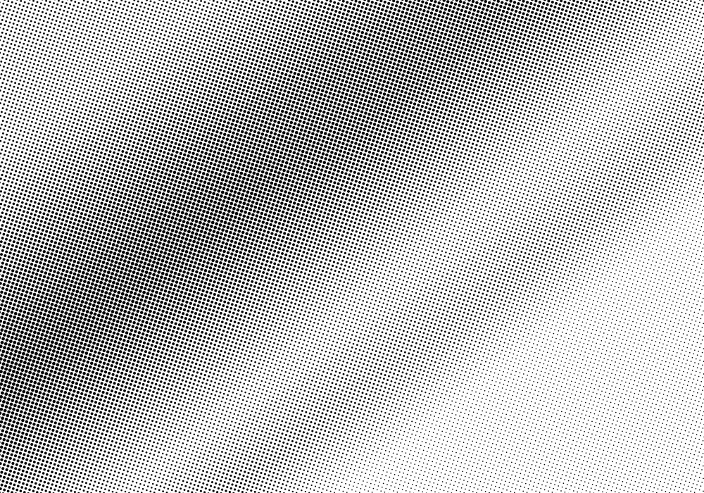
In a conventional screen the dots sit at fixed intervals and change size, so a dark area has large dots nearly touching and a light one has small isolated dots.
Every dot is the same black. Variable dot size is the mechanism people assume is variable intensity.
4. Your Eye Does the Rest
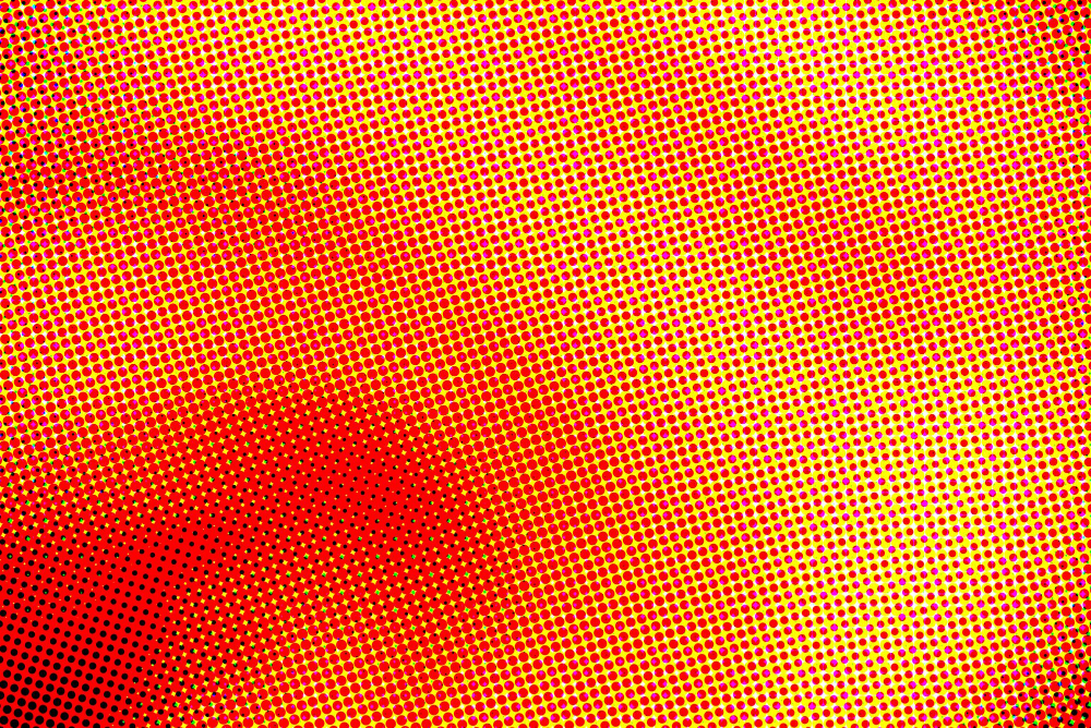
At normal viewing distance the dots are too small to resolve individually, so the visual system averages each small area and perceives a continuous tone.
Move closer and the illusion fails. Optical integration is the part of the process performed by the viewer.
5. Which Is Why Enlarging Ruins It
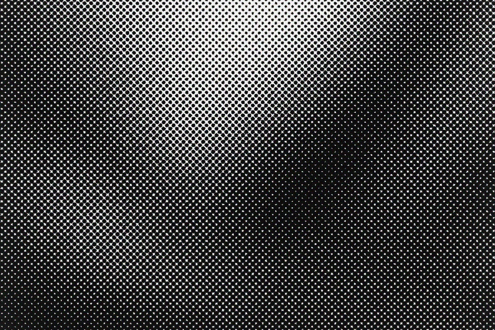
Magnifying a printed image does not reveal more detail, it reveals the dots – because the detail was never there and the dots were.
A printed photograph has a fixed maximum useful size. Resolution limit is why enlargement fails in a specific way.
6. The Screen Frequency Sets the Quality

How closely the dots are spaced determines how fine the reproduction can be, and finer screens require better paper and more precise presses.
Newsprint uses a coarse screen for that reason. Screen ruling is the specification that varies by publication.
7. Colour Uses Very Few Inks

Full-colour printing is achieved with a small number of inks overprinted in the same dot system, with the eye mixing them optically rather than the inks mixing on the paper.
No ink is the colour you are seeing. Optical mixing is how a limited palette produces everything.
8. Each Colour Gets Its Own Screen
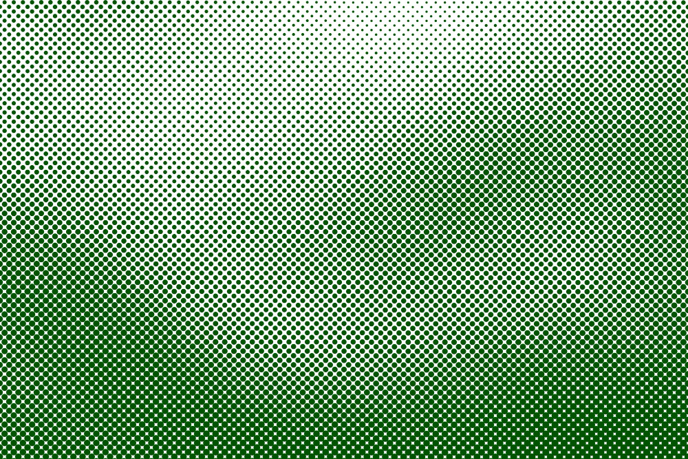
Every ink is applied as its own set of dots, which means several dot patterns are laid over one another on the same sheet.
They must not coincide. Multiple screens are what makes colour printing geometrically difficult.
9. The Screens Are Deliberately Rotated
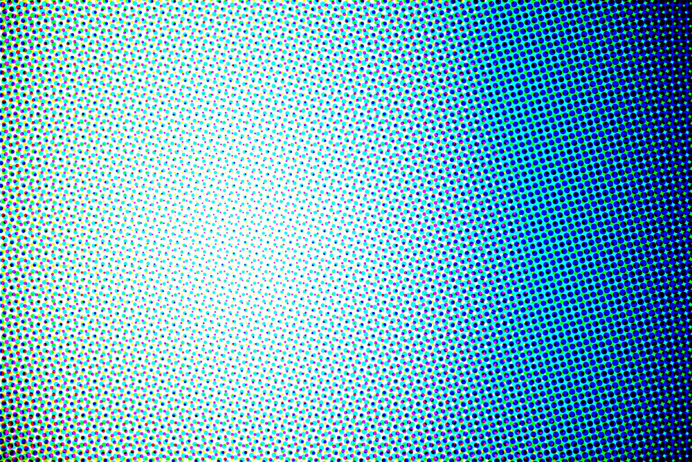
If two dot grids are aligned, their interaction produces a strong visible pattern, so each colour is screened at a different angle chosen to minimise it.
The angles are standardised and not arbitrary. Screen angling is a solution to a problem the process creates for itself.
10. And Getting It Wrong Produces a Ripple
Where angles are incorrect or where a printed image is rephotographed and rescreened, an interference pattern appears across the image as visible waves.
It is unmistakable once recognised. Interference patterning is the characteristic failure of overlaid grids.
11. Black Gets Its Own Ink for Two Reasons
Overprinting the colour inks produces a muddy dark rather than a true black, and text printed from three inks would need perfect alignment to look sharp.
A dedicated black solves both. Separate black is an economic and optical decision at once.
12. Everything Has to Line Up
Each ink is applied in a separate pass, and if the passes are not aligned precisely the result shows coloured fringes at every edge.
A fraction of a millimetre is visible. Registration is the tolerance the whole process depends on.
13. The Dots Spread Into the Paper
Ink absorbed by paper spreads beyond where it was placed, enlarging every dot and darkening the image relative to what was intended.
The effect varies with the paper. Dot spread is compensated for before printing rather than after.
14. Some Screens Have No Grid at All
An alternative approach uses dots of a single small size distributed with varying density rather than a grid of varying sizes, which avoids interference patterns entirely.
It requires more precision from the press. Irregular screening is the method that removes the geometry problem.
15. The Same Trick Runs Everything Else
Screens, displays and any other device producing images from discrete elements uses the same principle – separate small units too fine to resolve, integrated by the eye into something continuous.
The technology changed and the illusion did not. Universal dot logic is why a printed page and a screen work the same way.
Solid Ink Pretending to Be Grey
A press that can only print or not print, tone built from dot size, colour built from a handful of inks, screens rotated to avoid interference, and an eye that cannot resolve any of it.
The fourth item is the one worth sitting with. Half of this technology is in the press and half of it is in the viewer – the dots are entirely real and entirely visible, and the image only exists because human eyes stop resolving detail at a particular size, which is a remarkable thing for an industry to have built itself on.
Like our content? Follow us for more.