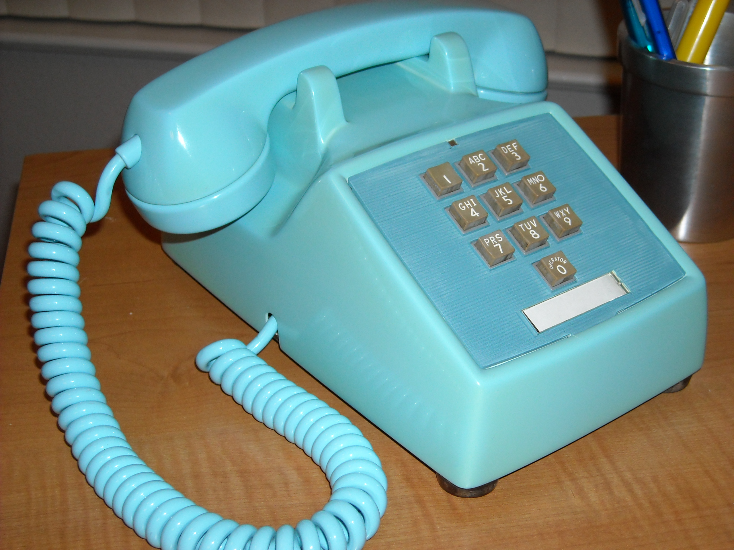
Look at the number pad on a telephone. The top row is 1, 2, 3 and the bottom row is 7, 8, 9.
Now look at the number pad on a calculator, a cash register, or the right-hand side of a computer keyboard. The top row is 7, 8, 9 and the bottom row is 1, 2, 3.
They are upside down relative to each other, they have been for sixty years, and the reason is not that one of them made a mistake.
The Calculator Layout Came First
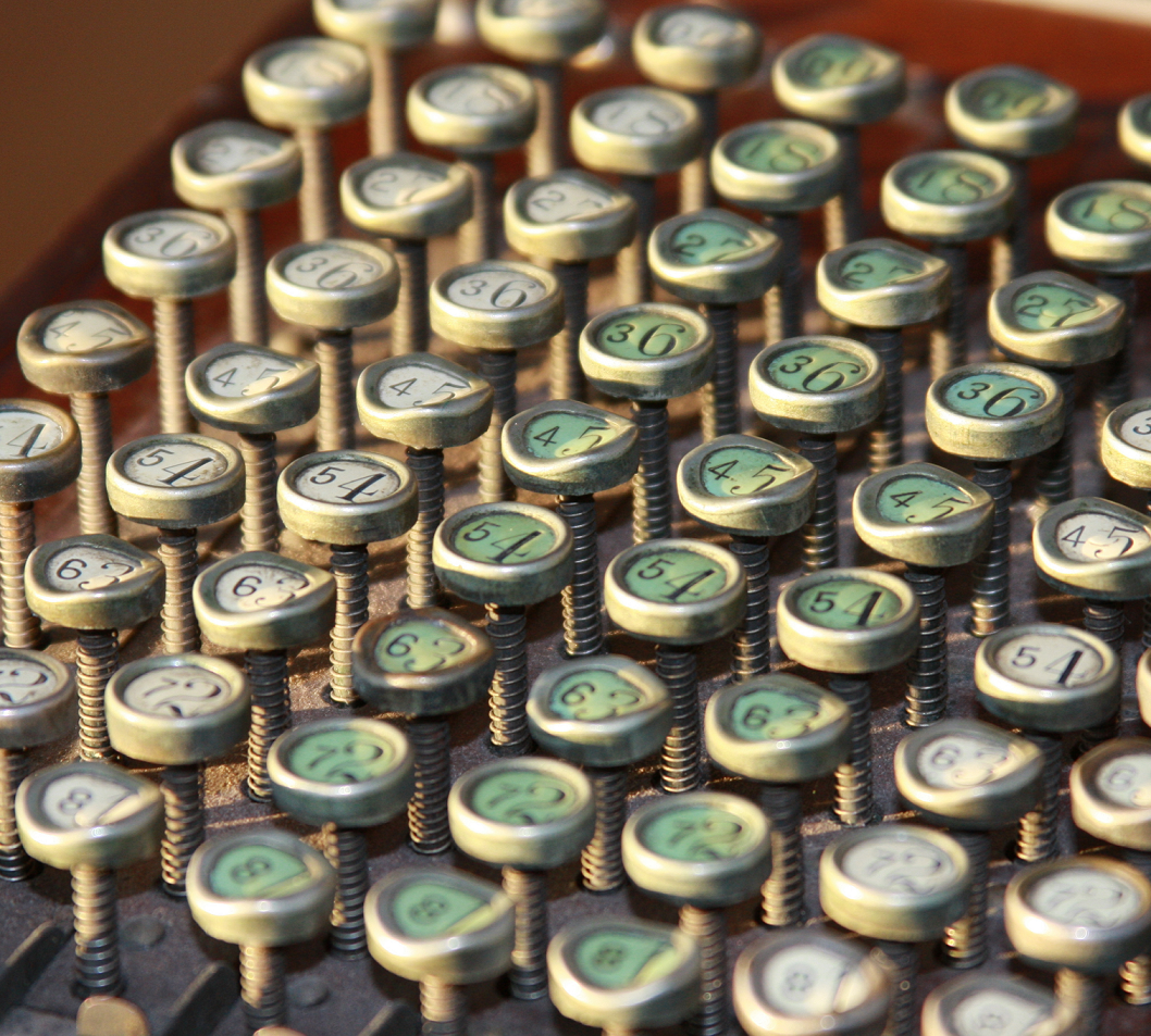
Mechanical adding machines had numeric keyboards long before telephones had buttons, and by the middle of the twentieth century the arrangement with the low digits at the bottom had settled into the standard for them.
The ancestry is a column of keys. Early adding machines had a full keyboard with a separate column of nine keys for each digit position, and in those columns the numbers ran upward from the bottom, which is the natural direction for a counting scale. When the full keyboard was condensed into a compact block of ten keys, the upward direction came with it.
By the time electronic calculators arrived, that arrangement was entrenched among the people who used them – bookkeepers, cashiers, accountants, clerks – all of whom were fast, trained, and working by touch all day. There was no prospect of changing it and no reason to.
Like our content? Follow us for more.
The Telephone Company Tested It and Chose the Other Way
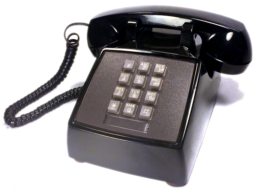
When push-button dialling was being developed to replace the rotary dial, the telephone engineers had to decide how to arrange ten buttons, and unlike the calculator makers they had no inherited convention to follow – a rotary dial is a circle.
So they tested. Human factors researchers at the telephone laboratories ran experiments with a number of candidate layouts, including circular arrangements echoing the old dial, two rows of five, a cross, and several rectangular grids, measuring how fast ordinary people entered numbers and how often they got them wrong.
The three-by-three grid with a zero beneath it performed well, and of the two possible vertical orderings the one with 1, 2, 3 at the top was chosen.
The reasoning that is usually given, and that fits the evidence, is that the telephone’s users were not trained operators. They were everybody. A person who uses a keypad a few times a day reads it rather than feeling it, and reading in most of the world runs top to bottom and left to right, so a sequence that starts at the top left is the one that matches how a novice scans. The calculator’s users were the opposite – fast, trained, working without looking.
Speed Was Not the Only Consideration
There is a second factor that is less often mentioned and is probably at least as important.
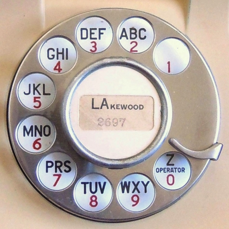
The early push-button telephones were being introduced alongside the existing rotary network, and the rotary dial has a definite order: starting from the finger stop, the first number you reach is 1 and the last is 0. A layout beginning with 1 in the obvious starting position and ending with 0 at the bottom preserves that familiar sequence for people switching over, which matters enormously when you are asking an entire country to learn a new way of doing something they do every day.
There was also a signalling constraint. The tone system that replaced pulse dialling assigns each button a pair of frequencies determined by its row and its column, so the physical grid and the electrical design were being settled together. That does not determine which way up the rows go, but it does explain why the answer had to be a tidy rectangle rather than a circle.
Nobody Standardised It Afterwards, and It Stopped Mattering
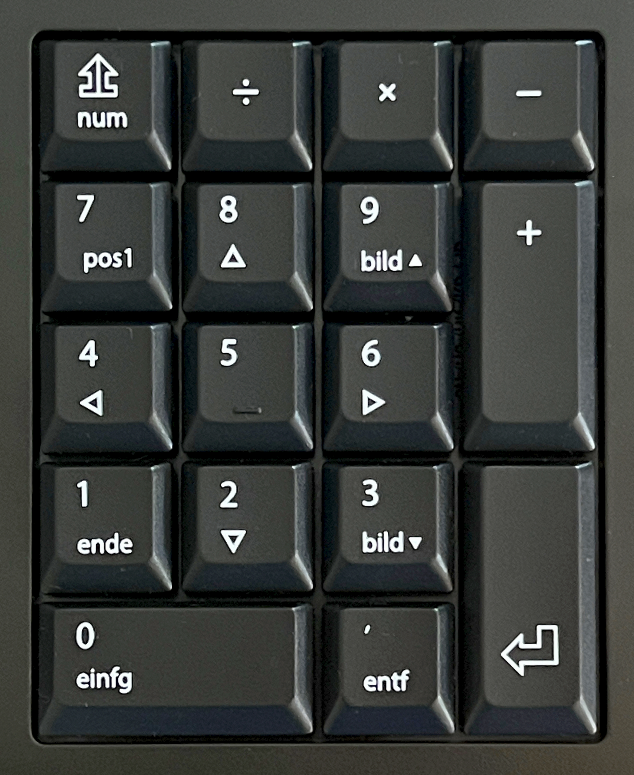
The obvious question is why one of them did not eventually give way, and the answer is that both populations were already trained and neither had a reason to pay for retraining.
A bookkeeper who switched to the telephone layout would have been slower for weeks. A telephone user handed a calculator layout would have misdialled. Each industry had millions of installed devices and millions of trained hands, and the cost of changing either was certain while the benefit was speculative.
So the two coexisted, and then the problem solved itself in a way nobody planned. Dialling a number by hand became rare. Phone numbers are now selected from a list or tapped from a message, and the keypad on a mobile telephone is an image on glass that is only summoned occasionally. Meanwhile the calculator layout survived in the one place it was always strongest – the numeric block on a full-size keyboard, used by people entering figures at speed, which is exactly the population it was designed for.
Both layouts won, in their own domain, and the inconsistency now costs almost nobody anything.
The Letters on the Keys Are Older Than the Buttons
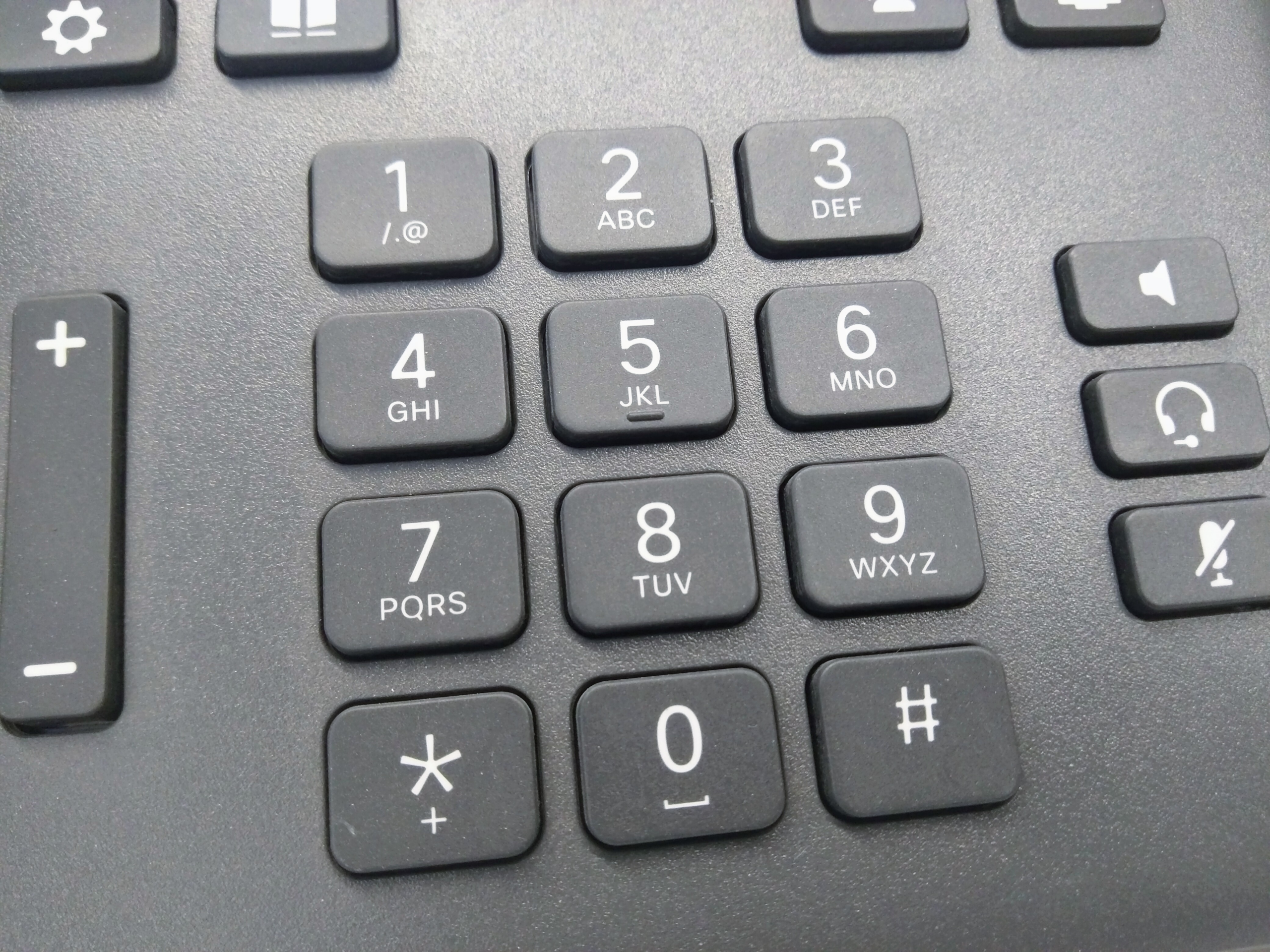
The other thing on a telephone keypad that nobody questions is the letters, and they predate push buttons by half a century.
Letters were put on rotary dials because early exchange names were alphabetic. A subscriber did not dial a string of digits; they dialled two or three letters identifying the exchange followed by the number, which is why old telephone numbers in films and on shopfronts begin with a word. The letters existed to make an exchange name dialable, and the groupings of three letters per digit were arranged to fit twenty-six letters across the available positions.
Q and Z were the casualties. With twenty-six letters and only so many slots, two had to go, and the two least used in exchange names were dropped – which is why for decades a telephone keypad had no Q and no Z at all, and why anybody spelling a word on a phone ran into trouble with exactly those letters.
They were added later, once text messaging made every letter necessary, and the modern allocation puts Q with 7 and Z with 9.
The whole alphabetic layer is now vestigial for its original purpose and entirely alive for new ones: vanity numbers that spell a word, menu systems that ask you to enter the first letters of a surname, and the muscle memory of anybody who learned to text on a numeric keypad by pressing a key repeatedly. It survived because it cost nothing to print and because somebody always finds a use for a spare dimension.
Where It Still Causes Trouble
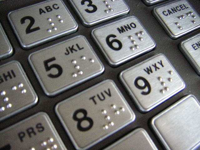
Almost nobody, but not quite nobody, and the exceptions are worth knowing because they are the places people make errors.
Payment terminals, cash machines, door entry systems, safes, alarm panels and microwave ovens all use the telephone layout. Industrial control panels and point-of-sale systems are split. Anybody who moves between a card terminal and a keyboard numeric pad all day is switching layouts repeatedly, and the error rate is real.
The place it bites hardest is entering a code under time pressure on an unfamiliar device – an alarm panel on the way out of the house, a payment terminal with a queue behind you. The hands reach for the position rather than the digit, and if the layout is the other one the result is a wrong entry.
It is also a genuine accessibility issue. Someone who cannot see the keypad relies entirely on position and on the small raised dot that marks the 5 key, which exists on both layouts precisely so that a finger can find the centre and work outward. That dot is one of the quietly universal pieces of tactile design in everyday life, and almost nobody notices it is there until it is pointed out.
Which Is the Better Design
If you had to start again with no history, the evidence points one way for each population and there is no single answer.
For occasional users entering a number they are reading off something, top-left-to-bottom-right matches scanning direction, matches how numbers are written, and produces fewer errors. That is the telephone layout, and it was chosen on test results rather than instinct.
For high-volume touch typing, the direction is close to irrelevant once it is learned, and what matters is that it does not change. That is the calculator layout, and its claim is seniority and an installed base of trained hands.
The actual lesson is the one that keeps turning up in design history. Two sensible organisations looked at the same ten digits, asked different questions about who would be pressing them, ran the work properly, and arrived at opposite answers – and both answers were correct for the people they were about.
Which is also why the question is so satisfying. There is no villain in it, nobody got it wrong, and the thing that looks like an obvious inconsistency is two good decisions that were never meant to meet.
If you want to see the whole argument in one object, look at a cash machine and then at the keyboard you type on. They sit in the same building, they are operated by the same people, they are both asking for digits, and they are the other way up from each other.
Nobody has ever fixed that, nobody is going to, and on any given day it inconveniences almost nobody. Which is roughly the honest state of most design inconsistencies that have survived a long time: not an oversight waiting to be corrected, but two settled answers to a question that turned out to have two right ones.
Like our content? Follow us for more.