

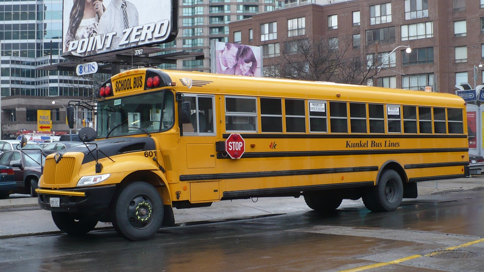
It is one of the most standardized objects in American life and almost nobody knows it was standardized on purpose. Every school bus is the same color. Not approximately the same – the same, specified by a formal color standard, maintained for the better part of a century, and recognized instantly by every driver in the country.
That did not happen by convention or by accident. It happened at one meeting, over seven days, where the participants looked at color chips on a wall and argued, and the thing they were arguing about was not what looks brightest. It was something considerably more subtle.
What the Problem Actually Was
To see why a conference was needed, it helps to understand how bad the situation was before it.
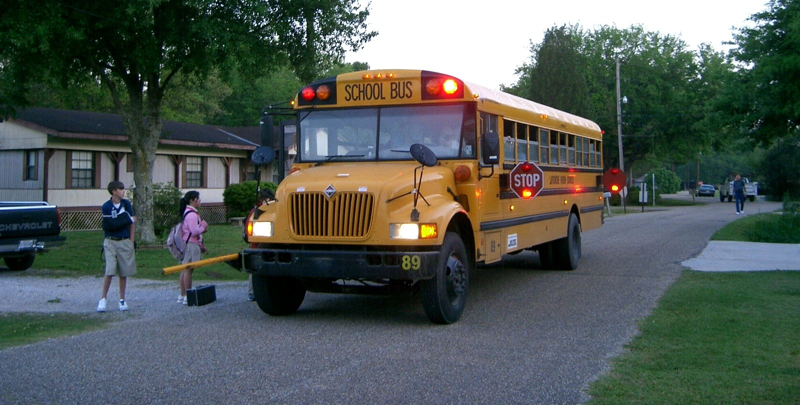
In the 1930s American school transportation was improvised to an extent that is hard to imagine now. Vehicles were frequently converted trucks. Bodies were built by local manufacturers to whatever specification a district requested or could afford. Seat spacing, aisle width, door placement, step height, roof height, window size, emergency exits, body strength and color all varied not just between states but between districts in the same county.
Color in particular was wherever the district’s taste or the painter’s stock landed: red, white, dark green, blue, two-tone combinations, the school’s own colors, or whatever was cheapest. A bus was identifiable as a bus only by context.
That is a safety problem with two distinct halves. The first is recognition: a driver approaching a vehicle needs to know, immediately and without reading anything, that children may be about to step into the road. The second is procurement: a district buying one or two buses at a time had no leverage and no standard to buy against, which meant every vehicle was effectively bespoke and nobody could compare anything.
Like our content? Follow us for more.
The Meeting
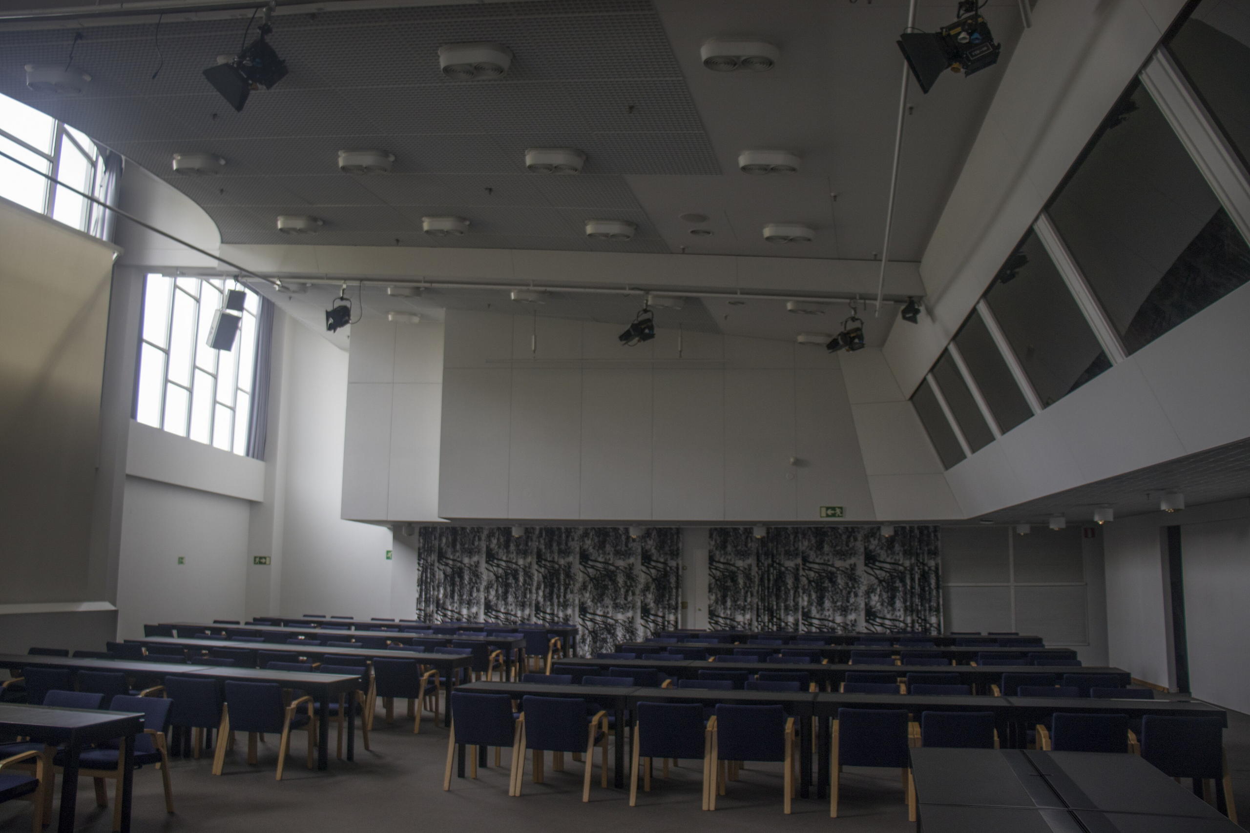
In 1939 a conference was convened at a university to address exactly this, bringing together transportation officials from across the states along with representatives of the body manufacturers and the paint industry.
The gathering ran for about a week, and its purpose was to produce a set of national minimum standards for school bus construction – dozens of them, covering the dimensions, the structure, the exits, the glazing and the equipment. The color was one item among many, and it is the one everybody remembers because it is the one you can see from the sidewalk.
The method used for the color decision was refreshingly concrete. Painted samples across the yellow-to-orange range were mounted on the walls of the meeting room, and the participants lived with them for the duration, examining them in different light through the course of several days and arguing about them.
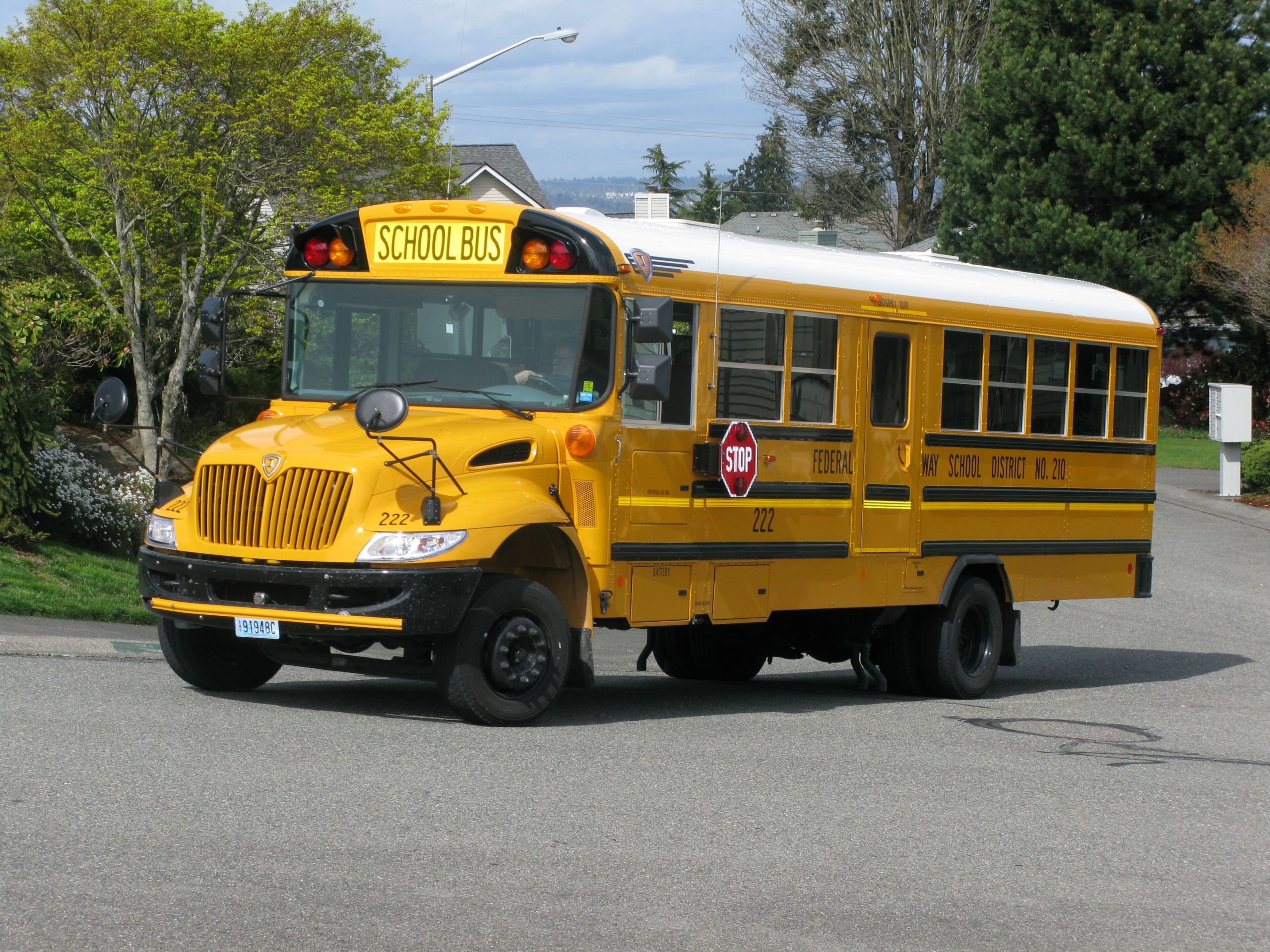
What emerged was a specific hue in the yellow-orange region – a yellow pulled noticeably toward orange rather than a pure or lemon yellow – together with the black lettering and trim that still accompanies it. The specification was written down, which is the part that mattered, because a written specification can be purchased against and enforced.
Why That Particular Hue Won
Here is the reasoning, and it is the interesting part.
The obvious assumption is that the color was chosen because it is the most conspicuous in bright daylight. That is not quite the argument, and if it were, the answer would probably have been different, because several colors perform extremely well in full sun.
The actual case rests on two properties.
The first is peripheral and low-light performance. Human color vision is not uniform across the visual field or across light levels. In dim conditions and at the edges of vision, sensitivity shifts away from the red end of the spectrum, and hues in the yellow-to-yellow-green region remain detectable – and remain detectable as color rather than as grey – longer than reds and blues do. A school bus route is run overwhelmingly in the hour after dawn and the hour before dusk, in exactly the light where this difference is largest, and it has to be noticed by a driver who is not looking directly at it.
The second is contrast against black lettering, and against the background. Black text on this yellow is close to the most legible combination available, which matters for the stop warnings on the rear. And the hue sits far enough from the greens, greys and browns of an ordinary roadside that it does not blend into vegetation, pavement or winter landscape.
Add the orange lean and you get something that also holds up in haze and in the yellowish cast of early morning light, where a purer yellow washes out.
So the choice was optimized for a specific, narrow and entirely correct use case: being seen at the edge of vision, in poor light, at the two particular times of day when school buses operate.
The Alternatives That Were Considered and Lost
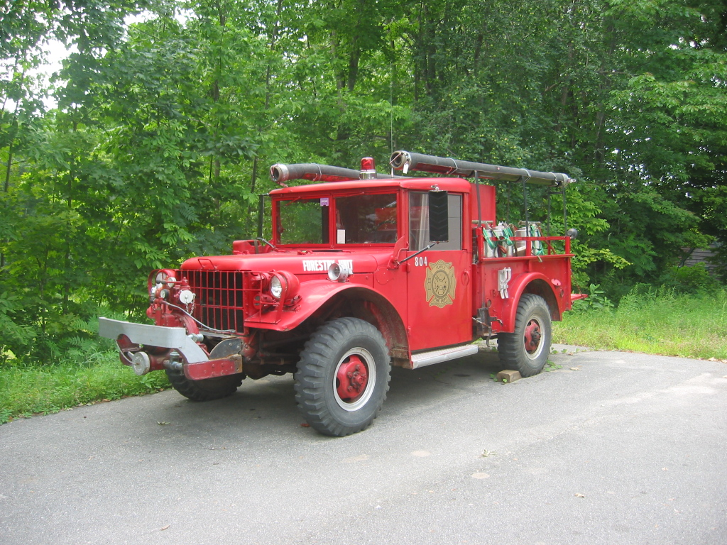
It is worth knowing what the yellow beat, because the losing arguments are instructive.
Red was the obvious candidate and it had real support. It is the color of fire apparatus and of stop signs, it carries an unambiguous warning meaning in American road vocabulary, and in full sunlight against a green background it is extremely conspicuous. It lost on precisely the ground that decided the whole question: red is the first thing to go in dim light and at the edge of vision. A red vehicle at dusk reads as a dark shape, and a dark shape on a shoulder is exactly what a driver fails to resolve in time.
White was argued for on cleanliness, cost and daylight brightness. It lost because it is the one color that disappears entirely against the conditions a school route most often runs in – fog, snow, overcast glare and a low sun – and because white shows every mark, which for a vehicle that spends its life on gravel shoulders and winter salt is a maintenance problem rather than an aesthetic one.
Orange was close, and in some ways the final choice is a concession to it. A true orange reads well in haze and holds up at dusk better than most colors. What it does badly is lettering contrast: black on orange is noticeably less legible than black on yellow, and the rear of a school bus is a sign as much as it is a panel. The hue that was adopted is best understood as the point on the yellow-orange line where you keep most of orange’s low-light behavior without giving up yellow’s contrast with black.
Two-tone schemes were rejected for a different and rather modern reason. A vehicle with a strongly divided paint scheme is harder to identify as a single object at a glance, particularly in the periphery, and the entire point of the exercise was instant recognition by somebody who is not looking.
Why It Stuck When So Little Else Does
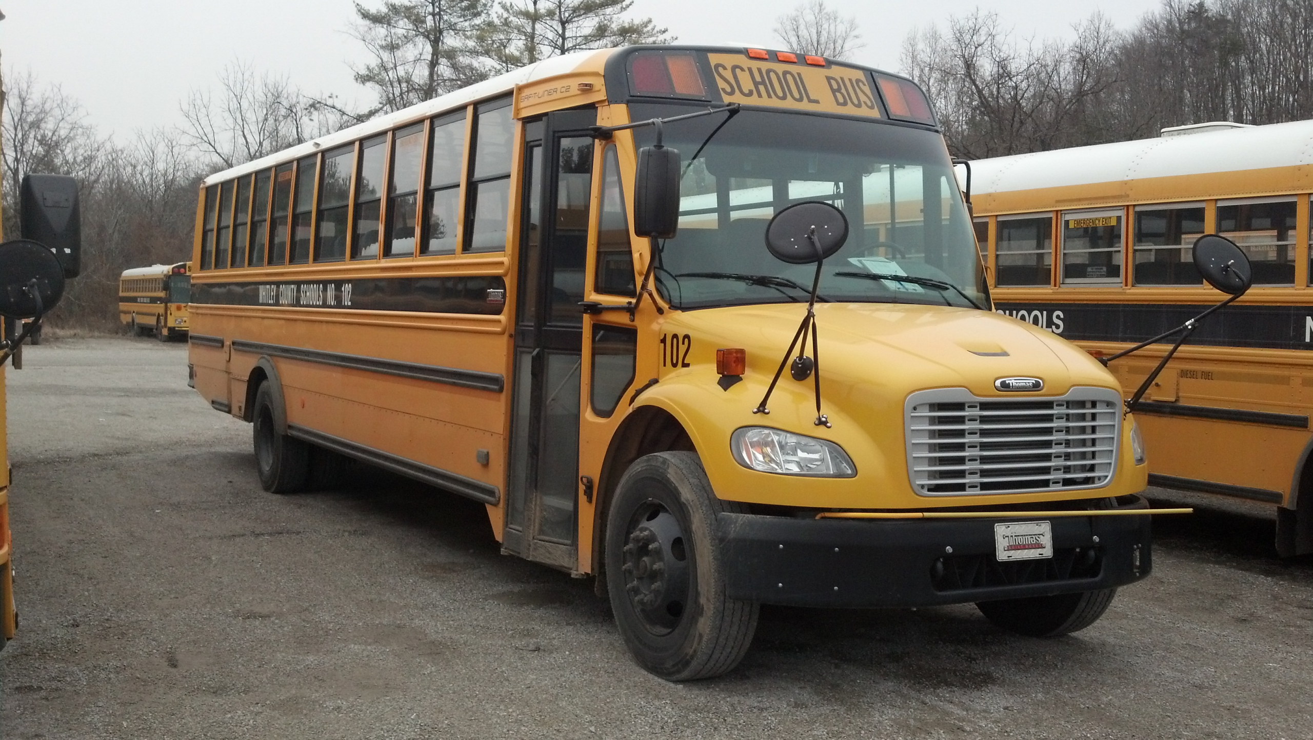
American standards have a habit of fragmenting. This one did not, and the reasons are worth noting because they explain more about standardization than the color does.
The standard was voluntary. There was no federal mandate forcing the color on anyone at the point it was adopted. What made it stick was the procurement effect: once a national specification existed, manufacturers built to it, because building to one standard is dramatically cheaper than building bespoke. Once manufacturers built to it, a district buying a bus was choosing between vehicles that were already that color, and ordering something else meant paying extra for a special.
The economics did the enforcement. A district could have had purple buses and would have paid a premium for the privilege.
The standard has also been revised repeatedly since – the conference became a recurring body, the construction specifications have been updated many times, and the color definition itself has been restated in modern colorimetric terms rather than as a painted chip. But the hue has remained essentially the same one chosen off that wall, which is a remarkable run for a decision made by a group of people squinting at samples.
The Thing This Explains About Everything Else
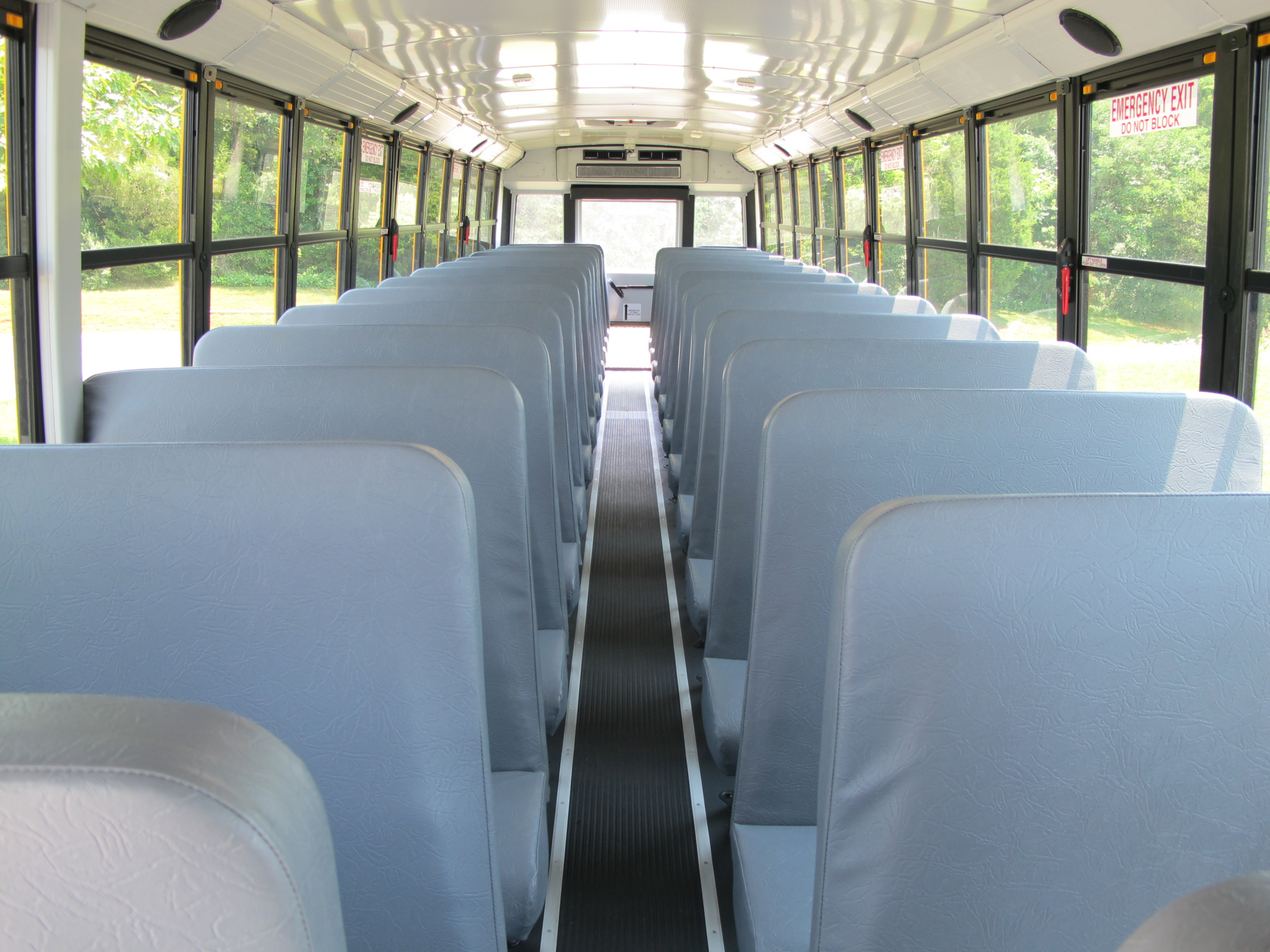
The color is the visible residue of a much larger achievement, and the larger achievement is the one that actually saved lives.
That same conference and its successors standardized the things you cannot see: the strength of the body structure, the spacing and height of the seats, the design of the seat backs, the location and number of emergency exits, the glazing, the steps, the mirrors and the warning lights. The distinctive stop-arm procedure, in which traffic in both directions is required to halt, depends entirely on the vehicle being instantly recognizable – which is to say it depends on the color.
The result is that student transportation in the United States became, by a considerable margin, the safest way for a child to travel, and it did so through an unglamorous process of specification rather than through any single invention.
Which is why the yellow is worth knowing about. It is not a style choice that happens to be universal. It is the one part of a seven-day engineering argument that is visible from the street.
The Honest Summary
Every American school bus is that yellow because in 1939 a room full of state officials, manufacturers and paint people spent a week looking at chips on a wall and picked the hue that stays visible as a color at the edge of vision in bad light, then wrote it down in a specification that manufacturers found cheaper to build to than to ignore.
It was not chosen for brightness in sunshine. It was chosen for dawn and dusk, because that is when the buses run.
And the reason it is still that color is not sentiment or regulation. It is that for eighty-odd years nobody has been able to make a case for a better one, and the alternative has always cost more.
Like our content? Follow us for more.
