

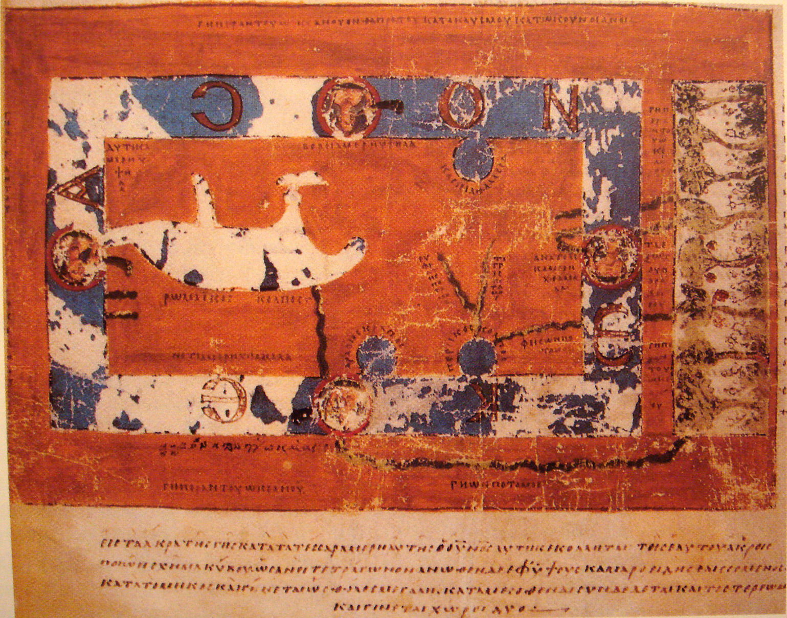
There is a standard way of looking at old maps that produces a confident and entirely wrong conclusion.
The method is to compare the map against a modern one and note the errors. Coastlines in the wrong shape, distances badly out, places missing, whole regions distorted. From that, a conclusion follows easily: people then did not know what the world looked like.
The problem with that reading is that the same societies were simultaneously producing other maps that are extraordinarily accurate — charts good enough to navigate by, with coastlines recognisable at a glance.
Both kinds were made in the same centuries, sometimes in the same cities, occasionally by people who knew of each other’s work. Which means the inaccurate ones are not failed attempts at the accurate ones.
They were doing something else, and understanding what makes them substantially more interesting than a list of mistakes.
What the Circular Maps Were For
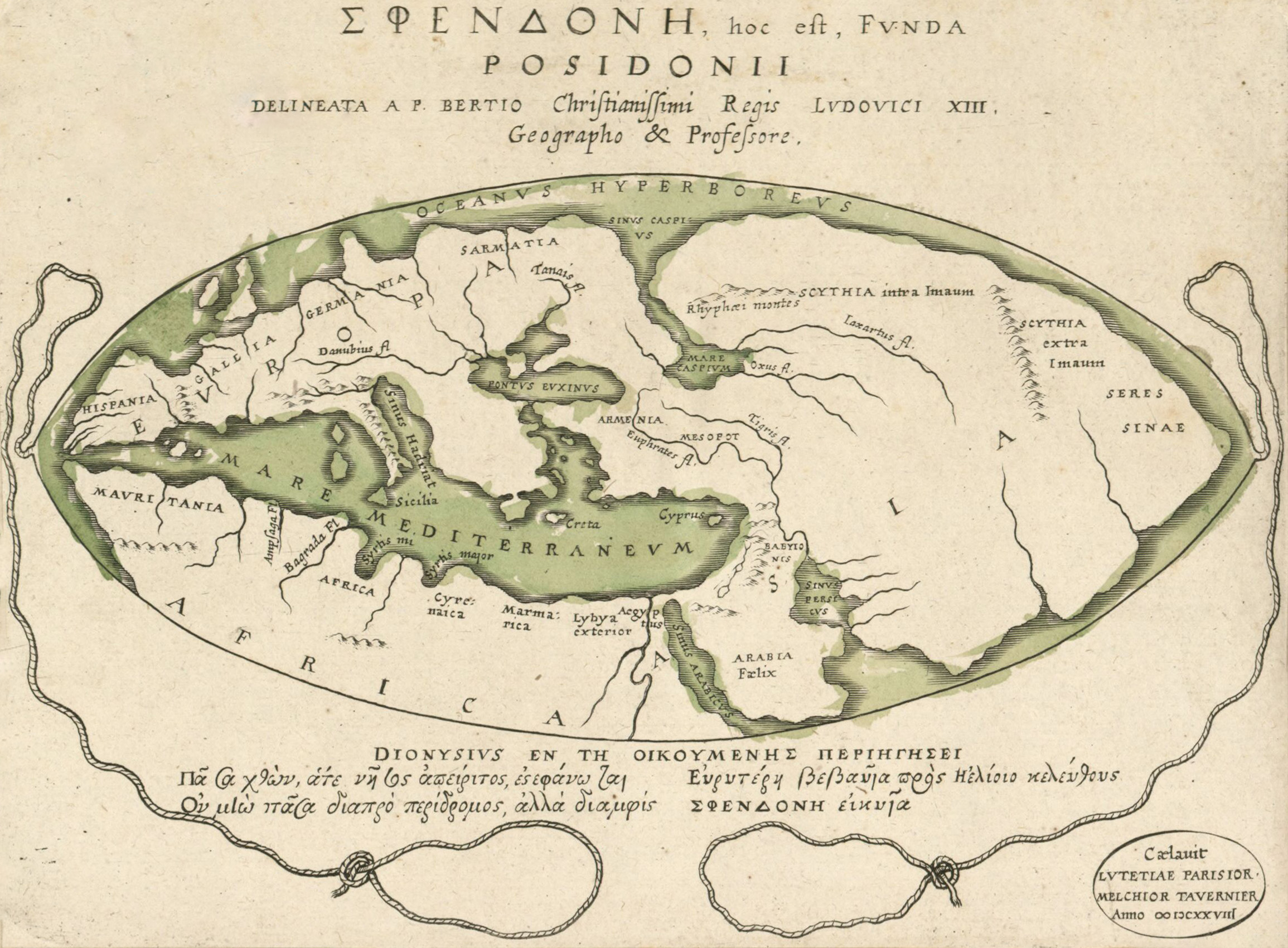
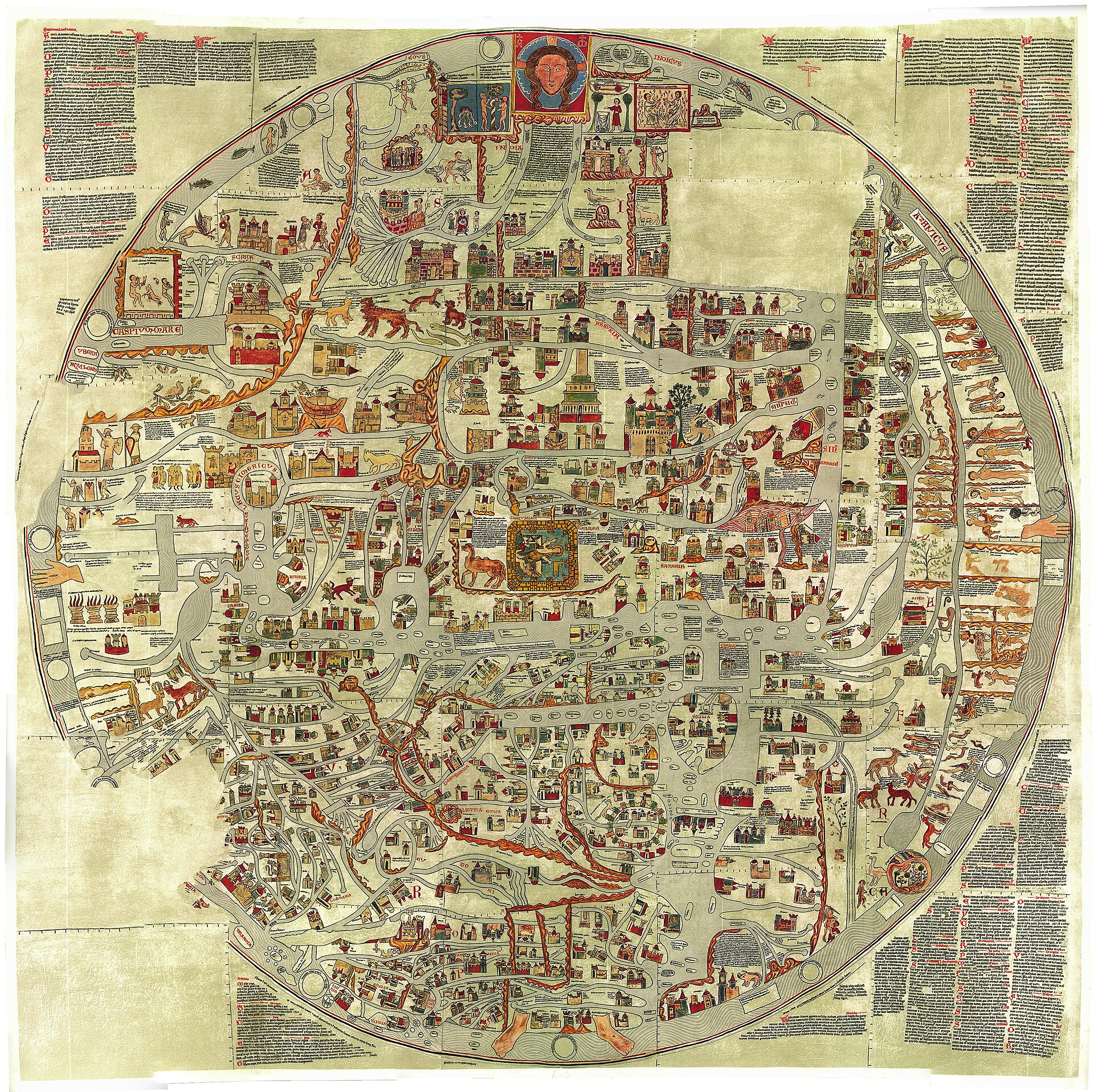
The large decorative world maps of the medieval period follow a recognisable convention.
The world is shown as a circle. It is divided into three landmasses by bodies of water arranged in a rough T shape. East is at the top rather than north. A significant religious city sits at or near the centre.
Within that frame, places are positioned according to importance and relationship rather than coordinates, and the map is populated with historical events, scriptural episodes, notable creatures and explanatory text.
Read as a chart, it is nonsense. Read as what it is — a diagram of a worldview, showing how everything relates to everything else in significance, history and meaning — it is doing its job precisely.
The organising principle is not space but importance. A modern equivalent would be a transit diagram or an organisational chart: both are maps, neither is geographic, and nobody considers them failed attempts at surveying.
The east-at-the-top convention has the same character. It is a choice reflecting what mattered, not an error about which way the world faces, and it survives in the word for finding your bearings.
Like our content? Follow us for more.
The Charts That Were Extremely Good

The contrast is what settles the argument.
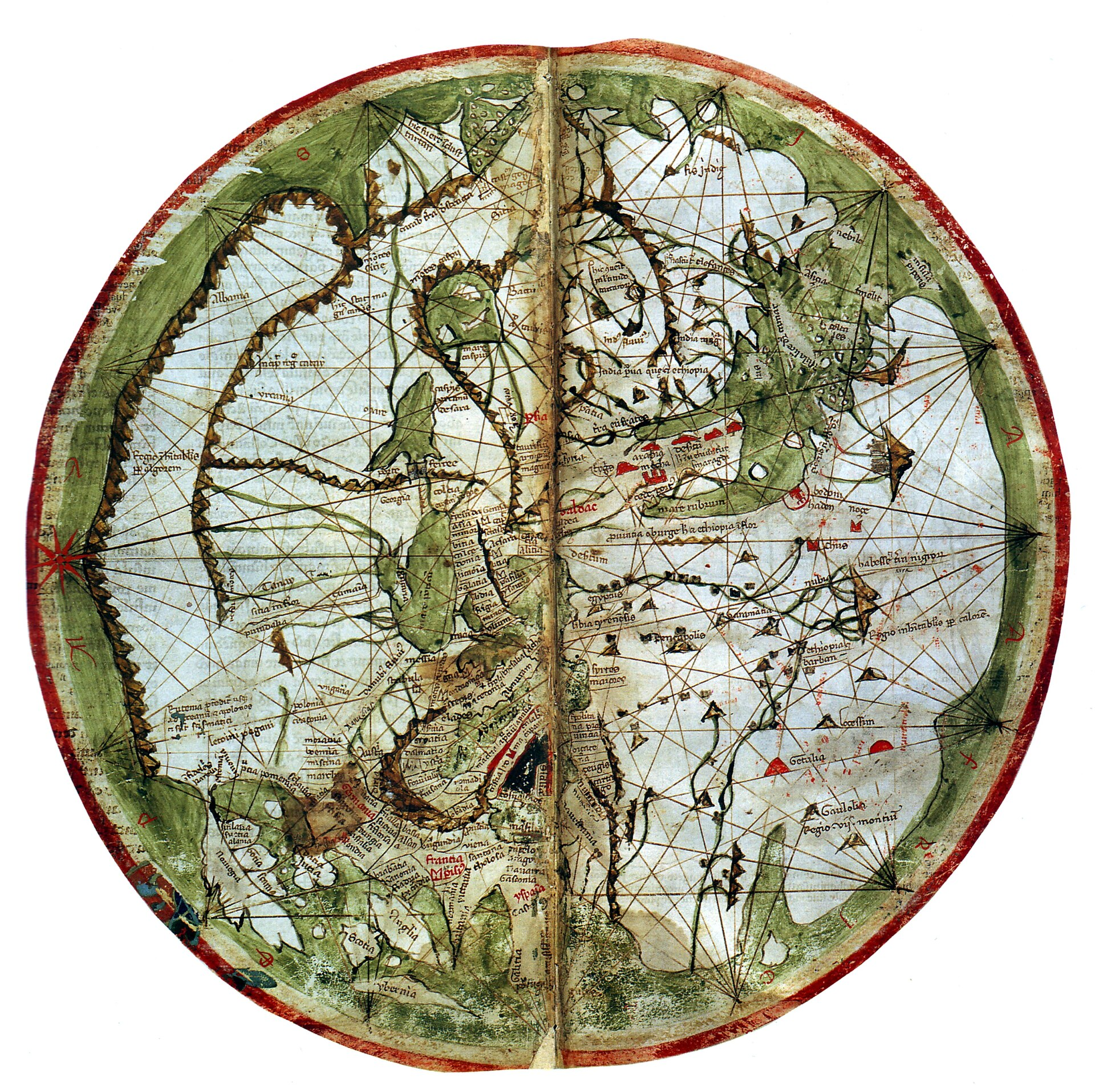
From roughly the same period, sea charts were produced showing Mediterranean and Atlantic coastlines with an accuracy that holds up remarkably well against modern outlines.
They are covered in radiating lines from compass points, designed for laying off a bearing with a straightedge, and they name coastal features densely while leaving interiors almost blank.
That blankness is the giveaway. These maps show what a navigator needs — the coast, the ports, the hazards, the bearings — and omit everything else, because everything else was not the point.
They were working documents, compiled and corrected from the accumulated experience of people who had sailed the routes, and updated as better information arrived.
So the same era produced both a symbolic diagram of the cosmos and a precise functional chart, and the people involved would have found it strange to be asked which one was the real map.
Reading Any Map by Its Purpose
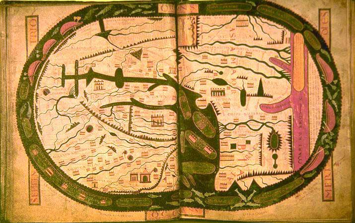
The general principle that emerges is the useful part.
Every map omits nearly everything, and what it keeps is determined by what it is for. A chart keeps coastlines and discards mountains. A diagram keeps connections and discards distance. A world map of the symbolic kind keeps significance and discards position.
Judging one against the standards of another produces confident nonsense in both directions — the chart looks empty and ignorant of the interior, the symbolic map looks geographically incompetent, and both judgements miss the point entirely.
That applies to modern maps too. A road atlas is wrong about almost everything except roads, and nobody minds, because the purpose is understood.
The difficulty with historic maps is simply that the purpose is less familiar, so the modern reader supplies a purpose the map never had and then marks it down for failing.
There is a related misreading about size. Regions on symbolic maps are frequently drawn larger or smaller than their actual extent, and this gets read as an error about geography.
It is the same principle as everything else on such a map. Prominence reflects importance, exactly as a larger label on a modern diagram indicates a more significant item rather than a physically bigger one.
The Blank Spaces
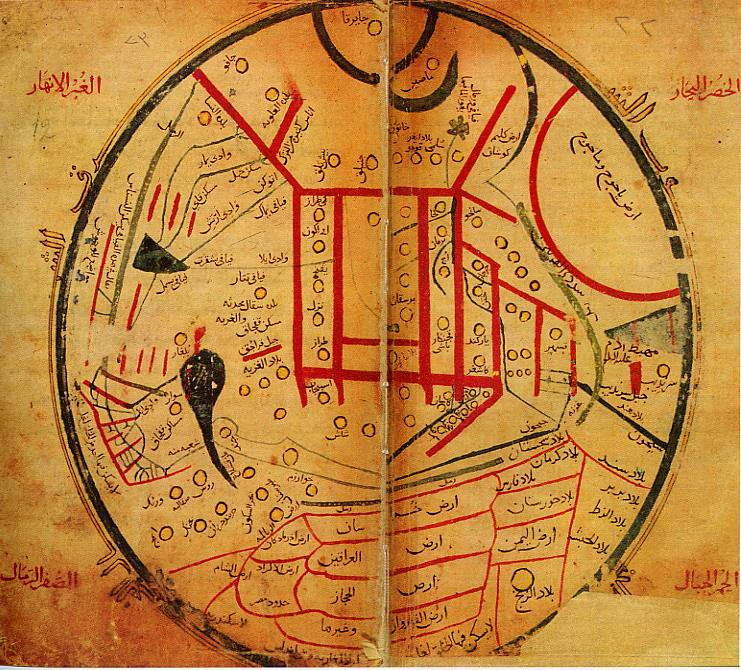
One specific correction is worth making because the assumption is so widespread.
Empty regions on historic maps are routinely read as meaning that the area was unknown, unexplored or empty. What they actually indicate is that the mapmaker had no surveyed information to place there.
Those regions generally had populations who knew them perfectly well. The blankness records the limits of one mapping tradition’s information, not the limits of anybody’s knowledge.
There is a related myth worth dismissing. The phrase about dragons occupying unknown regions is essentially a modern invention. Decorative creatures appear on some maps, in various places including well-known ones, and the specific formula appears on essentially nothing.
There is a practical reason the two traditions did not simply merge earlier. Producing an accurate coastline requires accumulated survey data that only exists for places people repeatedly travel to and measure.
Charts were accurate precisely where shipping was dense and inaccurate or absent elsewhere, which means accuracy tracked traffic rather than importance – and a world map covering everything could not be built from data that only existed along the busy routes.
Why the Accurate Ones Were Not Enough
A reasonable question follows: if precise charts existed, why did anybody continue making the symbolic kind?
Because they answered different questions, and only one of those questions was about getting somewhere.
A symbolic world map explains how the world is arranged as a whole, where its parts stand in relation to each other, and how present places connect to past events. That is an educational and interpretive document, and no chart addresses it.
They also served display and instruction. Large maps were made for institutions, to be looked at and explained, in a period when almost nobody would ever see most of what was shown.
The two traditions eventually merged, as surveying improved and as the interpretive function moved to other media, producing maps that are geographically accurate and carry very little meaning beyond position — which is a gain and also a narrowing.
What They Recorded That Modern Maps Do Not
There is a category of information on historic maps that has no modern equivalent, and it is worth noticing.
Because the symbolic maps recorded significance rather than position, they preserve a record of what their makers considered important — which places mattered, which events were worth marking, what relationships between regions were assumed, and what the world was understood to contain.
That is truly useful historical evidence, and it is not available anywhere else in that form. A map showing a particular city as central and a particular route as major tells you about a worldview in a way no text quite does.
The same applies to what appears at the edges. Regions represented as remote, marginal or strange indicate the limits of a mental geography rather than a physical one, and comparing maps across periods shows those limits moving.
There is also practical information embedded in maps made for other purposes. Estate maps, tithe maps and enclosure maps were produced to settle who owned what, and they incidentally record field boundaries, land use, buildings and place names at a specific date with considerable precision.
Those are among the most valuable sources for local history, and none of them was made with history in mind. They were legal and administrative documents, and their historical value is entirely a by-product.
Which returns to the same point from another direction. A map is evidence about its makers before it is evidence about the ground, and the more purposeful the map, the more it says about what somebody needed to know.
Looking at Them Properly
The practical upshot for anybody encountering an old map is a change of question.
Instead of asking what it got wrong, ask what it was keeping. The features included, the things given prominence, the centre, the orientation and the omissions all indicate what the maker considered worth recording and for whom.
That reading turns a map from a record of ignorance into a document about priorities, which is what it always was.
And it produces a more accurate view of the people who made them. They were not confused about the shape of the world. They were answering a question that nobody now thinks to ask a map — and answering it in a form that has survived long enough to be misread by everybody who assumes a map has only one job.
That assumption is the actual error, and it is a modern one. A period that produced both a diagram of the cosmos and a chart accurate enough to sail by understood perfectly well that maps do different things – and it is only from a position where nearly every map is geographic that the other kind starts to look like a failure.
Like our content? Follow us for more.
