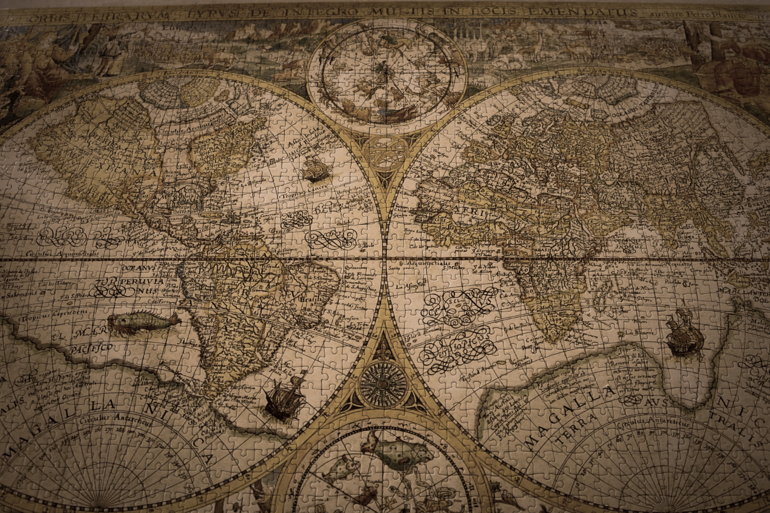
Picture a world map. North is at the top, south at the bottom, and it feels less like a convention than a fact — as settled as the ground being down and the sky being up.
It is not a fact. There is no physical sense in which north is up. The Earth is a sphere spinning in space with no privileged orientation, and a photograph taken from a spacecraft can be printed either way round with equal accuracy. Famously, at least one celebrated image of the Earth was taken with the south pole uppermost and is almost always reproduced inverted, because the other way round looks wrong to people who have only ever seen one arrangement.
For most of the history of mapmaking, other arrangements were normal. Here is how the current one won.
When East Was Up
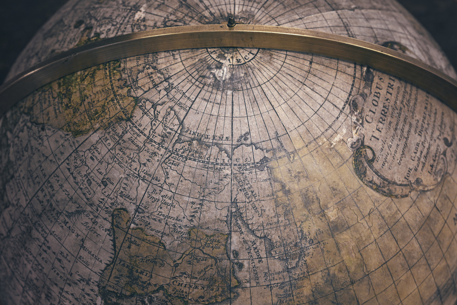
The clearest evidence that the convention is arbitrary is preserved in the language.
To orient yourself means to work out which way you are facing. The word comes from the Latin oriens, meaning east — the direction of the rising sun. It means what it means because arranging yourself relative to a map once meant finding east, because east was at the top.
Medieval European world maps, the mappae mundi, were generally drawn that way. The best-known surviving example, made in England around 1300, is close to unrecognisable to modern eyes: east at the top, Jerusalem near the centre, and the earthly paradise placed at the upper edge where the sun comes up.
That arrangement was not a failure of geographical knowledge. These maps were not primarily navigational documents; they were representations of a religious and cosmological order, and the placement expressed what mattered rather than what was where. Putting the direction of the sunrise at the top was a statement about significance.
The T-O maps of the period are the simplest form of this: a circular world divided into three parts, with east uppermost, functioning as a diagram of an idea rather than a chart of a coastline.
Like our content? Follow us for more.
When South Was Up
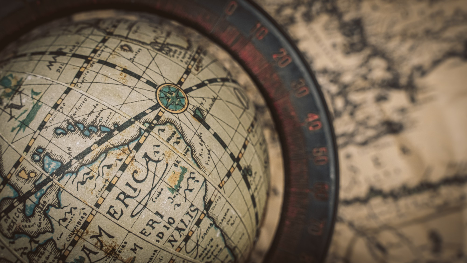
The medieval Islamic world produced some of the most accurate and sophisticated cartography of the period, and a great deal of it put south at the top.
The most celebrated example is the map produced by al-Idrisi in 1154 for the Norman king Roger II of Sicily, which is remarkable for its detail and accuracy. It is oriented with south uppermost — which means that turning it upside down produces something startlingly modern. The Mediterranean is there, the Arabian peninsula, the coast of Africa, all roughly where they should be, simply the other way up from what a modern viewer expects.
Explanations for the southern orientation are debated rather than settled. Proposals include the direction of prayer for early Muslim populations located north of Mecca, the alignment of major trade routes across North Africa and the Arabian peninsula, and the simple absence of any compass-driven reason to prefer north.
Chinese cartography also produced south-up maps, and there is a linguistic dimension there too. The character for south carries associations of front or forward, while north is associated with the back, and the Chinese term for a compass translates as a south-pointing needle rather than a north-pointing one.
So three major cartographic traditions arrived at three different answers, which is about as clear a demonstration as one could ask for that the question has no correct answer.
The Man Who Set the Convention
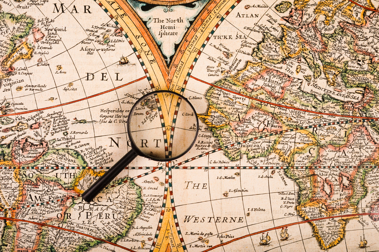
The north-up arrangement traces to Claudius Ptolemy, the Greek astronomer and geographer working in the second century, whose Geography set out how to construct maps of the known world.
What makes this satisfying is that Ptolemy explains his choice directly, and the reasoning is not what anyone expects.
His concern was practical and had to do with drawing. He wanted the map constructed so that the person making or reading it would work through it in a sensible sequence, with northern parts drawn before southern and western before eastern — which places north at the top and east to the right.
In other words, the arrangement follows the direction in which ancient Greek was written: left to right, top to bottom. Draw a map so that it is built in reading order, and north ends up at the top.
Historians have offered supplementary explanations, including the suggestion that the better-known parts of Ptolemy’s world lay in the northern hemisphere and were most conveniently studied in the upper portion of a sheet. But Ptolemy’s own stated reason is about the mechanics of construction.
Why It Stuck
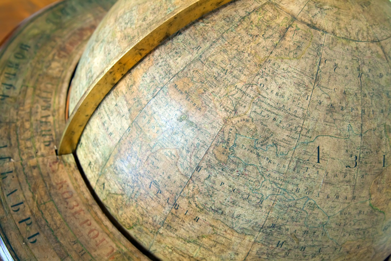
Ptolemy’s work was largely lost to medieval Europe and returned in the thirteenth century, with printed editions proliferating in the late fifteenth.
That timing mattered enormously. The rediscovery coincided with European maritime expansion, the spread of printing, and the adoption of the magnetic compass, which had reached Europe in the twelfth and thirteenth centuries.
The compass reinforced the convention directly. A needle points north, so a chart aligned with north at the top matches the instrument in the navigator’s hand without mental rotation. For anyone working at sea, that is a real practical advantage rather than a philosophical position.
Printing did the rest. Once maps were mass-produced from plates rather than drawn individually, the dominant arrangement propagated at scale, and European cartography was in a position to propagate it widely.
There is a further dimension that cartographers discuss openly: information at the top of a map tends to be read as more prominent, and societies generally place themselves centrally and uppermost in their own depictions of the world. That pattern is visible across cartographic traditions rather than being unique to any one of them.
Not every mapmaker followed Ptolemy even after the rediscovery. A celebrated map produced around 1450 drew on Ptolemy for some content while declining to adopt his orientation, which is a useful reminder that the convention took time to become universal.
What Changes If You Flip It
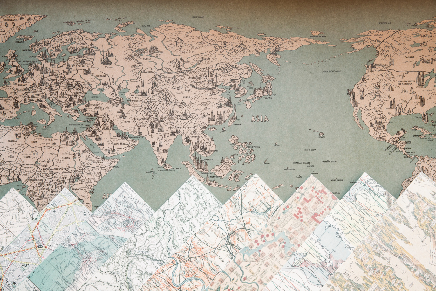
South-up maps exist, and looking at one is a truly disorienting experience that is worth having once.
Everything is accurate. Every coastline, every border, every relative position is identical. The only thing that changes is which end of the sheet each thing occupies — and the effect on a viewer accustomed to the other arrangement is substantial. Familiar shapes become hard to identify, and the relative prominence of regions shifts noticeably.
They are sold as souvenirs in some southern-hemisphere countries in considerable numbers, and used by some teachers specifically to make students notice an assumption they did not know they held.
The practical position has changed too. Digital mapping has steadily made orientation a variable rather than a convention: navigation applications routinely rotate the map to match your direction of travel, which means a great many people now use maps with north pointing wherever it happens to point, without noticing.
Maps Were Never Only About Geography
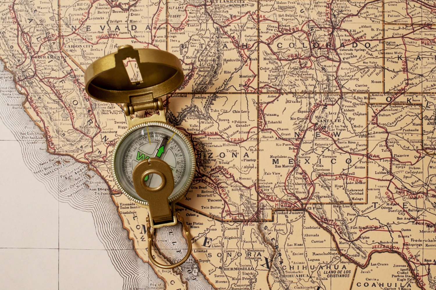
There is a broader point underneath the orientation question, and the medieval examples make it clearly.
A map is a selection. It cannot show everything, so somebody decides what appears, at what size, in what position and at what level of detail — and every one of those decisions carries information about the maker rather than the territory.
The mappae mundi are unusually honest about this because they are not pretending otherwise. A map with paradise at the top and Jerusalem at the centre is not a failed attempt at a road atlas; it is a diagram of how the world was understood to be arranged in significance.
Modern maps make the same kinds of decision less visibly. Which places are labelled and which are not, where the map is centred, which projection is used, how borders are drawn in disputed areas, and what counts as worth including are all editorial choices that look like observations.
That is not a criticism. Any representation of a sphere on a rectangle requires compromise, and any map of everything would be useless. The decisions are unavoidable.
What the orientation question offers is a way in. It is the one editorial decision on a map that anyone can identify in a second, verify as arbitrary, and reverse by turning the page around — which makes it a useful reminder that the other decisions are there too, and substantially harder to see.
An Assumption Worth Noticing
There is a modest but real lesson here that generalises beyond cartography.
North is at the top because a Greek astronomer in the second century wanted maps drawn in the same order as Greek was written; because his work happened to be rediscovered at the moment European printing and navigation were expanding; and because a magnetic needle happens to align with one particular direction.
None of those reasons is about the planet. Every one is about the people making the representation.
That is worth knowing not because the convention is wrong — a universal standard is truly useful, and the current one works — but because it is a clear, checkable example of something that feels like an observation and is actually an inheritance.
Most of us look at a world map hundreds of times without registering that we are looking at a decision. Turn one upside down and the decision becomes visible immediately, which is the entire value of doing it.
Like our content? Follow us for more.