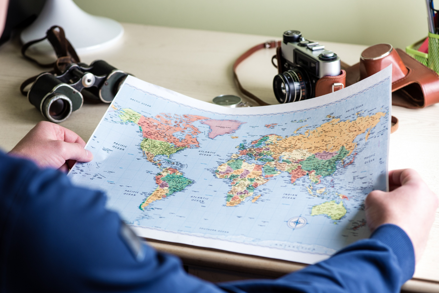
Picture a world map. Almost everyone picturing one is imagining the same thing: a rectangle, with a large Greenland floating at the top, Canada and Russia spread enormously across the northern edge, and Africa somewhere in the middle looking substantial but not dominant.
That image is a specific map, made by a specific person, for a specific job it does very well and a different job it does very badly.
The Flemish cartographer Gerardus Mercator published his projection in 1569 to solve a navigational problem. It became the default for classrooms, atlases, wall charts, news graphics and — critically — the online mapping services most people now use daily.
And it distorts size dramatically. Not slightly, not in edge cases, but by factors that overturn most people’s mental picture of the world. Here is what is actually going on, and why the map that is wrong about size is still the right map for some purposes.
The Problem Mercator Was Solving
Start with the constraint, because it makes the design comprehensible rather than merely wrong.
The Earth is a sphere. A map is flat. There is no way to flatten a sphere without distorting something — this is a mathematical fact, not a failure of skill. Every projection ever devised sacrifices something: area, shape, distance, or direction.
Mercator chose to preserve angles and direction. On his projection, a straight line drawn between two points is a line of constant compass bearing, which a ship can simply follow. Set the heading and sail it.
For sixteenth-century navigation, that was extraordinarily valuable and worth almost any price. The price was area.
To keep the angles correct, the projection stretches the map horizontally toward the poles — and then has to stretch it vertically by the same factor to keep shapes from becoming distorted. That compounding is why the inflation grows so severely with latitude. Near the equator the distortion is negligible. At high latitudes it becomes enormous.
Like our content? Follow us for more.
What the Distortion Actually Does
The specific comparisons are what break people’s mental maps, and Greenland is the headline case.
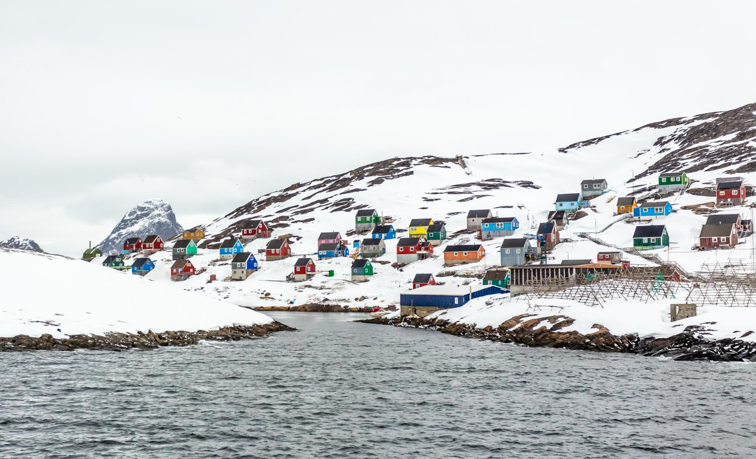
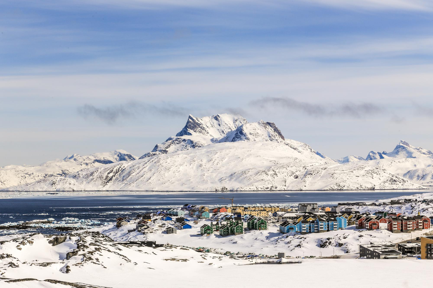
On a Mercator map, Greenland appears roughly the same size as Africa. In reality Africa is about 14 times larger. Greenland’s actual area is around 2.17 million square kilometres; Africa’s is roughly 30 million. Greenland is comparable in size to the Democratic Republic of the Congo alone.
According to analysis by climate scientist Neil Kaye and mapping tools built on the same principle, Greenland is the single most exaggerated territory on Earth by percentage, appearing about 74 percent larger than it actually is.
The rest of the list is similarly disorienting. Alaska looks about the size of Australia; Australia is roughly 4.5 times larger. Alaska occupies as much map area as Brazil; Brazil is nearly five times its size. Madagascar and Great Britain look comparable; Madagascar is more than twice as large. Europe appears larger than South America, but South America is nearly twice the size of Europe. Africa looks similar to South America; Africa is over one and a half times larger.
Africa is large enough to contain the United States, China, India, Japan and most of Europe with room left over, which is not the impression the standard map gives at all.
The Consequence for How People Think
This is not purely a technical curiosity, because the distortion demonstrably affects perception.
A 2020 study published in ISPRS International Journal of Geo-Information surveyed over 130,000 people worldwide and found that the projection meaningfully shapes how people perceive geography. Given that most of us learn the shape of the world from these maps before we can read a scale bar, that is not surprising.
The effect runs in a consistent direction: regions at high latitudes are systematically over-represented in the mental image, and equatorial regions systematically under-represented. Anyone who has seen a true-size animation — where countries are dragged toward the equator and visibly shrink — has experienced the correction as a small shock.
It is worth being careful here. There is a long-standing argument that the projection’s persistence reflects and reinforces a particular worldview, and alternatives such as the Gall-Peters projection have been promoted on those grounds since the 1970s. That debate exists and is not settled; this piece confines itself to the geometry and the documented perceptual effect, which are not in dispute.
What Mercator Gets Right
It is worth being fair to the projection, because the criticism is so routine that its actual merits get lost.
Mercator is conformal, meaning it preserves angles locally. Shapes of small areas are essentially correct, which is why coastlines and street layouts look right rather than sheared. This is not a minor property; it is the reason the map remained in use for four centuries.
For navigation it is close to perfect. A rhumb line — a course of constant compass bearing — appears as a straight line, so a navigator can rule a line between two points, read the angle, and sail it without recalculating. Before satellite positioning, that was worth almost any distortion elsewhere.
It also handles zoom gracefully. Because the distortion is uniform in all directions at any given point, magnifying a region does not introduce shearing, which is precisely what web mapping needs when a user scrolls from a continent to a street corner.
The projection is not a mistake that persisted through inertia. It is a specialised instrument that happened to become general-purpose wallpaper, and the failure was in the second part rather than the first.
The Alternatives, and Their Own Problems
If Mercator distorts area so badly, the obvious question is why we do not simply use something else.
Alternatives exist and are widely available. Equal-area projections such as Gall-Peters preserve relative size accurately, at the cost of distorting shape — landmasses appear stretched or squashed in ways that look wrong to eyes trained on Mercator. Compromise projections such as Robinson and Winkel Tripel distribute the error, getting nothing exactly right but nothing badly wrong, which is why atlases and geographic societies often prefer them. The AuthaGraph projection, developed by the Japanese architect Hajime Narukawa and recognised with a major design award, attempts to preserve proportions unusually well at the cost of a highly unfamiliar layout.
None of these is simply correct. Each makes a different trade, because the underlying problem is unavoidable: you cannot flatten a sphere faithfully.
Mercator also has a real modern justification that is easy to overlook. Online slippy maps use it largely because preserving angles means shapes stay right when you zoom in, and local accuracy is what matters when you are navigating a street. At city scale, the distortion is irrelevant. It only becomes misleading when the whole world is displayed at once — which is precisely the view that shaped everyone’s mental image.
Why the Distortion Grows So Fast
The mathematics is worth a moment, because the rate at which the error increases is what makes the Greenland case so extreme.
On a Mercator map, the horizontal stretching at any latitude is governed by how much smaller the circles of latitude become as they approach the poles. At the equator a line of latitude is the full circumference of the Earth. At 60 degrees it is half that. At 80 degrees it is less than a fifth.
To flatten those shrinking circles into a rectangle of constant width, the map has to stretch them east-west by the inverse of that factor — doubling at 60 degrees, and by more than five times at 80.
Then, to preserve shape, the same factor is applied north-south. Because area is the product of both dimensions, the areal exaggeration is that factor squared: roughly four times at 60 degrees, and over twenty-five times near 80.
Greenland spans latitudes from about 60 degrees to beyond 83, which places most of it in the range where the squaring effect becomes severe. Its northern tip is inflated far more than its southern coast, which also distorts its shape.
At the poles themselves the factor becomes infinite, which is why Mercator maps simply cut off before reaching them, and why Antarctica is either absent or smeared across the bottom edge.
What to Do About It
The practical correction is straightforward, and it does not require abandoning any map.
Use a globe when the question is size. A globe is the only representation with no area distortion at all, and holding one for thirty seconds resolves the Greenland question permanently.
Use true-size comparison tools when curiosity strikes. Several free interactive tools let you drag countries around a Mercator map, watching them shrink and grow as they move toward and away from the equator. It is unusually good at rewriting an intuition, because you see the specific thing you believed being corrected in real time.
And know which map you are looking at and what it was built to do. The projection is not lying; it is answering the question it was designed for. A navigation chart optimised for compass bearings in 1569 is doing exactly its job when it inflates the poles. The error is in taking that answer as a picture of relative size.
There is something worth sitting with in the fact that a specific technical decision, made by one cartographer over 450 years ago to help sailors hold a heading, is still shaping how billions of people picture the planet they live on. Mercator solved his problem well. We simply kept using the solution for a different question, for four and a half centuries, without noticing.
Like our content? Follow us for more.